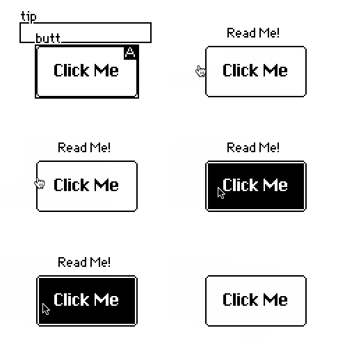
How would I go about displaying a tool tip that shows up when I hover over a specific widget?
The main thing to keep in mind about tooltips- or anything activated on "hover"- is that it won't be accessible on devices that don't have a mouse, like most tablets.
That said, there are several ways we might approach implementing tooltips in Decker. The key will be the Pointer Interface, which we can consult to obtain the last-known coordinates of the user's pointing device.
Let's start with the simplest possible implementation: one button and one field containing a tooltip (named "tip"). We want the tooltip to appear when the mouse is over the button. By marking the button as "Animated", we can use its view[] event handler to control the visibility of the tooltip when pointer.pos is within the button's bounding box:
on view do
 tip.toggle["transparent"
  (min pointer.pos>me.pos)&(min pointer.pos<me.pos+me.size)
 ]
end

If you're doing this in many places, perhaps the above can be factored into a utility function that you move to a deck-level script:
on hover_caption target caption do
 caption.toggle["transparent"
  (min pointer.pos>target.pos)&(min pointer.pos<target.pos+target.size)
 ]
end
Simplifying the call sites to something like:
on view do
 hover_caption[me tip]
end
Instead of having individual animated widgets for each hover target, you could centralize the logic by having a single widget handling this responsibility for every button on a card; maybe even a locked invisible button with no other work to do. If you set up some kind of naming convention (like making the previous example be a button named "b1" and its tooltip named "b1_caption") you could write a generic routine which queried "card.widgets", found widgets with corresponding captions (or vice versa) and carried out the equivalent of the above automatically as buttons and captions were added and removed.
We could also build tooltip logic into a contraption, which would give us a place to keep around additional state to handle situations like an ease-in/ease-out animation for revealing the caption. Note that you'd probably design such a contraption to be layered underneath interactive targets like buttons.
Does that point you in the right direction?