Indie game storeFree gamesFun gamesHorror games
Game developmentAssetsComics
SalesBundles
Jobs
TagsGame Engines

Where is my Pixel Art at Skillwise?

A topic by EpithetSoup created 24 days ago Views: 136 Replies: 5
Viewing posts 1 to 6
(1 edit) (+3)

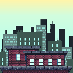
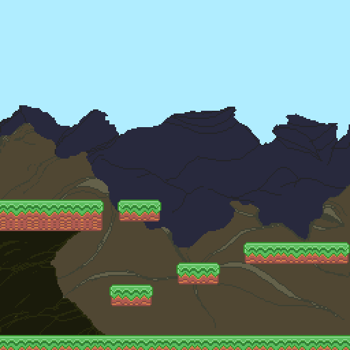
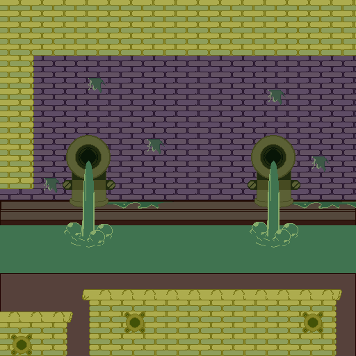
So its been about 5 momths or so ever since I began drawing Pixel art and I wanted people's feedback on where Im at compared from now to then.


Then:
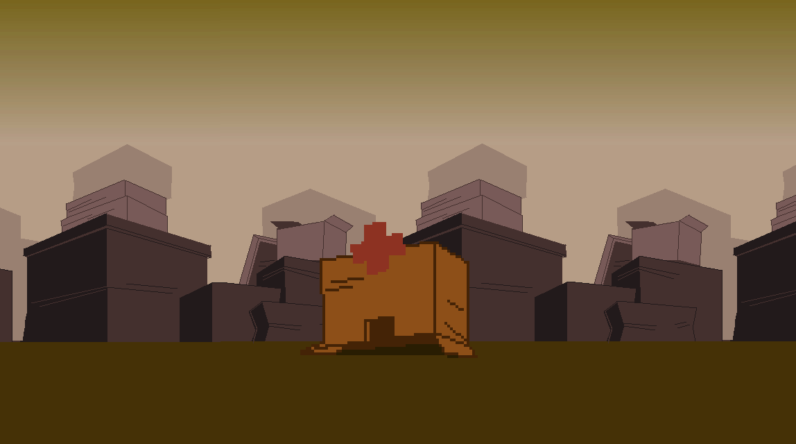
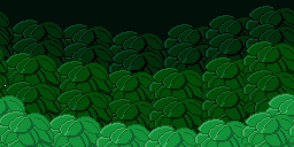
Now:


I think you hit the mark!

I like how it look and I can see it in a game.

Keep at it!

The shapes are very clean and clear, and the pixel size is consistent.

Good work :D

Looks good.

Good improvement.

Good work on your improvement. For the leaves, I'd suggest you use hue shifting over simply adding more shades of black to them. What happens when you just lower the value is that the colors wind up looking washed out when you brighten or darken the image. For green, shifting toward blue when darker and yellow when lighter preserves the color information without having that problem. 

It looks very good throughout. It looks unprofessional but it looks good for the most part. Also feels unique.