I want to start out by saying how fantastic this game is Adam, thank you for your wonderful work!
I've wanted a post-apocalyptic base builder for some time. Atom Society looked cool but it just wasn't my thing.
This is something else entirely. So with the spirit of that, I've compiled a list of paper notes while playing, because I enjoyed it so much and would love to see it succeed and have as many others enjoy it as possible too.
Lets get started:
- I'd love if the player just 'popped' through doors (maybe with an accompanying sound of the door slamming). Having to open/close doors as it stands is a little bit difficult, over and over so I just end up leaving them open as it stands.
- Stamina made sense, felt like it had just enough juice in combat, however health bar wasn't immediately obvious to me. I only made the connection between it and my health once I was close to death.
- Fade out during death took too long. Shorten the tween, or use bounce-in/out on the fade, dunno. Something. Could just shorten it.
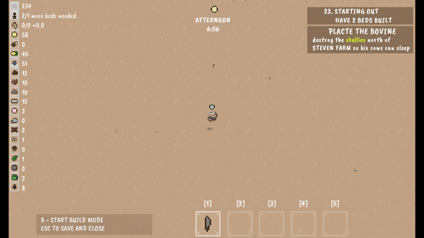
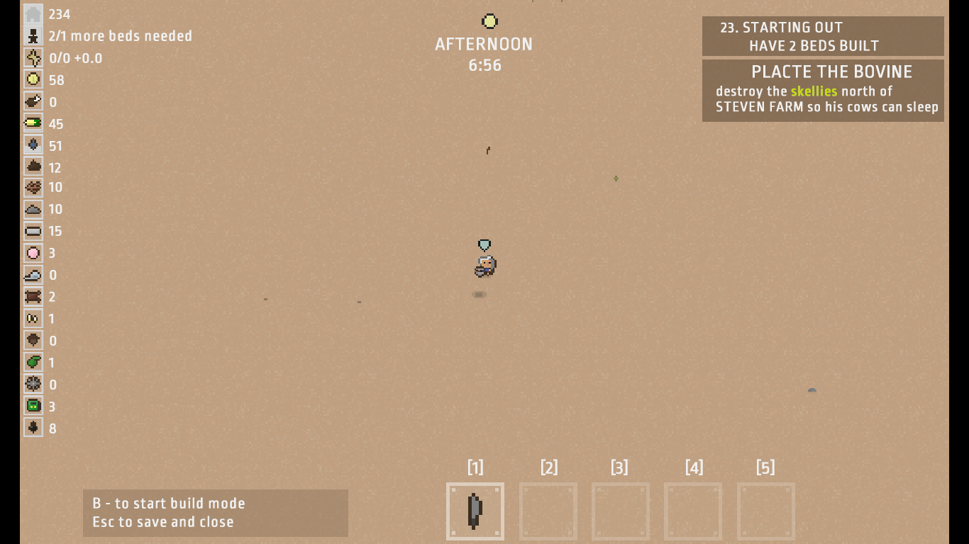
- Font on build menu was painful to read and navigate repeatedly. I went through and looked at font alternatives. I looked at several, including raleway bold and various DIN type fonts (I'm a UI designer) like Barlow. I found a couple that maybe you'd like, or at least ones that appeared to fit the feel of the UI, are legible, free for commercial use, and then did some mockups.

Thats Caveat Brush at a couple different font sizes. It's similar in look to the font used in Terraria, which I've always loved.
Another font os is Capital Darren. It's non-commercial, but the has that all-uppercase feel that seems to fit so it's worth checking it out and looking for similar fonts.
The other font I tried was Ropa Sans..

..which you can find on google fonts, again, open font license, so it's free to use commercially. I don't like how big the clock element 'afternoon' is here, but this was just a quickie to eyeball what it'd look like.
The focus was 1. contrast, 2. legibility, 3. multiple weights, 4. open licensing, 5. matches the 'light and cartoon feel' feel of the pixel art and I think both Caveat Brush and Ropa Sans check most of those boxes.
Other observations:
- There were a few headscratchers about what some of the resources were. Putting names next to them would create an ugly distracting wall of white text on the left of the screen, but maybe put the resource name in a tool tip that pops up when hovered?
- Be sure on each level when you spawn objects that produce resources, that you set a limit for balance. For example, if testing shows that the ideal amount of metal resources on a map is 30, don't spawn more than 30 *objects-worth* of objects bearing metal resources. That makes it easy to diversify the kinds of objects per-resource that are spawned and the amount each type of object spawns, without overdoing it. You'll always know, by drawing on a limited set pool, how much of any given resource will be on any given map.
I have other input but I don't want to flood you.
Thanks again Adam, you've made a cool game. When do my family and I get to play it on the switch?
- J
Edit: I don't know if you meant "PLACATE THE BOVINE" but I chuckled and left it as is in the mockups.


