Indie game storeFree gamesFun gamesHorror games
Game developmentAssetsComics
SalesBundles
Jobs
Tags

Match-Lite Castle (Turn based+ Color match + rogue-lite). Add/Change?

A topic by JoshBurleson created Aug 18, 2019 Views: 1,263 Replies: 5
Viewing posts 1 to 4
(1 edit) (+5)

Match-Lite Castle

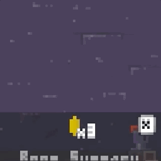
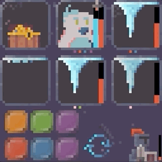
An idea has been rolling around in my head for a Rogue-lite that uses simple color matching mechanics but with deeper strategy behind the use of those colors.  I decided to use this years LowRez2019 to do a prototype and here's where I landed. 

Testers that I've had play it in person enjoyed it and there seems to be potential for a full release (redone art at normal resolutions of course).  Any feedback or thoughts on if I should continue development, design changes or the games future would be appreciated. What would you like to see added?

  https://joshburleson.itch.io/match-lite-castle   

Cheers!

(+1)

I am playing the game and I like the idea a lot, but I have to say that it was difficult for me to see the points under each box with which you have to match the color (after finding it I have seen that it was explained in the how to play video, so it's probably my bad).

Another thing is that being a pixel art letter and in small size, some letters have been a bit difficult for me to read.

For the rest, in general, I would encourage you to move on with the game, it seems like a good idea and may have potential!

(+1)

Your encouragement and valuable feedback is super useful and I'm really grateful you took the time to post here. There's for sure some UX issues that need to be ironed out and hopefully I'll be able to continue working on those after the jam. Cheers!

(+1)

Hi Josh!

I played a few runs of your game. I got to the last boss a most times, but never won. It's very promising :) It kind of feels like those card games that are popular at the moment, but different! I have some critisism of course, but overall I like it. Here's some things I noted:

  • Going for low rez graphics seems pointless if there's going to have misaligned pixels everywhere.
  • Colors could be more contrasted. The title for example blends perfectly with the background. It's also kind of ironic that a game about color looks so desaturated.
  • I think using a more limited palette would look better. You're using a lot of useless micro variations of the same colors which make the game look blurry.
  • The text is difficult to read.
  • I read ALMI's comment before playing so I knew to look for them, but the colored points below enemies really are very small!
  • The wording of some item descriptions could maybe be clearer. For example, "45% to poison target for 3 turns" made me think I had 3 turns at the start of every fight to poison enemies. Maybe my reading comprehension is just bad...
  • The game looks a bit confusing sometimes; some information is shown very briefly and is not too obvious. For a few runs, I wasn't sure if I was taking or doing damage when I did a critical hit. (there's critical hits right?) I was also confused whenever I triggered a column/row attack. I saw that everything took damage, but wasn't sure why. Now I see the weapon pops up, but it's subtle.
  • I really liked figuring the game out and finding strategies, but I feel like randomness overpowers strategy most of the time. Maybe some kind of clue about probability would be good?

Anyway, good prototype I say. Worth an enhanced version for sure!

(+1)

Thank you for laying out such detailed feedback, GravelBlock. I have to admit to you that I have the same criticisms myself. Many of the issues are inherently due to the fact that this game was built for a LowRez gamejam (has to be 64x64). I had the idea separate from the Jam and really just used it as an excuse to make a prototype of the concept. I started on the game 1/2 way though the jam so that left me with a little over a week to get this prototype done. Not leaving much time for presenting a clear vision of the game mechanics. The whole thing was just a big experiment to see if I could make the concept "fun" and other people could enjoy it to some degree.

  • I agree. One of my problems was that when I was spriting I wasn't sure how unity would translate over the small resolution and ended up kinda rigging something that made the pixels be "pixel perfect" but messed up their alignment on the screen. If I continue development one of the first things I'd want to do is remake the art at a normal resolution of some sort.  I may not even use pixel art honestly.
  • - See below.
  • This sounds silly but normally I make my own color pallet. This time I wanted to try and  use one a found online.  About 3/4 of the way through the jam I was running out of time so I just started to use my own shading technique. It kinda broke things.
  • I built the game and I can barely tell what the hell the text is saying lol.
  • The color points were the biggest criticism and one of my biggest mistakes not taking the time to develop more.  I kinda just threw em on there. Obviously that was  a hug mistake considering those few pixels are the core mechanic of the game 🙄 
  • The text is almost useless because you don't have enough space to describe anything all that well. I had to kinda "Cave-man" the language to make it fit on the screen. Hence vague and incomplete statements like the one you pointed out.
  • (Yes there is critical hits and nice job  figuring that out) A lot of the "juice" I'd normally use to give the player feedback was unavailable to me at this low resolution. This left many of the actions in the game kinda vague. Taking damage, critical hits, enemy cast types, etc. I'd probably need to put each enemy cast/action in a short que and let each one have a second to play out. Then the player could watch events unfold rather than having it all be mashed together in one single jumble.
  • I'm really glad you picked up on this. Personally, I found the game to actually have a lot of depth once you got past the messy presentation. The randomness you mention is partially due to it being a "rogue-lite" but I feel most of it stems from not being able to display information to the player clearly.  I'd need to a lot more work on the game to deal with the balance issues.

I can't thank you enough for taking the time to leave such a detailed post. I will take all of your feedback to heart and hopefully someday you'll be able to see a more "clean" version of the game. Cheers! 🍻

(+1)

No problem! Seems like you know what you're doing :)