In our 2017 year in review post we hinted at updates to our homepage. Over the past few weeks we've been incrementally pushing out functionality and today we're ready to tell you what's new!
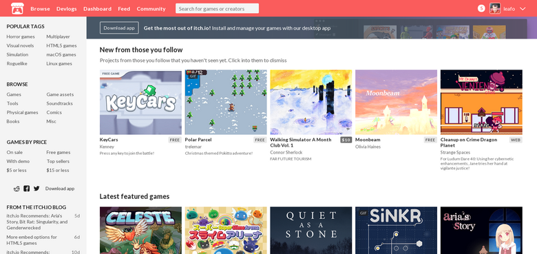
The itch.io homepage was traditionally a grid of games picked by our team. Although it was simple to implement, there were many parts of itch.io we wanted to promote but didn't have space for. Additionally, with around 200 new games added per day, we have more developers than ever looking for promotion.
After some experiments, we've decided on grids of different modules. The design is flexible enough that we can continue to add new sections as we come up with them. If you have any ideas for modules you'd like to see leave a comment.
Here's what's new with the itch.io homepage:
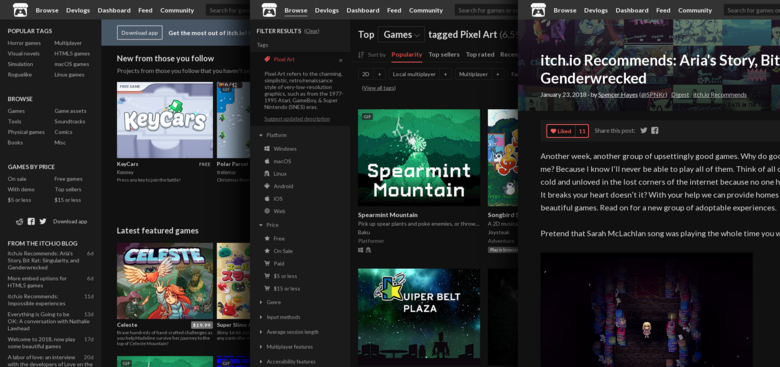
For no good reason, itch.io's homepage had a dark color scheme for many years, while the rest of site used light colors. We've decided to unify the design with a consistent header and matching color scheme. It felt a bit sad removing the darker colors though. Many sites these days provide a darker option, so why not itch.io! You can find an option to enable a darker theme from your account settings page. The dark theme is a work in progress, so not all pages are converted, but you'll find it available for many of our commonly accessed pages.
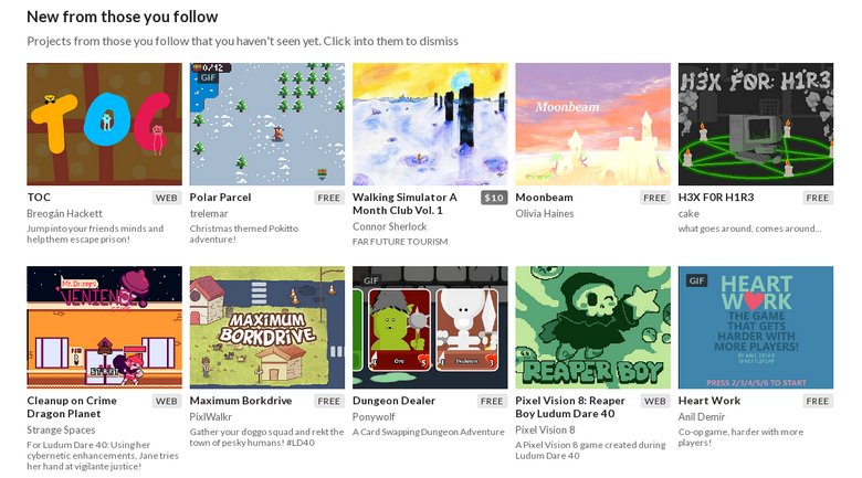
Following creators is a great way to show support while being updated on what they're up to. If you're not actively watching your feed you may miss new releases though. We've added a new module on the top that shows projects released by your followers that you haven't viewed yet. Have you missed any new games from your followers? Go take a look
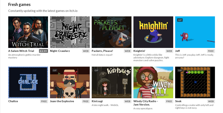
Our featured games section, although updated regularly, has a limited number of slots and can feel a little stale if you visit the homepage regularly. We decided that a secondary section with games added more frequently would be a great way to give more developers more eyes while giving visitors something new every time they visit. Fresh games are pulled from different collections created by itch.io users along with curation from our team. We hope that it helps put a spotlight on interesting things that may have otherwise been missed. (BTW, to devs, posting in release announcements can help you get spotted for this section)
Previous we had game jams mixed in with games. That was confusing... Now you get a dedicated row to see featured upcoming & ongoing jams.

Following creators on itch.io is great. It's so great that we recently wrote a guide about why you should do it. It will make you happy, and the person you followed happy. In order to get you to follow more we've added a module to the homepage with accounts you might be interested in. This list is pulled from projects you've previously interacted with in some way (downloaded, rated, purchased, etc.). If you haven't followed anyone yet, give it a shot!

When we've previously done site-wide promotions we would insert a list of interesting things on sale. In retrospect, there's really no reason not to have this module always available since there's generally always something interesting on sale! If you have a developer's account you'll also find game development resources as well.

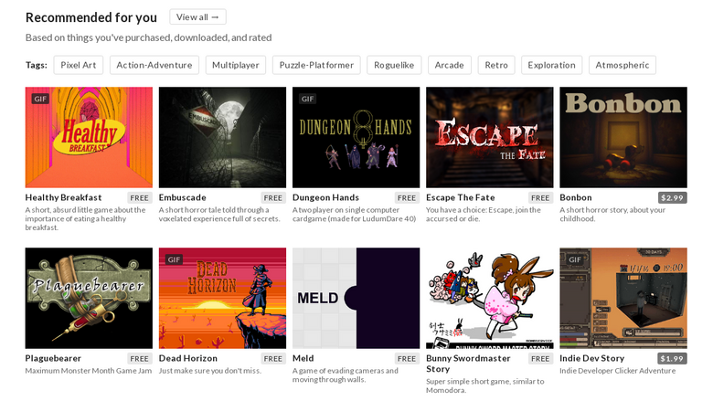
The recommended games section also got an upgrade: you'll find that we show more games at once (no more carousel) in addition to some suggested tags if you want to do some exploring on your own. We've tweaked the algorithm a bit to make sure that things you've already interacted with don't show up there.
I hope you enjoy the updates. We look forwarding to adding more as the year goes on.
Thanks
Did you like this post? Tell us
itch.io is an open marketplace for independent game creators. It's completely free to upload your content. Read more about what we're trying to accomplish and the features we provide.
Leave a comment
Log in with your itch.io account to leave a comment.
I am really not feeling the front page, it is really uninviting and visual communication feels hampered by the lack of color-coding. The way the front page felt distinct from the other pages made for a great initial experience, it felt like what you were seeing had been carefully picked for you and displayed in the most inviting way possible, now everything just feels the same and I have trouble distinguishing each section of the page as all the visual cues are the same.
DARK THEME FTW!!!!
Cool update! I also noticed a new(?) option called "Embed BG" when I was customizing one of my pages. What is this, and what does it do? I tried uploading an image using this, but I didn't notice any change on my page.
Yes! This is so good. I love the "New from those you follow" feature the best—it's the best form of curation, and reminds me to check out stuff from the people I love!
You address lots of things that I didn't quite understand (i.e., game jams in the games), but never would have complained about because y'all were already amazing.
Thank you!! xoxoxo
The feed notification was definitely a great addition, before it was added I'd leave my feed unchecked for... well, almost always. All the other stuff is welcome, too.
I like the update! Thanks for keeping the dark theme as an option. :)