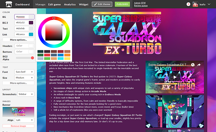
One of my favorite parts of itch.io is how developers can take the creativity they put into their project and display it on their project/store pages. From the very beginning, one of itch.io's guiding principles has been about giving developers a page that they can customize with content that they control.
Sadly, itch.io's project page theme editor hasn't really kept up with the development of the rest of the site... until now. Thousands of lines later, the oldest part of the site is now rewritten. Introducing the new theme editor!

Updating the theme editor has always been a challenge for us. Thousands of developers use our page editor to make some really unique stuff, and when we make updates to it we have to be careful about inadvertently breaking their designs. For this update I analyzed game pages using Custom CSS, since they're the most fragile. I viewed 600+ project pages, got to see a lot of interesting stuff, and took notes about the things they did. The most common changes became the inspiration for the new features that are available today, and the ones I have planned for the future.
646 public games have used custom CSS on @itchio, going through all of them now to think of new features to add to theme editor pic.twitter.com/rT0rke6QGc
— ↘️↘️ go to itch.io and buy games please 🙌🙏↙️↙️ (@moonscript) November 2, 2017
This release was mostly concerned with getting the rewrite out, so I'm calling it Phase 1. The architectural changes will make way to many more advanced customization options in the future. Here's a brief overview of what's new today:
Many changes were also made to address users who work with CSS (you should have gotten an email about it!):
Try it out, and tell us what you think. With the foundation improved it's much easier for us to continue adding new customization options. Please don't hesitate to leave a comment here with any ideas you'd like to see.
While working on this project I had the opportunity to see a lot of cool pages. You can check them out in my collections:
Enjoy
Did you like this post? Tell us
itch.io is an open marketplace for independent game creators. It's completely free to upload your content. Read more about what we're trying to accomplish and the features we provide.
Leave a comment
Log in with your itch.io account to leave a comment.
We are grateful for this change. We hope that more features will be added in the future.
YYYYESSSSSSSSSSSSS. Thank you so much. Bless your heart. Everything little thing you add exponentially allows for people to create completely unique game pages, I love it. Please never stop improving profile/game theme editors, it adds such personality into the website - which I love.
Suggestions:
I've just updated the page for my main game with the new tools! Fantastic!
Thanks for your work!
What's the chance of this project also happening with Profile pages? I know a few of us even use Custom CSS over there as well. (Managore's in particular is impressive.)
Yeah. If you've noticed there two styles of theme editors. The goal is make make them all look and work like this new one.
That's a good point, I think it would be worth having a account setting that disables the fonts, like how we have one to disable gifs.
Hooray! I have already switched to the new theme editor and away from custom css due to these changes, thanks so much for your hard work!
New toys!