Play game
Azure Hue's itch.io pageResults
| Criteria | Rank | Score* | Raw Score |
| Theme | #1 | 4.600 | 4.600 |
| Horror | #2 | 3.800 | 3.800 |
| Story | #2 | 4.400 | 4.400 |
| Gameplay | #3 | 2.600 | 2.600 |
| Overall | #3 | 3.833 | 3.833 |
| Presentation | #4 | 3.800 | 3.800 |
| Creativity | #5 | 3.800 | 3.800 |
Ranked from 6 ratings. Score is adjusted from raw score by the median number of ratings per game in the jam.
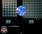
How did you choose to implement the Theme: Cursed Jewel in your game?
This is the overall theme and basis for the entirety of the game.
Did you implement any of the optional Bonus Challenges, and if so, which ones?
No
Did you create your game in RPG Maker?
Yes
Leave a comment
Log in with itch.io to leave a comment.


Comments
Gameplay - Mostly walking around with a few simple chases, but it's polished and didn't break/bug/crash at all. 3
Story - I'll admit I'm not the biggest fan of Ju-On/Ringu style "unwinnable" horror but I think it's very solidly written. 5
Presentation - The characters and monster are well-drawn and the final walk with various graphic fates is quite unsettling. 4
Creativity - A definite standout, with the odd and unsettling creature design and death scenes. 5
Horror - It genuinely feels like a short horror film in video game form. 5
Theme - The gem was very present in the story but it did also end up being a red herring/hope spot to trick the victim. 4
Amazing. Definitely the most horrific entry I've rated, and overall just a well-crafted horror short.
Hello!
Okay, I'll be honest. I've never played a game made by an egg before, so I wasn't sure what I was getting into. And now, after having played your game, I can that eggs are amazing developers!
All right, let's see
The visuals are really good, and the monster is pretty creepy, although I'm not sure what it was supposed to be. A quadrupedal beast? A hand covered in diamonds? Whatever the case, I liked the design. The human characters were really cute and I really liked them
The gameplay was good, I didn't have any trouble with it
The story is no doubt the best thing about this game. I absolutely love it! Specially the ending, as it's really dark and macabre. A lot of people always expect happy endings and they get really disappointed with dark endings; that's not my case though. I really appreciate endings such as this one, it reminds me of some of my fav horror films/books, so that's a plus for me. Honestly, if the protagonist managed to escape from the monster, it might have been too cliché. But that final scene with the monster and the "survival" dialog...it was amazing! I loved it. Not to mention the post credits scene, that was a really nice surprise (and something I'll probably try in my own games hahaha)
Overally, I loved this game and I honestly would love to see more games focusing on the monster, since this has potential for becoming a series. I also look forward to more of your games!
Great job! : D
Oh man, this is such an honor to have such a nice review from you! I absolutely fell in love with your games when I first discovered yours back when you posted The Sakabashira Game! I'm so glad you liked my little game! I'm definitely still new and an amateur when it comes to game development, (most of my games are really more like stories with minimal "gameplay" aspects) so making a game for a gamejam was a challenge for me that I wanted to run with in my own way.
As for the monster design- I didn't have a clear idea in mind for whatever type of "creature" it was supposed to be- I just wanted it to be something you couldn't easily comprehend; something abstract and eerie. I first thought of something like a misshapen hand one would draw if they traced over their hand with a marker (eg: hand drawings made to look like turkeys or chickens), but also something deformed and warped. I was originally going to go for a more gore-y/trypophobia-esque design, but since me and my husband have that particular phobia, I figured it was best to leave it with just enough "holes" to identify a "face".
I absolutely agree with the notion of dark endings- they're really some of my favorite in horror films/media too! I wanted the ending to be dark and show that the monster/"bad luck" that befalls these victims is one of an ongoing loop- like it happens to random people of all walks of life, all throughout different places in time. I knew from the beginning of development that I wanted the ending to be a sad/not happy one. I'm glad to know people enjoy that aspect! Aah, it's such a pleasure to know that my tiny entry could inspire you to do something similar with the ending- it's really touching coming from a popular developer, so thank you for saying that!
Thank you so much for all your kind words! I had a lot of fun working on this in the end, and I'd like to think I've learned some when it comes to development- I'm not that great at game-mechanics, but I'd like to give it a shot with something else in the future! (Ah a series would be really interesting!) You're an incredible inspiration, and I thank you again for playing my game :>!
[Spoilers everywhere]
.
.
One thing that I really appreciated was the amount of flavor texts: on the one hand, it was interesting to know the behind the scenes of a jewelry store, on the other they were perfect for getting to know Vanessa well... and then being very disappointed to see that ends badly. This is the part that contributed the most to the horror factor: Vanessa doesn't win, the evil thing continues to claim victims and the person you've been with all the time loses. The final cliffhanger and the prologue with the discovery of the evil stone during the archaeological excavations are so classic to make everything appear, in fact, "classic" and not banal. If there hadn't been the reference to streaming services, I would have easily thought of it as a 90s movie!
On the graphic side, I found the pixel avatar very cute. I was a bit perplexed by the fact that mister Cameron and the colleague didn't have a sprite but, thinking about it, maybe the "problem" was that the little girl's father has one: if he didn't have a sprite, it would just be the people who enter in possession of the jewel to have it and the attention would be all on them. I think.
BTW, I hated the first chase because I kept getting stuck in columns. But I guess most of the discomfort was my nonexistent sense of direction.A nice game that makes you regret reading (I guess) all the flavor texts. Good job!
Wah, thank you for such a detailed comment! I'm terribly sorry about the first chase being difficult- playtesting it seemed to be alright for me, but I might just be biased as the creator ;; but! As for your comment about the ending factor: this is exactly what I was going for. I wanted things to be bittersweet (or more-so bitter than anything else.) and to not have everything ending happily. I wanted to go for a more eerie and somewhat somber feeling- like a perpetual cycle that happens to random individuals without explanation. Wrong place, wrong time-type situations- things like that.
In regards to the sprites: that's really my bad;; I'm not very good with spritework, and when I realized I needed sprites for other individuals, I went a rather lazy route instead of making some new ones. Maybe in a future update, I'll make some changes, but I do apologize for the strange appearance. I started with the archeologist's sprite first, then his daughter, but sometime in development, I ended up using Vanessa as the main/secondary protagonist. I already had the fathers' sprite ready, so I thought it'd be a waste not to use it. (Although, I suppose I could've repurposed the father's sprite for the boss' instead, but that's still my fault;; sorry!)
I love games that have interactable items/flavor text- it feels like it fills the void, so-to-say. Even if it's somewhat boring or not exactly plot-relevant: I just like having the ability to peer into one's surroundings, even slightly.
Thank you again so much for playing, and thank you again for all your kind words! :>
I really quite enjoyed this one, in-particular I appreciated everything that you could click on having unique text, such as the boxes/garbage out the back. I ended up playing for almost an hour to not miss anything. 😅 Will have an LP video up tomorrow. 👍
Complete playthrough, hopefully I didn't miss anything!
Ahh sorry for the late response! I watched your whole playthrough- thank you so much for all the praise!! ;w; It definitely means a lot to me, especially since I felt I didnt' do my very best for this game;; I can't tell you how pleased I was with seeing you interact with multiple things- it's definitely one of my more favorite parts of game making! I loved hearing your narration, and I'm glad the controls weren't super difficult to handle (apologies about not prepping the player to hold shift right before hand, haha!)
Thank you again so much for playing and for the video! :>
Thanks for taking the time to check it out! 👍 No worries on the controls, I thought they were fine honestly, just didn't click to me to sprint for a bit haha.
Ok, so, here's my review of this game:
SPOILERS:
Gameplay:
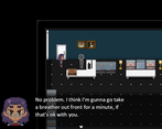
So, this is a "walking simulator" with some chases. Actually, outside of the chases you mostly spend your time in cutscenes, so the gameplay is limited. And even when you don't, it's basically just "walk over to the door to the next map so you can watch the next cutscene". There's nothing wrong with that in theory, but it doesn't exactly make for a thrilling gameplay and the cutscenes didn't really make up for that.
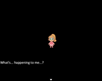
Also that part at the start, where you play as the blonde girl and have to examine what seems to be everything to be allowed to progress... I wasn't sure how many items I need to examine something to progress and kept trying to leave, but it wouldn't let me until I managed to find whatever it was that I still hadn't seen yet. I wasn't a fan of that.
As for the chases... well, the first chase is not designed very well. For one, the monter starts a tile away from you and you have a save point right there. So you get a game over the first time and then once you load the game, you basically already have to be holding shift and the movement key to actually get away. Also that second part where the monster teleports behind you and its speed is now the same as dashing speed, well, I got a game over five times before I managed to get past it.
Overall, I'd say the gameplay has some significant issues that detract from enjoyment, but nothing that can't be somewhat easily fixed. As an advice, use the text pauses less often and in the first chase, you could have the protagonist make two steps away from the creature, say something like "I have to get away!" and THEN have the same point, so that you have more of a headstart.
2 Stars!
Story:
The story was good, basically, a monster uses a cursed jewel as bait to lure unsuspecting victims and then some time later it will transport them to its realm and eat them. Still, there were some parts that dragged on a bit too long (for example the parts where the MC is at work) and also there were some parts of the story I'm not too sure about. Like, for example, the monster sees the MC only as food, but it also tries to trick her by transporting her into a dream where she archieved everything she wanted? Was it to lure her closer so that it can attack or why? It's good not to explain too much in, but I think there could've been a bit more focus on the monster and how it works.
4 Stars!
Presentation:
Alright, so, the tilesets were great and the maps were fine. The custom sprites were good, though the coworker and the boss could've had their own proper sprites instead of those outlines, they were prominent enough characters that it was strange that they didn't have them unlike the blonde girl's father. The lack of music or background sounds is an issue though, it makes the game feel too quiet, and not in an eerie sense.
3 Stars!
Creativity:
Well, I'd say this was mostly a typical RPG Maker Horror Game in a lot of aspects, but you did manage to give it some unique spin. I really like the design of the monster for one and the "generational" timeskip between two victims of the cursed jewel was a somewhat unique twist.
3 Stars!
Horror:
The game isn't that scary and the lack of music really doesn't help this category, however it has some decent atmosphere in some parts, especially during the "dream sequences" and the story and writing help bring up a sense of unease. There were also some genuinely good horror parts, such as when you try to exit the store only to end up in a seemingly endless hallway or near the end when you are following the road out of town while in the forest you could see the MC being killed in various ways.
3 Stars!
Theme:
You've certainly managed to capture the essence of the theme. The cursed jewel is the front and center of the story and the way it ties the various characters together is great. And while you wrote that you didn't implement the bonus challenges, I'd say that the Price of Greed bonus challenge was actually implemented. In its most basic form and it's not outright stated, but still.
5 Stars!
Overall, you definitely have potential to make a great horror game someday! This was an alright game, especially good considering it's for a game jam. I'm sure your next game will be even better!
Wow, thanks for such a detailed review! I knew my game was lacking in several aspects, so I'm not ashamed to admit I'm still really new to storytelling in game-format. I purposely wanted to leave what the monster did as "ambiguous"- that is to say; I didn't intend for it to exactly come across as a dream-like sequence, so hearing that as a description was really interesting and something that hadn't crossed my mind! I wanted the idea of a demon/creature "devouring" a person in some abstract/hard to describe way- something that would render the victim as "missing" to the public. I must admit: I initially started the idea with the girl and her father in the intro being the main focus, but somewhere along development, I switched it to a more modern story. At the time, I did realize how odd it looked to have the co-worker and boss to have a really simple sprite;; Apologies for that, really!
I think I thought that having limited music was a decent way to encapsulate a more "horror" feel- and for some reason, the audio I've included in the game just doesn't play in the browser version. This happened to me during development, so that was completely unintentional;;; ((As far as I'm aware, the downloadable version's audio seems to be working properly.))
I do appreciate the further criticisms and tips, though- I agree that the first chase does leave players at a disadvantage. As for the beginning area: I suppose I wanted the player to be able to interact with things before rushing off to another map- I see now how this is frustrating to some. (The game only needed 5 different items to be interacted with to proceed- though what I thought could be a more charming experience, ended up a bit more sloggish/time consuming than I intended.)
The demon/creature was somewhat intended to confuse and cause hallucination type situations- even ones that might seem "dream-like" or "could give the person whatever they'd want"- but I also wanted it to be obvious that it was a strange, eerie farce; like the monster really was just toying with it's "food". Maybe I went a bit overboard with not being as descriptive as I could've been.
Of course, I'm not negating your review in any way- I think this is fair and gives me much to think about when it comes to developing things going forward! I hope to be able to make a game in the future that feels nice to play for people besides myself- I'd like to expand my horizons! :> Thank you so much for the review and for hosting the jam!