Play game
Protocore's itch.io pageResults
| Criteria | Rank | Score* | Raw Score |
| Theme | #14 | 4.308 | 4.308 |
| Audio | #17 | 3.077 | 3.077 |
| Arts | #21 | 3.538 | 3.538 |
| Gameplay | #32 | 2.923 | 2.923 |
| 2 Colors | #40 | 4.308 | 4.308 |
| Mood | #50 | 2.385 | 2.385 |
Ranked from 13 ratings. Score is adjusted from raw score by the median number of ratings per game in the jam.
Leave a comment
Log in with itch.io to leave a comment.


Comments
Some concepts I liked from most important to least important:
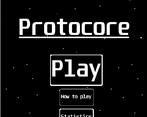
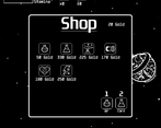
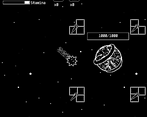
* The UI was nice and made the game look professional and polished. It made me feel good while playing the game. I liked the menus and I especially liked the item purchase menu as it looked nice, professional, and it reminded me of games I played.
* I like how many different and interesting mechanics were incorporated. The combination of mechanics made the game pretty different. I particularly like how the health decreases when the player attacks an enemy. It is a different way to approach health in games.
* The soundtrack was not repetitive and it sounded okay. It kind of fit the mood of the game.
Some concepts that I did not like from most important to least important:
* There are some fixes that need to be in the How To Play section. The technical writing (like spelling, grammar and punctuation) of this section needs to be better. For example, there are some letters that are capitalized, and they are not supposed to be capitalized. There are some letters that are NOT capitalized, but they are supposed to be capitalized. Also, the controls do not mention movement using the arrow keys or WASD keys.
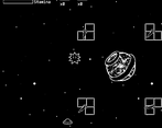
* There are some gameplay tweaks that should be made. The click to attack is kind of hard and awkward to use. The reason why is because the attack only moves the player a specific amount of distance. Due to this, it can be frustrating to attack enemies that are nearing the core because when the player attacks one enemy, the player will unnecessarily move pretty far away from the core because of the amount of distance the player moves during the attack. In addition to this thought, I think the game would be better if it had the click attack AND had a mechanic in where if the player touches an enemy, the enemy will be destroyed. However, this distance problem should be tweaked so the player does not move so far away after attacking an enemy that is close to the player. I also think it is quite inconvenient for the player to have to press the space bar to pick up coins. After all, there are no disadvantages to picking up coins. I think it would be better if the player picks up the coins by just touching the coins as there is not a scenario where the player will not want to pick up coins since there are no disadvantages to picking up coins. Also, the four turrets in the beginning of the game do not attack the enemies. What is the purpose for these turrets if they do not attack?
* When most games deal with health, they usually have a health bar that decreases when taking hits. In this game, the bar increases. I do not like this because this was confusing to me. I initially thought I had plenty of health when most of my bar was white and not much health when most of the bar was black. This seems like an unnecessary change in the game and I do not think that you should change just for change's sake, unless you fully know what the change will bring. This mechanic is confusing as I have learned from games that the health bar decreases when the player takes hits.
Thanks for the feedback!
-In the shop there is a Coin magnet upgrade that is quite cheap but yea i understand
-The turrets purpose are explained in the how to play section but it probably wasnt clear enough since I have aspergers and i cant explain stuff that well. But they point towards the nearest enemy because i found it kinda hard to see enemies, and can be upgraded to slow down enemies too
-About the healthbar, it does decrease actually idk what youre talking about, could u elaborate on that?
When I was playing the game, the white part of the bar was increasing when taking damage instead of decreasing. When I first started the game, my health bar was completely black. When all my health was gone, the health bar was completely white. The player’s health bar and the core’s health bar follow the same model in that the health bars become more white while taking damage.
When you start the game youre at full hp (All black) and whenever you lose hp the black part decreases, the white is just the background of the healthbar.
Yes, but usually it is the other way around in that the black is supposed to be the background part of the health bar. This is usually the case in video games I play. Since you made black be the foreground part of the health bar instead of the background part, I was initially confused as I thought I had close to no health when I had close to full health. I also initially thought I had close to full health when I had close to no health.
Oh yea that makes sense, will keep that in mind for my future games, ty :)
Very good, but the game being unchangeable windowed made me click away constantly, really infuriating. But still, animations, the feel, it's all there.
It's a really cool game. Did you create your own enemy navigation or are you using the unity navmesh?
You get stuck in the walls sometimes when you attack. Other than that, the idea seems promising, maybe if you expand it you can get a really good game.
I keep getting stuck on the walls, and there seem to be some audio issues. Aside from that, fun little game and fits the theme well.