Play game
Mission - #2ColorsGJ's itch.io pageResults
Criteria | Rank | Score* | Raw Score |
2 Colors | #2 | 4.846 | 4.846 |
Audio | #7 | 3.538 | 3.538 |
Theme | #16 | 4.231 | 4.231 |
Arts | #21 | 3.538 | 3.538 |
Mood | #25 | 3.154 | 3.154 |
Gameplay | #42 | 2.538 | 2.538 |
Ranked from 13 ratings. Score is adjusted from raw score by the median number of ratings per game in the jam.
Assets
Music by Olivier Gasnault (made for the project)
Leave a comment
Log in with itch.io to leave a comment.
Comments
A fun little game overall.
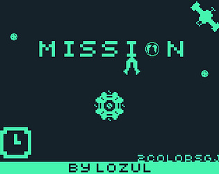
I love the color choices and the music was quite nice. I found the overall aesthetic quite appealing for using just two colors.
I feel that maybe the laser indicators could be bigger or somehow more noticeable, it wasn't until I was on my third or fourth attempt I figured out where they were.
I enjoyed the game overall, the first thing I'd like to see is using keyboard keys for movement! Excellent presentation and effects. Good job!
Thanks a lot for your testing!
The feedbacks about lasers will be enhanced in the post-jam version.
A keyboard implementation is a great idea, definitely in the next update too.
Cool spin on the classic dodger game, I haven't beaten it yet but I like it so far. The story text and music are both nice too. I like the color choice. Overall the game and presentation is very clean and of good quality :)
Thank you for your kind message! I'm glad you like the game :D
The design of the game is very cool, I liked the colors, and also the style of the texts. I was a bit scared with the lasers (they are too fast) and the sounds, I was listening to music before I started playing so, it was very loud hahaha. I love text games actually, anyway, Great Job!
Hey FlifT!
Improving the lasers will be the first update on the post-jam version, i will add effects and sounds to help the player.
Sorry about the music :') i've runned out of time to implement a settings UI, but there will be one in a future version.
Thank you for your feedback!
I really like the visuals and color choice here, especially at the beginning when the text screens! Very nice effects. The lasers could be a bit bigger to make them a little easier to see. I also couldn't see the bar at the top of the screen to tell how far into the level I was. I think the play window might have been a bit too tall for my laptop to show.
Hey! Thanks for your message!
Yeah, another tester have pointed the problem of too thin lasers, i should have test with different resolutions (actually it's 480x720), same for the invisible top bar :/ sorry about that. Maybe if you zoom out x) ... I take notes for a post-jam version!
And i'm glad that the visual please you!
I like the idea of having to defend yourself from the lasers and not to be attacking, but there are some problems. The function of the shield seems confusing, the enemy lasers sometimes cannot even be seen sometimes, they need to be more visually impacting in my opinion.
In short, I think the games needs some more feedbacks elements so the player knows a bit more about how are they doing, otherwise it's a bit chaotic.
Thanks for your feedback!
The shield works during one second, you can't be shooted during this time. It's that who is unclear, or something else?
Next, for the lasers, i admit it, sometimes they are too thin (random width). If i make a post jam version, i will make some visual effects to enhance their visibility.
I hope you have enjoy the game!
I kind of figured the shield function, maybe you could add some visual effect or sound when you use it right so the player gets sure of how and when to use it.
Yes, maybe a second circle when a laser touch the shield + a sound. It's the first time i've made a game without a test time with other persons. Thanks for your messages that help me for my future projects!