Play Downwell Run
Downwell Run's itch.io pageResults
| Criteria | Rank | Score* | Raw Score |
| Visuals and Sound | #14 | 3.632 | 3.632 |
| Overall | #18 | 3.351 | 3.351 |
| Fun | #20 | 3.211 | 3.211 |
| Creativity and Theme | #29 | 3.211 | 3.211 |
Ranked from 19 ratings. Score is adjusted from raw score by the median number of ratings per game in the jam.
Leave a comment
Log in with itch.io to leave a comment.


Comments
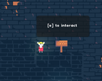
I was slightly confused by the lack of visual/UI response to events, like for the cheese chests I was mashing 'e' to be sure whatever needed to trigger would trigger, not entirely sure what it was meant to be accomplishing, but aside from that it's pretty enjoyable! :)
Impressive game, good job!
I find the game hard, but not because of the level design, but because of the lack of feedback:
Thank you! I wholeheartedly agree with the lack of feedback when taking damage and/or opening the chest, they're a case of 'didn't have time' or 'couldn't technically implement it yet' – will add those asap. Also, good idea to have a visual indicator for the fall too - that would be a nice way to let the player know they're reaching the limit. Appreciate the feedback!
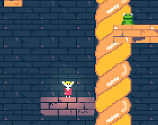
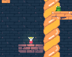
I really liked how everything fits together, the visuals, the sounds and the theme (small mouse in a big well), wow! +10 points for letting the text actually readable, not pixelating like game devs usually do.
Thank you, glad you enjoyed it!!
That double jump while falling saved me a few times, but it was a very satisfying game to play and the music was top notch! Great job!
Thank you!!
Nice game, congratulations on your submission. It looks very nice and the music fits the game very well.
Thank you so much!
Nice little game. Runs well (har har), smooth controls, nice classic visual style. Gameplay is mostly random and not a lot to discover.
Ahaha, thanks! I know the game is super short, it’s meant to be just one level (of hopefully more to come).
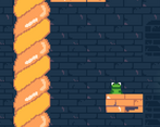
Nice and simple, The art style is very good. It was a bit hard to tell where the next platform is since you can't see that far. Overall, a very nice and polished game.
Thank you for the feedback, much appreciated!
This is so cute! I can only imagin how long it must have taken to make the art for this, but it was well worth it! (terrible pun intended)
Ahaha good pun, thank you!!
Good!!!
Thanks!!
Wonderful art and movement. I saw someone else already commented about the oddity of being able to use two jumps after walking off a ledge, but it also seems like the instadeath from falling "too far" is managed by time rather than distance, which feels a bit odd when i use my double jump and then die at a higher depth than where i used it from. I also think that the deaths would benefit from some sort of transition screen to indicate that a death occurred and hide the frozen screen - especially when seemingly sudden deaths occur from long falls. Overall one of the most cohesive and polished entries I've played thus far; great work!
Thank you for the detailed feedback, I really appreciate it! In all fairness, I did not realise the issue with the double jump until it was pointed out to me, so I’m happy to take that onboard. Same for the instadeath and transition screen - which were not polished enough due to time constraints. Once again, many thanks!
Loved the art. It was a bit tough with the camera zoom to tell where to go next sometimes. Fun overall!
Thank you! The camera was somewhat intentional, hope it wasn’t too bothersome. I’m glad you enjoyed it!