Play game
The Vanished Lantern's itch.io pageResults
| Criteria | Rank | Score* | Raw Score |
| Presentation | #32 | 3.500 | 3.500 |
| Creativity/game design | #48 | 3.063 | 3.063 |
| Overall experience | #55 | 2.875 | 2.875 |
| Gameplay | #60 | 2.563 | 2.563 |
Ranked from 16 ratings. Score is adjusted from raw score by the median number of ratings per game in the jam.
Does your submission follow the required limitation?
Yes, yes it does.
Leave a comment
Log in with itch.io to leave a comment.


Comments
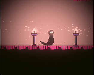
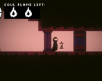
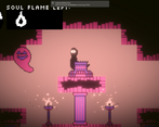
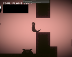
I liked the presentation a bit, the use of light and shadow was quite nice, though there was a serious problem in that the buttons shown to you in the tutorial were impossible to see because the shadows covered them up.
The concept also had a lot of potential, with the lantern giving you an attack, and two different forms of movement for when you had it or not, but the execution was very messy.
First of all the player is way too large, and way too sluggish and slippery. This makes it so basic platforming is annoying to do, especially because you keep needing to keep switching between holding the lantern and not holding the lantern in order to get around.
Second of all, the puzzles are all very confusing. It's not at all obvious what you need to do to continue, other than just running around in circles activating and deactivating torches until the doors forward open. The black torches also were not explained at all in the tutorial, only being explained after a level where you needed them to solve the puzzle, which I got stuck on because the torch I needed to switch was on the ceiling where I couldn't see it.
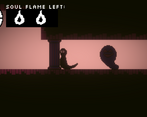
Thirdly the attack was basically useless. Despite using the mouse it only shot straight forward, meaning with the difficult jump controls it's extremely hard to land a hit on the ghosts. There was also a line about banishing them in the tutorial, but I never managed to do it even when I shot them twice with the fire. The fire also takes too long to reload, and there's no indicator as to when they'll reload, so I just had to wait around for no reason since it needed to reload for a puzzle.
Overall it's got a lot of potential, but it's so frustrating and annoying to play that I wouldn't wanna touch it again until it has a lot more polish and design work.
thanks for the feedback.
Very cool mechanic with the lantern and different jumps. Like the pixel art. Tutorial fonts should have stand out more but overall a very cool experience! nice entry!
Thanks. What do you think what part most have more polish?
Its really just details, like the start screen and the tutorial presentation. The lantern mechanics/jump and the art are really nice. It could make a good full game maybe like a metroidvania complete story. Really great job!
And I have think the game is better metroidvania.
The game was a little confusing , but apart from this everything else is great !
thanks
what part is confusing?
the tutorial
ok
Little confusing initially, but great polish and visuals.
Thanks
Nice game, with a great visual style!
There where some typos and sometimes the character seemed to get stuck on something until I jumped once. I also don't see the theme implemented that well
But apart from that, it's a great game that has a nice atmosphere to it!
Thanks
I got stuck early on and the controls and instructions are a little confusing, and you could work on polishing the movement.
But I really loved the art and the mechanics! I think this game has so much potential and I would love to try a more polished version soon!
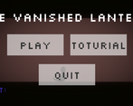
the aesthetic is great and the mechanic is very unique, the sound effects were good and the menu was very polished. I liked how the buttons made sounds and there was a smooth transition from the menu into the actual game. however you should work on polishing the movement and the level design. When you land on the ground there is some camera shake that instead of making the game seem more polished it sort of made the jumping seem clunky. There weren't really that much indication to the player on what to do and they had to have gone through the entire tutorial to have known what to do(the tutorial was a bit too long).
thanks a lot
Looks great, but the instructions are a bit unclear.
thanks