Play game
Collection from the Dead's itch.io pageResults
| Criteria | Rank | Score* | Raw Score |
| Music | #48 | 2.393 | 3.000 |
| Art | #65 | 2.165 | 2.714 |
| Gameplay | #65 | 1.937 | 2.429 |
| Originality | #69 | 1.937 | 2.429 |
| Overall | #69 | 2.203 | 2.762 |
| Theme | #70 | 1.709 | 2.143 |
| Is the graphics 1 bit? | #72 | 3.077 | 3.857 |
Ranked from 7 ratings. Score is adjusted from raw score by the median number of ratings per game in the jam.
Leave a comment
Log in with itch.io to leave a comment.


Comments
Hmmm
Fun little fetch quest game. I liked the art and music!
The graphics for the game were cute. I like the sort of terror feeling with the music. The game was also short but it is a game jam so mi not suppressed.
As said in previous comments the platforming was hard due to the way the camera worked
Overall i quite liked the game and i do look forward to see what you can do with it if you update it.
If possible id also love it if you could rate my game and give it some feedback too :)
As others have said, the camera should always lead the player especially in platforming. Who did the music? I didn't see any mentioned in the credits, cuz it had a NIN vibe I loved. Granted, the music did make me anxious for terror despite the simple happy fetch quest the game was.
Game was short, but got the job done. You submitted something in the short timeframe and should be happy! Some graphical glitches were there, yeah, but I think this could be updated and fleshed out.
Thank you for playing and also thank you for the feedback! We are hoping to update this in the future, so is there anything else you think could be improved?
Nothing that comes to mind now, it'd have to be in response to lengthening the game. The controls are snappy for platforming but the camera needs work (as mentioned prior). It all depends on where you're going with controls/story etc.
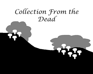
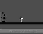
With this camera platforming was pretty unfair, I just couldn't see next platform! There is four colours: black, white + 2 shades of grey (background and bush(???)). Some sprites were in ground, they should have been a little higher. Button isn't removed from the screen if you pass by the houses. Still, the controls are nicely done, I liked movement in this game.
Thank you for playing and also thank you for the feedback! We are hoping to update this in the future, so is there anything else you think could be improved?
That was a quick playthrough! I liked that there was some story there and the graphics were cute. Despite how short it was, the platforming was nicely challenging. I felt the music was a bit confusing though (tense music in a rather peaceful setting?) but that might be my personal taste... so feel free to ignore that if you don't think that applies.
Thank you for playing and also thank you for the feedback! We are hoping to update this in the future, so is there anything else you think could be improved?