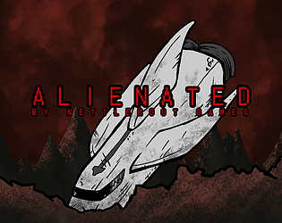
Play game
ALIENATED's itch.io pageResults
| Criteria | Rank | Score* | Raw Score |
| VISUALS | #204 | 3.795 | 4.000 |
| DESIGN | #284 | 3.268 | 3.444 |
| MUSIC | #323 | 3.057 | 3.222 |
| THEME | #338 | 3.162 | 3.333 |
| OVERALL | #402 | 3.162 | 3.333 |
| SOUNDS | #416 | 2.741 | 2.889 |
| INNOVATION | #617 | 2.424 | 2.556 |
Ranked from 9 ratings. Score is adjusted from raw score by the median number of ratings per game in the jam.
Leave a comment
Log in with itch.io to leave a comment.


Comments
Nice work ! The visual and sound design are complementary well. I had just some collision problem. Really interesting univers witch it would be pleasant to discover more :).
Thank you!
Probably the best visuals i saw all jam. Really neat but the tiles are kinda ugly not gonna lie. Everything else is pure art and i would never guess it was made in 7 bloddy days!
thank you so much! i kinda hate the tiles too and i already made new ones but we didn't have the time to implement them. Thank you so musch again!
A super neat game actually. Love the theme of the bugs how they look similar but evolved of each other -really cool. I don't know if it's just me but it look me ages to realise Z was the shoot button!? Probably just me being a dumdum. The boss was cool too although I beat it wrong by standing in the corner where he could get me! Maybe a clearer way of dodging attacks? I seemed to get hit every time I jumped over him. Some good stuff and very clear use of the theme. Great job
Thx a lot! glad you noticed the similarity's between the aliëns. we are aware of the 'stand in the corner' bug and i already told our programmer he should change the controlls. Thx for the feedback.
Really cool art for the player character and enemies felt like playing a comic book. However, it felt like some of the environmental pieces did not complement the cartoon style. The sound effects were a little too loud.
Thx for the feedback! I agree that the pieces dont fit well with the rest and we will fix it in a new version.
Love the alien designs! Really cool art. Not a fan of the controls though. Z for shoot while trying to move with WASD was pretty tough to coordinate. I kept trying to use space for jump and left click for shoot.
Thx! It was a lot of fun to design these aliëns so i'm glad to see so many people like them. I'm also not a fan of the controlls but our programmer said this was the best option (i told you so, ruben)
The concept is really interesting, and the art on the enemies is compelling. I wish the movement were less slidey. Doing more with mechanic of gaining power for less health (like higher jumps or some kind of puzzles) would have been interesting.
Thank you very much! A lot of time and love went into the art so i'm glad you like it. Thanks for the critisim too we will probbably update this game a bit after the game jam and we'll definetly take your points into account.