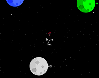
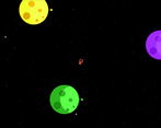
Play game
Dye Sector's itch.io pageResults
| Criteria | Rank | Score* | Raw Score |
| Innovation | #23 | 3.500 | 3.500 |
| Theme | #37 | 4.000 | 4.000 |
| Sounds and Music | #91 | 2.875 | 2.875 |
| Visuals | #95 | 3.125 | 3.125 |
| Overall | #104 | 2.875 | 2.875 |
| The Experience | #113 | 2.500 | 2.500 |
Ranked from 8 ratings. Score is adjusted from raw score by the median number of ratings per game in the jam.
Leave a comment
Log in with itch.io to leave a comment.


Comments
Very good innovative game. At first I didn't understand the color table but then it clicked :D Relaxing fun game only when I didn't launched myself to infinity :D Had great experience.
And i find a bug probably:
There is planet hitbox in the corner.
Great work.
First off, thank you!
I'm very proud of the level design, thanks, and indeed, the floating to infinity was way too slow like many other people said!
I'm glad you enjoyed it, and i'm happy you put the time to understand the game!
PS:
Hahahah, that's a neat picture. For some reason I decided to place a brown planet without texture inside the map. Did you happen to go there already brown or did you get repelled at first and then deducted it should be a planet and went there as brown on purpose to be there?
Again, thank you. I'm happy for the feedback.
I wanted to go from the top orange one to the white planet, so I can clear the color from brown, but I missed and flew to the corner. So it was in many ways just a lucky shoot :D
Finally found time to play your game. Interesting concept, but it took me solid 10 minutes to really understand how to play the game. After that it was quite easy to finish. It just took forever because the movement is a little to slow, as already mentioned by others. Also the aiming was a little problem because falling "off" is way too easy.
According to your game mechanics. I don't really understand the need of running around on the planet and clicking on the flower. It basically doesn't add any challenge to the game. It just makes the game longer for no reason and a little annoying.
Maybe add a little variety to your planets.
Some more sound effects would have also been nice, but there isn't much going on which could need sound.
But overall nice game idea. Would love to see what you could make out of this in the future ;)
Thank you! I agree with you like i said to some other, it's too slow, the game pace isn't good at all. There's no need for the flower, i just imagined it like that originally but after submitting it, I was told i should have made it so that you only need to click F while on the planet. You (and him) are surely right and i will do that after the rating phase ends.
Yup, more variety would be nice. Some sounds effects too, but those last two i just didn't have the time to do.
I will polish the game a little bit but I don't intend on working too much more on it, I will make eventually another game that revolves around a similar concept, and I've learned with the mistakes i've made in this one, and am looking to making new stuff :)
Thank you for playing the game until the end :) and thank you for the feedback :)
(This is all a bit critical, but just to confirm I'm not writing this spitefully whatsoever.)
Gameplay wise it feels pretty tedious. Here's what I think may be causing that, and some possible solutions:
Movement speed is simply too slow. The walking speed around the planet could certainly use a big increase. The space speed could probably be doubled, and you could get away with even further speed increase on that by making the deflection off a planet even faster.
The respawn system is a little confusing. If you fall off the map, then you are given a choice to respawn at the starting planet and keep all of your progress. Yet, the second you become brown you're forced to entirely restart. The only consequence for dying is having to do the puzzle all over again. Which greatly adds to the tediousness. The easiest solution for the problems in the death system is to simply not have one. Especially for puzzle games, for puzzle games death systems are by default unnecessary.
There is no way to keep track of your progress on unlocking the planets. An indicator on the planet after you've unlocked it would help to keep track of that.
Onto other things:
I'm glad that there's a hotkey for the color pallet, it would be nice if there was a hotkey for the map and maybe even the controls as well.
Art wise I would recommend making the colors on the planets less saturated, meaning instead of them being a raw 100% neon color, instead tone down the colors a little until it looks relaxing to look at. The dark purple planet already does this.
It's a pretty fine puzzle design. Perhaps the color mixing is a bit nonsensical, but other than that it's a legit working puzzle.
The art for the player astronaut is pretty good.
While I think the respawn multiple choice system is a little confusing, I like the wording behind the accept fate option.
The music is pretty great, very great. It captures the atmosphere of a calm space puzzle well.
Thank you! I don't find it spiteful, I appreciate the feedback! Overall you're right and I have a lot to improve, thank you for being so specific with what went wrong, I'll surely take all of that into consideration next time, and when editing the game I'll speed him up too.
Yeah, I also could've given more thought to the death / respawn system, I agree with most you said too.
And besides the colours you've had showing when pressing escape, no, there isn't a way to keep progress.
there is a hotkey for the map, it was in the controls panel :p
I see, thanks for the art pointers, I'm a big newbie there.
And thank you for the positive remarks!
To conclude, thanks for taking the time to write this post, I found it very helpful and inspiring! You might see more of me if we stumble upon each other again, I'm trying to jam as often as possible :)
I'll be honest with you, after reading how to play I was still trying to find how to play. I spent 10 minutes on it and I couldn't manage to understand what my goal was. I think you should make more clear how to play maybe with some animation (tutorial) . When playing games usually the player wants to get to play as soon as possible and I think in this case is not possible. Your little dude is very cute! Sounds and music as well!
Alright!! I appreciate your honesty very much and you are right ! I kinda got lost in developing and i didn’t focus on the player’s point of view, i will definitely take that more into consideration the next time. I should have tried to make things clearer but at a certain point i just tried to explain instead of changing what i had, that was also a mistake ahah.
Thank you, i like my dude as well and i think that even the sounds that i didn’t have much time to do turned out alright by being simpler.
Thank you for the feedback!
Definitely there is some good concept there. So good luck with your future development, I hope you will try to improve things. for sure I would like to see more from you!
The concept is really interesting and the main mechanic is very innovative but maybe you should find a way to make it less tedious, some animations would be cool too, the music is pretty cool
Thanks! You’re right! It does need to be less tedious, if i keep working on this i’ll make sure that happens, and yes, animations would DEFINITELY add a lot to the game, it would be a big step up if he had a walking animation and a jumping one, maybe eve a floating one haha, anyway thanks for the feedback and for playing it :)