Play game
The Exception - V1.1's itch.io pageResults
Criteria | Rank | Score* | Raw Score |
Audio | #213 | 3.440 | 3.440 |
Innovation | #219 | 3.480 | 3.480 |
Overall | #291 | 3.407 | 3.407 |
Game Design | #331 | 3.400 | 3.400 |
Graphics | #359 | 3.600 | 3.600 |
Fun | #416 | 3.280 | 3.280 |
Theme | #493 | 3.240 | 3.240 |
Ranked from 25 ratings. Score is adjusted from raw score by the median number of ratings per game in the jam.
In what way does your game fit the theme?
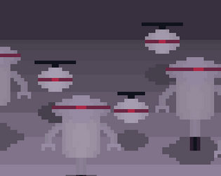
You must try to defeat an extremely strong boss while avoiding countless projectiles from nearby robots and you must strategically use your abilities to weaken it.
Did you write all the code yourself and made all the assets from scratch?
I wrote every line of code myself and created every asset by myself, except for the music.
Leave a comment
Log in with itch.io to leave a comment.
Comments
Brilliant Mechanic! I like how it keeps me from shooting so I have to take the decision of switching places and adding some strategy to it. Also, nice that you added difficulty levels. Well done!
Great game and the player movement feels really good too!
I liked the graphics and the movement a lot pretty impressive!!
I liked the graphics and the movement, and it's impressive the you made it in just a week. However, I think it does need some polishing. I saw three main problems:
1. The UI was massive. In the tutorial it was fine, but once Swap was added, the entire top-right quadrant was covered by UI. You should at least half that, and maybe even cut it down more. Similarly, it is very hard to see buttons on the starting menus. More contrast between the buttons as the background would fix that.
2. The game wasn't well balanced. The player has a projectile while the Exception has a melee weapon, so the best strategy is to run away and shoot behind you, even in insane mode. This led to long, boring battles. Many of these kinds of games give both players projectiles, but I propose a different solution: give the player a melee attack. Maybe even add interaction between the players' attacks, like blocking, and multiple attacks so the player has to choose one to get past the robot's defenses. Then to scale up the difficulty, make the robot react faster or have more accurate blocks, instead of just increasing health.
3. And lastly, for some reason the loading screen exiting the level is the same as the loading screen starting the level. I've never experimented with loading screens so I can't tell you how to fix that, but it doesn't make any sense telling the play what the target is as they head to the main menu.
This looks like a giant block of text, but really the problems are huge, and overall you made a fun game. Nice work! And it would be great if you could check out mine, too.
Tysm for the feedback. I will take it on board for polishing this game in the future as well as any future ones I make!
Cool game!!!
Very cool art! Music fits well too.
Nice game :) The artwork is really nice, the tutorial is really well done. Good job! :D
nice game +)
Nice game! Really loved the artwork, the concept and the music. My only complaint is that the reloading feels slow, and the exceptions take too much time to kill (but I think that's the idea).
great game good artwork
Great game, the tutorial was a great idea, cuz first i was confused what swap actually does, then i checked the tutorial
Congrats on finishing Voltaik!
The lil tutorial was a great introduction to the mechanics. That made it a lot easier to understand. Well done! I think the core loop felt a lot more polished in this version than the one you showed me before. The enemy healing felt really OP though, and not in a good way.
I really like the sprite art and animations in this one. Super well done :)
Good game, but not an easy one. I think the ammo realoding was kinda slow. i liked the music, it was nice and the art is good also. Good Job!
Great game! Audio is pretty nice. and assets are well done
thx
Cool game! Hard but fun