Not really, I'm no UI expert. But, you are lumping all your UI stuff into the 1 corner of your game, you could move stuff to the other corners of the screen so that it isn't all cluttered into the same corner. After doing this you then need to decide whether the scale of these items needs tweaking if it still is too large and blocks too much screen real-estate. You have to strike a balance of UI readability and it not getting in the way of the player playing your game because too much of the screen is blocked by it. You have to also decide what does and does not need to be communicated by the UI. But I would say first step is moving stuff into the other corners of the screen to see how it improves, then tweaking screen UI element sizes. Doing that should likely be enough to improve things.
bjiCorp
Creator of
Recent community posts
Nice game. Great art (and sound) would have been more impactful with animation for your character, even if you did single frames for each action - one for idle, one for move, one for jump. I'm surprised you've used python, been a while since I've come across a game done in python. As the other commentator said, you should consider something like Godot for a 2D platformer.
Nice metroidvania game. Liked the art and animations. Nice axe mechanic to make the gameplay stand out. With the default window that opens, the UI is far too large. Found the enemies not sticking to one side too challenging as they race about avoiding hits. Perhaps make them slower or stick to one side of the player to make them easier to kill. But, maybe this is just me.
Really liked your game even tho it wasn't a metroidvania. I have no issue with the AI art at the start even tho everyone else apparently does. It gave me an Office Space (1999 Mike Judge film) vibe. Thought the prologue was really well done. I would like to see this project at least prototype the metroidvania aspect. Think a metroidvania set in an office or the corporate world would set it apart from the rest, especially if it has humour to it like the prologue. Maybe do that for the next MVM super edition..?
Nice platformer, especially if it's your first game as the other commentator noted! Good range of mechanics with competent enemies. Didn't like that you couldn't attack whilst jumping. Also, I'm not a fan of having space for jump. The issue is that I always find moving right (W) and jumping (Space) awkward as I use my thumb for both. Not sure there is a fix for it as it is more to do with how I play and possibly not an issue for most players. But good job overall!
Did you extract the folder from the zip file or did you try and run the game whilst it was still compressed inside of the zip file?
Windows will let you open the zip file like a folder and browse the contents, you can even run the exe, but it will fail.
Thanks for rating the game regardless and the positive feedback based on the video.
Thanks for playing and for the detailed feedback. Really appreciate it.
I agree the stamina is not clear or well implemented yet, which has been raised by others. I find it frustrating myself. I also feel the tunnels are just not fun yet -- too large to explore and no story stuff in there yet. Combat could use some additional work too.
The amulet you're supposed to put on, and once you do you can speak to the skull in that room (unless it is missing). Seems this isn't clear, perhaps I need to force equip the amulet once you pick it up.
I'll try and give your submission a play before the voting ends. Unfortunately I am going through a lot of personal stuff at the moment and it's hindering what I can do around this jam. But again, thanks for playing and for the detailed feedback.
Bit late but are you trying to run the game from inside of the zip file?
Windows will open it like it is a folder so you can view it, but, it is not a folder that you can run the game within. You must extract the folder within out and then run the executable. Otherwise you will get an error and the game will not run.
Thanks for the quick reply!
Ok, I'll have a look at what the regulations are for itch to be sure. I'll try and replace the censor bars by at least removing nipples or putting on coverings. Not sure I will get around to it as I'm kinda burnt out on pixel art and need to start implement the content in game, along with, finishing off updating and adding code -- I'm a one-man team at the moment.
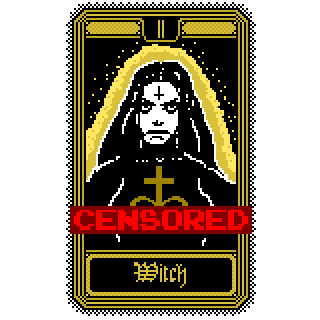
So I'm working on a pixel-art game that will make use of Tarot cards, but reimagined for the game. I've completed a fair number of them and wanted to clarify what constitutes nudity as far as this jam is concerned. They aren't lewd but artistic, but I wanted to clarify by showing censored versions of what I mean below -- I'll do it in a follow up post in case the censored version need to be removed.
FYI If they would be problematic in their original form, then I can endeavor to not make use of them for the Jam and use others instead, or, I can just use the CENSORED versions. However, I would prefer the original as it has a clear artistic intent and meaning to them being that way.
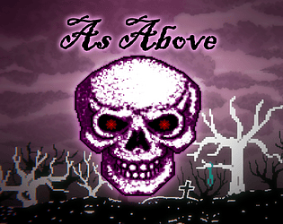
EDIT: so that you understand the context of their use, they are to be used in an old project I am working on for the jam: https://bjicorp.itch.io/as-above
Thanks for the positive feedback!
I thought the deal with Twitch is that if it isn't extreme, and the point of the game is not NSFW content in that it is something that appears in the game but is not the point of the game. And in this case it is artistic photos that are very pixelated that appear on the wall. That Twitch isn't going to have a problem with it. Anyway I've been meaning to implement a system that replaces such textures used with kittens and puppies if you would prefer for things like streaming. It's probably getting to a point where that is necessary.
The enemies are actually all hitscan, so their attacks are just raycasts. There is a delay as to where they will shoot. So if the timing is right you can "dodge" attacks. I'm considering replacing it by having them fire projectiles instead. So I might do that when I update the enemy AI to give them a bit of a cooldown before they attack -- to aid with stealth gameplay; should potentially make them a little less aggressive.
Anyway thanks for playing!
Without a voting period, there is no incentive for people to play and provide feedback on the games. So far I've had 1 person provide me with feedback when I'd usually get at least several.
I know the voting is kinda BS anyway, but I tend to enter jams so as to get feedback from people, and that usually comes from the voting period -- how you get rated for categories via voting is usually helpful. Plus, I believe you can have categories like: fun, design, aesthetics, originality, etc. You don't need to have ultra specific areas tied to your jam or some theme that people can vote and provide feedback on. You can use the voting categories to get an impression of how your game comes across to people and where your weak areas may be.
Thanks for playing and the feedback!
I'm moving it towards being a bit of an immersive sim (stealth) game. Those systems are kind of half baked at the moment, as I haven't overhauled the enemy AI yet. But you can actually sneak around and what you do is either more or less stealthy. The light actually affects how you are detected too -- you can currently shoot most of them out. So the idea with the start is first playing sneaky and attacking enemies from behind where you get a damage bonus if you are close enough. There is also an SMG nearby, if you run and open a secret door.
But having said all that, I do recognize that a lot is not being adequately communicated yet about the gameplay, and some of the mechanics may need to change -- like being able to shoot whilst leaning. The start of the level is likely more difficult than it should be as it is basically the second of what will likely be three levels. Plus, I have played it so much I know all the secrets and stuff so it is very easy for me.
Anyway, I'll give your game a play once voting begins and give you some feedback.
Can I keep going with my last Metroidvania Month Jam Entry?
I can assume that this is a no, but I'd like to keep working on my last Metroidvania Month jam submission: As Above.
I've reached a point where I have a couple of projects I wish to continue working on, I'm not interested in coming up with any more for the time being. I don't care about winning jams, I just use them to force me to work on projects and to get feedback on projects. It would be great to just be able to keep on working on my last Metroidvania Month jam project, as there is still a lot to do to get it to a point of it being a complete demo.
My case for this is based on this rule:
3. Incomplete games are accepted, I would like to see them evolve if it's a project that you'll continue. So don't stress to make a complete game! But your submission should be playable.
I have not submitted the project to any other jam other than the last Metroidvania Month jam, and just want to continue on the project as part of another Metroidvania Month jam as I didn't manage to get a complete demo of what I was aiming for done in the jam timeframe.
Nice retro aesthetics. Would have preferred the character sprite just hard flipped rather than had a transition. This is kinda part of a greater issue arising from it using grid-based movement, in that if I try and line up the next move and I am too early, regardless if just by a little bit, that move is ignored. So it ends up not feeling responsive to player input. I also think that you should be able to attack whenever you want, not just when an enemy is near. This allows the player to test how it all works along with get a feel for it. For example, did not know the axe is thrown and never returns. You have to go pick it up whilst effectively being unarmed. Personally, I think it should be thrown but once it hits something or goes as far as it can, it just returns instantly back to the player -- that's kinda how old games handled it, like Gauntlet. Still fun pixel-art dungeon crawler!
Interesting use of AI generated art along with TTS. Definitely something to put into a portfolio, but I wouldn't want to play it long. Clicking through lots of TTS speech is not fun, though technically interesting -- the generic TTS voice doesn't add to the game's atmosphere. But the real issue is navigating your menus. Nothing made it clear that X was the button needed to select options. I was pressing all manner of buttons before I figured that one out. Also, when navigating the world via choices, nothing lets you know that you have progressed to a new area. It always looks the same, nothing lets you know that you have indeed gone someplace else until you press X and bring up the options of where to go. The combat needs more work for feedback too. But as I said, this is an interesting project to have in your portfolio, some things just need to be made much clearer.
Love the retro aesthetics. Not sure about the feel of the mechanics. The spear didn't seem to have much range, and I think maybe it should have been faster. Was a bit lost as to who was and wasn't an enemy as they are all skeletons. Killed what I take as the boss and then I think one of the ghosts did me in. I think in general the AI needs a bit more work, as in they will attempt to dodge attacks, or if in a group too many die, they will retreat and regroup or something. Anway, cool concept!
Interesting fun game. But I think you need something else other than S for shooting. Makes jumping and then shooting difficult. I would also make it so that you can change angle with the bow by using your mouse. Then LMB is to fire. You can then map this to a controller. At least I kind of expect this if you have a game that has something that typically needs to be aimed, like a bow. Like the aesthetics too!
Interesting concept with mixed visuals that kind of work. Not sure about the shooting mechanics; wasn't sure if I hit the soldier with tentacles at all or if it did anything when I did. Wasn't sure if I could switch weapons, found 2 but perhaps it won't let you switch to them if you don't have the ammo for them. Anyway, interesting start to a war-themed horror survival game, just not sure about the voxel aesthetics.
Interesting game. Didn't mind the grid based movement, however, you need to tweak how much the player is looking down. Kept on wanting to look up. I would make it controllable by the player, the ability to look forward, down or even up. Was a bit lost as to what to do. I know I triggered something, made some progress walking past inactive enemies, then tried to go through an unblocked corridor but couldn't for some reason. Then an enemy approached -- that I didn't even know was an enemy -- and I died. Still, I think it could make for an interesting action-puzzle game that is first-person with grid-based movement. Perhaps with the player able to interact with things with LMB instead of just having to walk over things.
This game exudes a lot of cool retro-horror atmosphere but it needs work. You need to change how crouch works. Having to hold down the L CTRL whilst using WASD for movement... Well you all must be very young with youthful hands. Plus, didn't really see how it did much anway, beyond make you slower -- it needs to factor in to how the player is detected by enemies.
The combat needs work. Picking up and throwing bottles at the enemies seemed to do nothing. I tried throwing them to distract the undead, that did nothing. I know there is a knife, but didn't find it. I think by default you need some kind of attack, even if it is just to push enemies away from you. I also think that the enemies spot you too easily. This says to me that it should be a horror-stealth game, as you are a weaker character, on their own, evading enemies in the dark. But, you can't do that at the moment due to the AI.
I think this is a cool looking game, just think more work needs to be done to make the gameplay match.
Great wave-based shooter game! Love the art-style, along with the audio. Felt very polished; looks like your using some postprocess shaders to get a 32bit retro style. Very nice. If I have a criticism, not sure if it is just me, but I found the camera rotation via Q + E awkward. My only thought is that if you just had it like a third person camera controller, so it is rotated via the mouse look. That may make it at least less awkward for me. But I can see how that would likely raise other issues and perhaps remove some of the challenge and uniqueness from the game. Still lots of fun!
This was a fun retro shooter! Loved the EGA-style graphics, all the creature designs and environment art. I think it could be improved some, for starters it isn't very difficult. There were a lot of health pickups, most I did not need.
The issue is the AI. You have a lot of enemy variants, but beyond some having more damage than others, they're basically all the same -- beyond a couple that had projectiles, and 1 that was a stationary turret. I found them just too timid, making it easy to kill them. You need to make some more aggressive, like the tank ones. Others you need to make faster. Maybe consider adding monster closets -- if the engine will support it. The only real challenge was the final boss, but only because it had so much health and had 3 stages. Bit torn on the boss, as I personally don't like boss fights that drag on, but I think it would be fine to leave as is as long as you make the rest of the game more of a challenge.
I also think that perhaps more weapons and pickups with various effects would be nice. Regardless I would first focus on the enemy AI design, and maybe add in a projectile effect for the player weapon as a bit more polish -- make it really feel like you are shooting energy bolts from your staff.
Overall this was a fun experience for someone who grew up playing these old shooters.


