Play game
Unreal Airline's itch.io pageResults
| Criteria | Rank | Score* | Raw Score |
| Theme | #350 | 3.400 | 3.400 |
| Graphics | #532 | 3.333 | 3.333 |
| Innovation | #570 | 2.933 | 2.933 |
| Game Design | #641 | 3.000 | 3.000 |
| Overall | #673 | 2.922 | 2.922 |
| Fun | #852 | 2.600 | 2.600 |
| Audio | #966 | 2.267 | 2.267 |
Ranked from 15 ratings. Score is adjusted from raw score by the median number of ratings per game in the jam.
How does you game fit the theme?
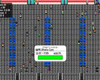
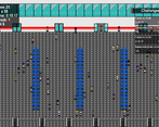
You need to check passports to see if they are real or not
Did you write all the code and made all the assets from scratch?
Yeah!
Leave a comment
Log in with itch.io to leave a comment.


Comments
I really enjoyed playing your game. It was very interesting and very fitting to the theme as well. Great job and keep on doing, what you did. :)
Check out my game if you dont mind. I would love to see you their. :)
Thank you! I'll happily check it out!
I’ve tried playing your game, but for some reason it would crash as soon as the game starts lol
I guess my laptop can’t run your game :(
Cool game!
thank you!
Very good keep it up
thank you so much!
Enjoyed the game a lot. Don't understand buying all the way, had 7k in the bank but couldn't use it to upgrade.
Took a screenshot of the rules after couple of waves I memorized it and it went really well. So they're mostly 90+ or toddlers :D Congrats on the game!
I was planning to use money for more important parts of the game, like buying employees that could scan people’s cards for you, reducing your work load. Didn’t have much time for it though :(
Glad you enjoyed the game!
It was a bit hard to remember everything but it was a good game!
Should’ve made a manual you could check anytime, but thank you!
Hey! This looks good. As some other people mentioned, a progressive adding of passport features and raising the difficulty would go a long way. Or making the info from the tutorial available in the game - something like a manual.
thank you! I was thinking about making an in-game manual, but I got carried away with other stuff haha
Cool game! We kind of did the same thing! Just remember that music goes a long way in a game. I personally use opengameart.org to get all my music.
Thank you! I thought about adding music, but I wasn’t too sure how to make a calm soundtrack/ambiance ^^”
i really liked the idea and gameplay of the game
good job man
thank you!
I like the fast pace feel, I just wish there could be a learning curve with information being added in each wave. There is really a lot of things to look out and check in each person when you first enter the game. Other than that, I like how there isn't a queue and you can check any person in the lobby!
glad to know you enjoyed my game! Also, that learning curve idea is really good! Should’ve implemented that when I could lol
I like your idea very much (and the take on the theme), but the execution could be better from UX/UI perspective. I have looked at the tutorial 2 times but only figured out the actual way to play when I started the actual game and finished the first wave.
thank you! The tutorial was a bit rushed since it was a last minute addition, so it’s possible that it’s not perfect haha. I’ll try to make it better if I ever decide to update the game
I think the game is not intuitive. For example you could add (mouse) button to accept/dismiss a passanger(while still keeping keyboard as alternative). That way player can immediately understand how to accept/dismiss passangers and dive into the game even without tutorial. I also think there is too much information to remember while checking passport - I would either limit the amount of information or show a valid passport model/pattern on side of the screen. Besides that I think art is great and It's a cool concept - it just needed a little bit more work to make it less discouraging for a new player.
Thank you for the feedback! If I ever update the game, I'll make sure to keep your suggestions in mind.