Play game
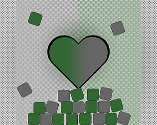
Waste Not (IndieCade Climate Jam '24)'s itch.io pageResults
| Criteria | Rank | Score* | Raw Score |
| Use of Themes - how effectively or uniquely does it engage in the jam's themes? | #2 | 4.667 | 4.667 |
| Interesting Gameplay / Fun | #7 | 3.667 | 3.667 |
| Overall | #8 | 3.822 | 3.822 |
| Smooth, Polished & Bug Free | #12 | 3.556 | 3.556 |
| Likely to Release | #13 | 3.778 | 3.778 |
| Aesthetic (Art, Audio) | #25 | 3.444 | 3.444 |
Ranked from 9 ratings. Score is adjusted from raw score by the median number of ratings per game in the jam.
Leave a comment
Log in with itch.io to leave a comment.


Comments
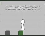
Idea is good. But gameplay while fun is a bit glitchy I think. Sometimes players can select multiple cubes even if they click on only one cube.
This game is quite polished, the way that you reinforce an enivornmentalist message with gameplay is very well done at the end. The first 2/3rds of the game are somewhat repetitive though. I would introduce a new way to sort the trash from the recycling or maybe a new obstacle. Perhaps there could be multiple platforms in the way of the falling blocks.
Hi there! First off, great job on Waste Not so far! It's looking great. I had a bit of an issue with selecting the trash/recycle squares and moving them though -- often I would pick up more than one and that made it a bit difficult to sort them at times. I really like the message of the game, and the simple and clean art style looks awesome! Best of luck on the rest of this sprint!
I had the opportunity to read the game design document for this game during Ideation, and was excited to see how it came to life. This is thoroughly aligned with the themes of this jam, both in telling a story that is not often told, but also showing a great deal of nuance in how it is communicated. The ending can make players feel as if the challenges are insurmountable, but also shares that there is a path forward - it will just involve more difficult choices. This is very much a gamified piece of art!
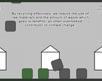
A couple of notes as we move forward into this final week. The text moves very quickly at times, and is not player controlled, meaning I sometimes was unable to keep up with it. If you can switch it so that the text moves when a player clicks it, that would be a great addition so folks can process the entire story. Second, the background of gray dots is a little hard on the eyes when all of the blocks are falling. I'm wondering if a clear, singularly-colored background may help with this.
This is a truly fantastic entry. Wishing you the best as we move forward!