Play game
Phantom Hallows Eve's itch.io pageResults
| Criteria | Rank | Score* | Raw Score |
| Creativity: Does the game include something unexpected or interesting? | #10 | 4.000 | 4.000 |
| Theme: Does this game represent the theme well? | #20 | 4.222 | 4.222 |
| Overall: Is the game objectively good? | #39 | 3.778 | 3.778 |
| Aesthetics: Does this game have aesthetically pleasing artwork or polish? | #47 | 4.111 | 4.111 |
| Cozy: Does the game you feel cozy? | #49 | 3.778 | 3.778 |
| Fun: Is the game enjoyable or satisfying to play? | #86 | 3.222 | 3.222 |
Ranked from 9 ratings. Score is adjusted from raw score by the median number of ratings per game in the jam.
Leave a comment
Log in with itch.io to leave a comment.


Comments
I've got 4 cards so far, and I'll play some more later. It took me a while to figure out what to do at first, but once I did, it was a very enjoyable experience. A suggestion would be to possibly map the various cards to different numbers on the keyboard so the player doesn't have to pause and swipe between cards so much. The music and the art are awesome, and this might be among my favourite games from this jam.
Can I run the game in windowed mode? The UI is unfortunately broken on my ultrawide screen and I can't read half of the text (and also some sprites might be hidden/missing)😢
nice
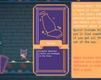
This is really good! Lots of depth. I think I'll have to play more later, I got stuck with the spiderweb card. Not sure I'm using it right, nothing happens when I press P
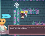
I thought this game was really cute, and had nice dialogue, but for like 10 minutes at the beginning of the game I had a really hard time figuring out where to go after talking to the werewolf. I got pretty far in the game but wasn't able to finish because I got really stumped on the grocery puzzle. Otherwise pretty awesome game, and the character portraits were really beautiful :)
Ok now this game looks soooooo good and seems to be really promising!!
I agree on some points mentioned in the other feedbacks, at first I was really confused about what I had to do, and also got a hard time dealing with the commands and messed a few times. But other people already did a complete feedback about those topics and there's not much I can add.
This said, once I got a better understanding about what to do, I really started to have fun! The ambiance is really nice, music is good (tho I encountered this known bug about volume suddendly lowering for no reason), and the graphics are AWESOME! I really liked it! I unlocked up to 3 cards when I had to stop playing, but I will definitely save this one, play it again and try to uncover the secrets of this awesome shop!!
PS: I am in love with Manuel ♥
SUPER CUTE GAME! I think my feedback will be similar to Endocrine/BAMSc. I really enjoyed the atmosphere, the design is so well done. The colors, the character illustrations (especially when they change emotion), and the environment were all BEAUTIFUL. The music is super seamless and fit right in.
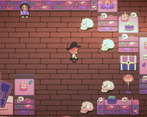
I think something I struggled with was understanding the cards. It took me ages to figure out I was unlocking them and using their powers so for 10 minutes I was just running around the human store. Speaking about the store, I think it was a larger than I would have wanted, especially because I had to remember two different layouts. A smaller store would have made it a little easier to remember where things were and how to get to them, I still dont know how to get around after 20 minutes of playing. I also couldn't tell what I could interact with which got kind of confusing, maybe as you approach an interactable object it gets highlighted or something? I kept thinking certain things were colliders that weren't and vice versa, maybe you could use colors to your advantage here and make non-colliders darker in color (so maybe tone down the carpet runners) and colliders lighter? Last thing, I found the different key-binds a little confusing. I think WASD works great and the Q/E to scroll works good but I think you could combine F with SPACE and have SPACE do all the work for both, and the I/O/P wasn't intuitive enough, even after 20 minutes I kept clicking the wrong buttons. Okay actual last thing, when I clicked ESC it would open the pause menu but clicking ESC again did not close it and I wish it did, I had to return to my mouse to click the RESUME button but because I wasn't using my mouse at all for the game it felt weird. Okay last last thing, I wish I could play it in the browser. OKAY THATS IT SORRY
I think you have an amazing game on your hands if you can make it more user-friendly. During the scope of a game jam its really hard to get enough play-testing in to figure these things out but once you do this is EASILY something I would buy-- the story is compelling, the atmosphere is stunning, the music is soooo good, and the idea is THERE. I'm only writing so much because you clearly put the work in to make something great and you've earned a lot of feedback. Really really good job.
Hey folks, I thought I'd give a little feedback on the game. For reference: I've played for like 20-30 minutes and got the vacuum and portal cards.
Very cute artwork, the dialog is well written, and the card mechanic is really cool, once you figure it out. Has a lot of heart, and you can feel that.
Time for some hopefully constructive criticism.
For my liking, the pathing was too confusing and I didn't know what to do most of the time. I was more or less searching blindly for something to do in the game. It would be nice, especially in the context of a game jam, if you did get handheld a bit more to find tasks and their solutions.
I think a good solution would've been to make the room a little smaller, then you could've reduced the movement speed of the character a little too, it feels a bit fast to me.
A little tutorial on the cards would've been nice, but probably wasn't possible due to the time constraints.
The button layout "P" to use abilities not too great in my opinion, the game is primarily played with wasdf and space, something closer like "R" is better then. Same goes for the "I" button. Also, the "Q/E/I" and "P" buttons should show with the cards, "Q/E/I" hovering over the minimized cards, and P when you call it.
Most of that is personal preference, I would be interested to learn what others think about it.
I hope the feedback comes of as constructive, it is intended this way. Thanks for your hard work and this lovely submission!