Indie game storeFree gamesFun gamesHorror games
Game developmentAssetsComics
SalesBundles
Jobs
TagsGame Engines

[DevLog] Starfall 2D

A topic by klamp created Oct 07, 2020 Views: 361 Replies: 11
Viewing posts 1 to 9
Submitted

I'm embarrassed to say I haven't spent much time on itch.io, so I totally didn't notice there was a community section for Devtober! I've been posting my updates to Twitter and Facebook, but should have been posting here, too.

I don't have much experience in Unreal, so I wanted to make a simple 2D platformer to help me wade in and become a bit more familiar with it. I'm also using a pixel art style (another thing I'm not very familiar with), since it allows you to get up and running pretty quickly in terms of art asset creation. I'm hoping by the end of this month to be much more comfortable with pixel art and creating stuff in Unreal. The following is the project as it has developed so far:


Since I wanted to focus on learning Unreal and its Blueprint system, I wanted my heavy lifting to be focused on the creation of art assets and the implementation of them into Unreal. I didn't want to spend the whole month trying to come up with a compelling design, then run out of time and not get around to making anything playable. That said, I decided to base the project on a game called "Starfall" I made in college with some classmates. That game was a 3D platformer in the vein of Super Mario 64, but I always thought it would make for a good 2D game as well. Until a better name comes along, I've decided to call my Devtober project "Starfall 2D".

Despite being based off a previous game, all the assets and functionality is being made from scratch, since the format is entirely different (2D pixel art vs. 3D polygonal meshes). I decided I should start with a bit of look development brainstorming:
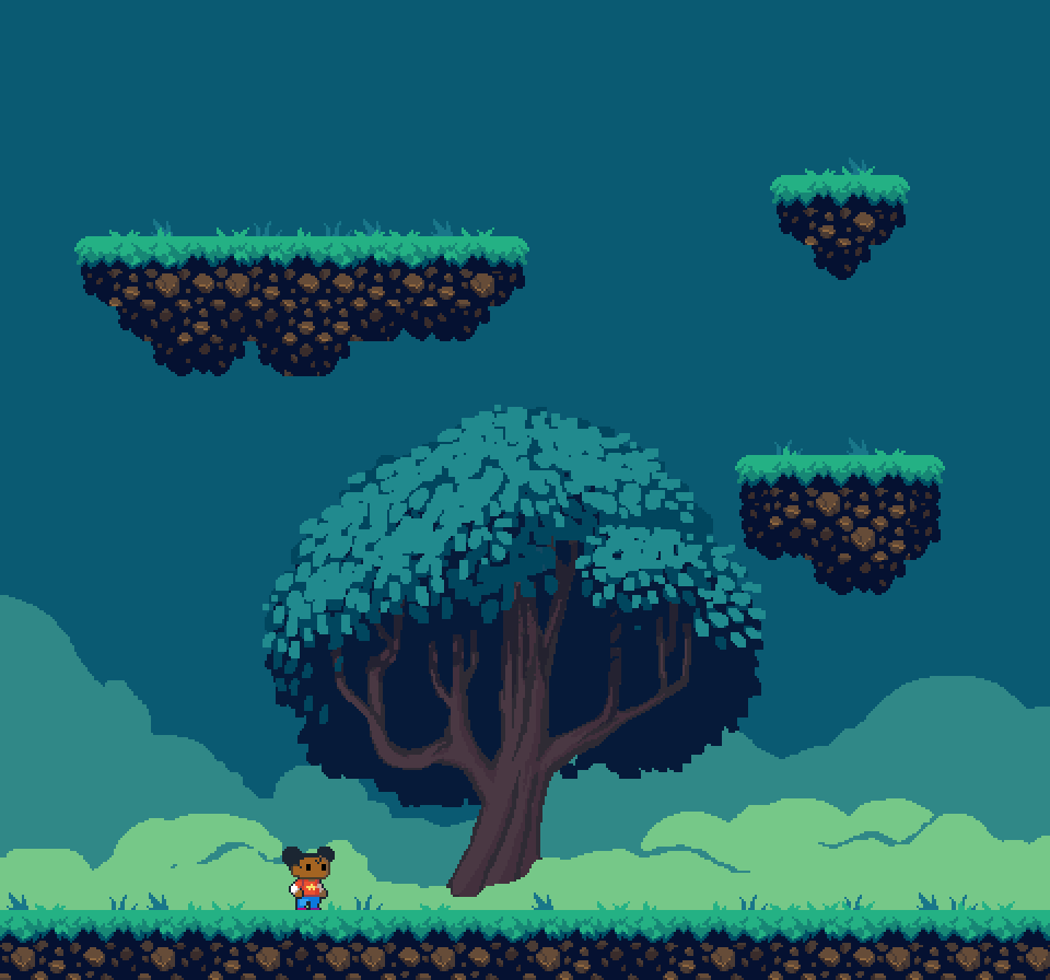
I'm using Pyxel Edit (https://pyxeledit.com/) to make my art assets, and their tiling tools have really come in handy. Once I was happy with how the style was looking, I moved on to creating some basic character animation cycles - an idle, a run, a jump, and a fall:
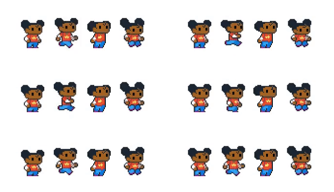

Next, I created a new project based off the Paper2D template in Unreal, and started hooking up the animations:

For the most part, hooking up the animations was surprisingly easy. It helped that the Paper2D template project already had a character in there and it was mostly a process of changing out the flipbook animations and resizing the collision capsule. The trickiest part I needed to figure out was how to appropriately hook up the jumping and falling animations. I wanted to make it so when the character started jumping, it played the jump animation, but at the apex of the jump when the character began to fall downwards, it played the fall animation. This was not a default setup, and as far as I know there is no built-in state machine for 2D sprites in Unreal (there is a state machine you can use for 3D assets), so I needed to create my own sort of state machine:
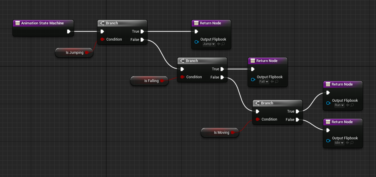

In the character Blueprint I made a new function for the animation state machine to determine what state the character was in and, therefore, which flipbook to play. Basically, it does a series of checks on the character from the most specific case to the most broad. The event graph shows how these states are defined:
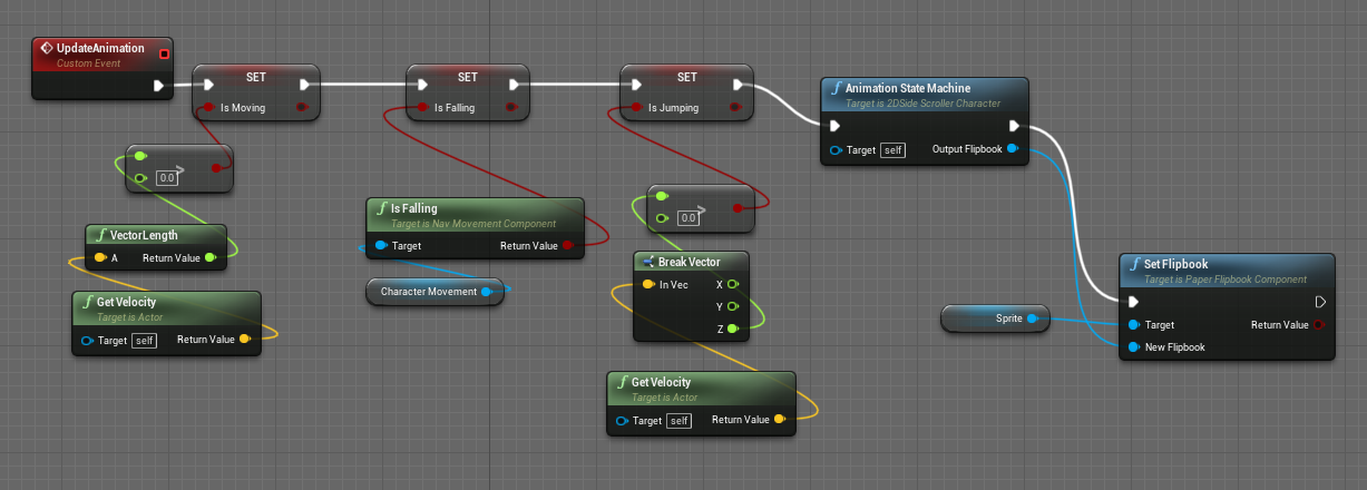
"Moving" is defined by the character having any sort of vector motion applied to them at all (hence, the most broad of the states). "Falling" is when the character is in the air, but not flying or suspended in any sort of liquid body (this definition is built in to Unreal and provided by the "IsFalling" function). Finally, "jumping" is when the character is in the "falling" state, but they also have a positive upward velocity (hence, the most specific state). If the criteria for a state applies to a character, the state is set to "true" in the event graph, then passed through the animation state machine. The state machine assesses which states are checked, and the most specific state is passed to the "Set Flipbook" function to activate the correct animation on the character.

I've made more progress than what's shown above, but I think I'll break this up into several posts as this one is getting pretty long.

Submitted

nice cute graphic style - I like it :)

Submitted

Thank you!!

Submitted

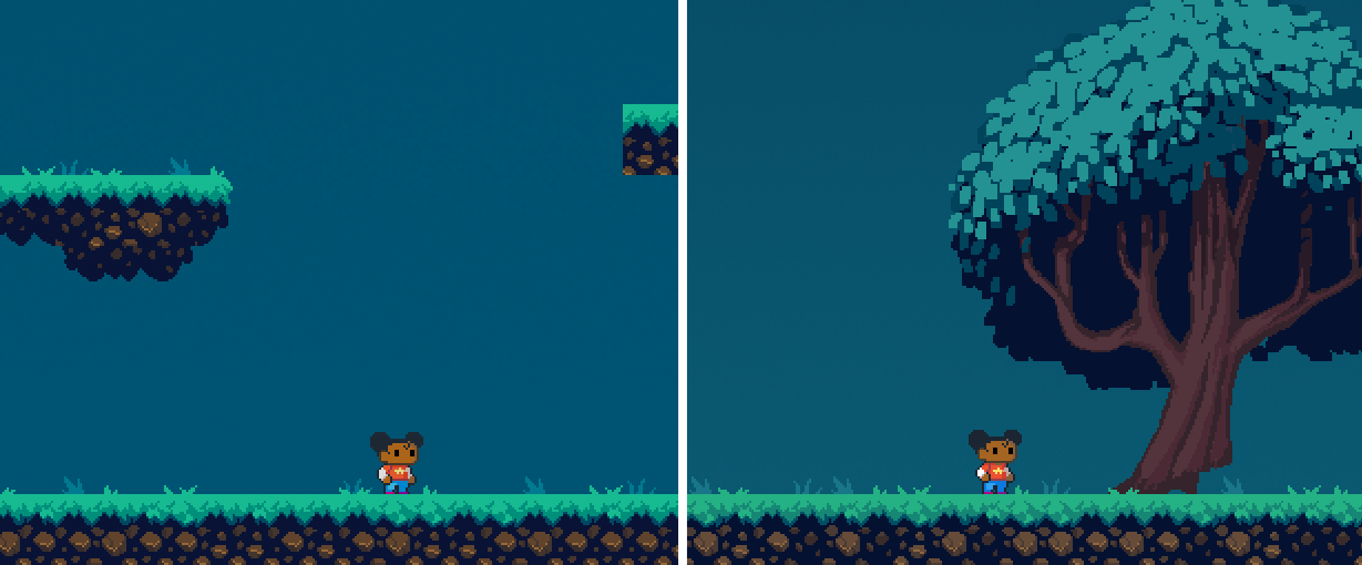
For this next update I wanted to mention an issue I was having in Unreal. I had started with the Paper2D project template, but when it came to implementing the tile map I created I thought it might be easier to start with a blank slate, so I created a new level and started pulling my assets in. After playtesting a few times, I noticed something off about the colors:

The left side of the image shows what the art assets looked like when running the game and playing in a new editor window. The right shows the source art assets in Pyxel Edit. Something was happening behind the scenes to blow out the colors. Also, though you can't see it in the above image, it looked like there was a slight vignette effect being applied. The assets were supposedly using an unlit material, so they should look exactly the way they do in Pyxel Edit.

It took me a loooong time, filled with googling and asking the Seattle Indies community for help, but I was finally able to figure out what was going on. Turns out that Unreal, by default, tends to apply some color correction and effects to your game. In order to have no effects applied to the visual output, I essentially had to apply a post-process handler that negated the effects of the post-processing being applied by Unreal.

And, in my opinion, here's the most bonkers part:


You can see, above, that when the vignette effect is supposedly turned "off", there is still a vignette being applied. In order to entirely get rid of the vignette, I have to turn it "on" in the post-processer, and set the value to 0.

WHAT.

Anyway, that was frustrating, and still seems strange to me, but I'm glad it got figured out and now the colors are looking relatively close to the way they were intended (below, left shows playing in-editor, right shows assets in Pyxel Edit):


After getting nitpicky with the post-processing, I continued filling out the tilemap and eventually got something that resembled a playable level:

I then continued to work on fleshing out the environment, including adding some moving platforms to slightly increase the challenge of traversing the level. I also added more purpose into the game: stars! The original Starfall was about how the stars had fallen, and it was up to you to go around collecting them and returning them back to the sky. So I made some star sprites that would bob and glow gently to get your attention and created a HUD widget that would show the amount of stars you'd collected vs. total number of stars in the level:

More updates coming soon!

That vignette issue sounds like a nightmare to troubleshoot! Who would guess that "off" and an intensity of 0 are different things? Way to figure it out, though! The art and the animations look so smooth and expressive :D

Submitted(+1)

Right?? It seems crazy to me that this is the way Unreal works, but it is what it is. And thank you! Glad you like the art!!

Submitted(+1)

Now that I had implemented the building blocks for a basic level, the next biggest thing that was bugging me was the camera. It was fixed on the character at all times, which meant if she went to any of the borders of the level you could see off the edge of the world. Definitely not ideal. In terms of the logic and pseudo code, I knew what I wanted to happen and how I thought it should be set up, but the challenge came in figuring out what terms Blueprint wanted me to use. After a bunch of googling, I finally found the answer: "clamped" values. By feeding the position of the character to the camera, but clamping the values if they went beyond the borders of the map, I was able to make the camera behave how I wanted it to:

There are other, more fancy things I would like to do with it, but for basic functionality that will do for now.

I pivoted to work on the star collection mechanic. I decided that the way the player would go from level to level was to pass through a star gate star door. There would be a number of stars in the world, but you wouldn't need to collect all of them in order to go to the next level, just a minimum of 5. I decided the progress bar might not be the best way to represent this concept in the HUD, so I changed the visuals to better match with the mechanics. I also added in some mist to help add to the mood and provide more interesting depth cues:


More to come!

Submitted

Some more updates over the past few days! Here's where I'm at now:

  • I added some more exaggeration to the star animations on the HUD. I don't want them to be too distracting, but they are kinda small and I think they needed to be a little more noticeable than they were before.
  • I've added animation to the little door icon in the HUD. It now flips over to reveal an "open door" icon when you've collected the 5 stars necessary to open the door.
  • There's now an in-game button prompt for when you're nearby objects in the game that the player can interact with
  • I started adding sound effects. Currently sounds are hooked up to jumping, running, landing, and collecting stars.
  • I added a pause screen. Currently you can pause, resume, and quit the game. There is no main menu yet, so "Quit to Main Menu" currently does nothing.

For the most part, adding sound effects was pretty straightforward and didn't give me too much trouble. The only issue I had was in implementing the footsteps, so I wanted to go over the problem I encountered and the solution I ended up finding. It is probably not the best solution (in terms of cleanliness and efficiency), but at the end of the day it gave me the results I wanted. I thought documenting it might help someone who had a similar issue - or, at the very least, it'd be nice to come back to this for my own reference.

So... logically, I knew what I needed to do. I made a few footstep sounds, and I wanted to hook them up in such a way that...

  • you only hear the footsteps when the character is running
  • the footstep sound only played during the part in the animation where one of her feet hit the ground
  • the footstep sounds were randomized - I had made three sound effects, and I wanted the game to play one of them at random each time the sound was needed

I did a bit of googling and found out you can make what's called a "cue" in Blueprints, which would allow me to randomize the sounds:

So every time I played the cue, one of the three footstep sounds was chosen at random. Sweet! Then it came time to hook it up to the player character, and this is where I ran into trouble:


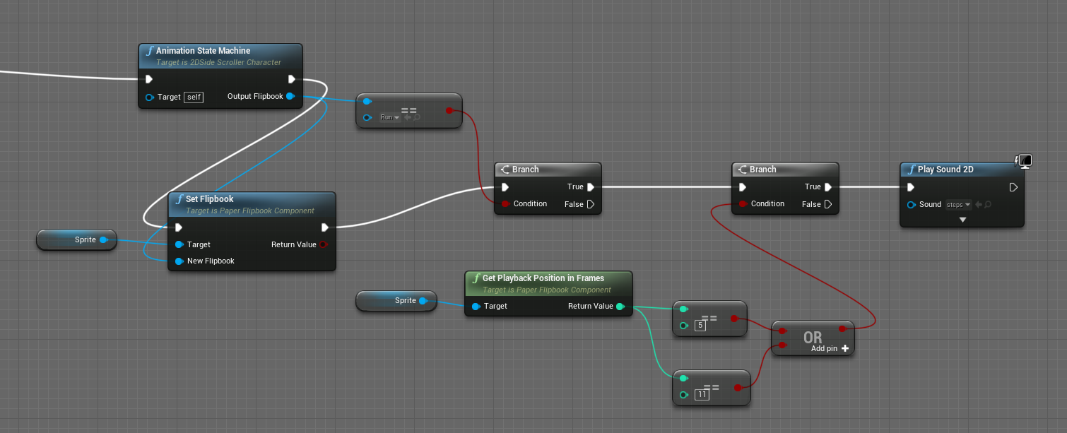
As I'd mentioned in an earlier post, I made an animation state machine that would check what state the player was in and then play the correct flipbook corresponding with that state. So to hook up the footsteps, I pulled from the output of the Animation State Machine to check and see which flipbook was currently active. Next, I used a branch to check if the running flipbook was the current one. If it is, I check to see which frame the animation is currently on. The characters feet touch ground at frame 5 and frame 11, so I used another branch to check and see if one of those frames is the current frame. If it is, I want to play the footstep sound cue.

But after all this was hooked up, I didn't get the result I wanted:

The footsteps sounded totally fine in the editor when playing the sound cue, but in game there was this strange distortion that sounded like a loud buzz playing overtop the sound effect. I tried a few things that helped me rule out some obvious issues, then finally, by hooking up the jump sound effect to the run animation, I was able to get a clearer idea of what was going wrong: the sound effect was being triggered multiple times in rapid succession, which was causing a sort of reverb effect. But why?

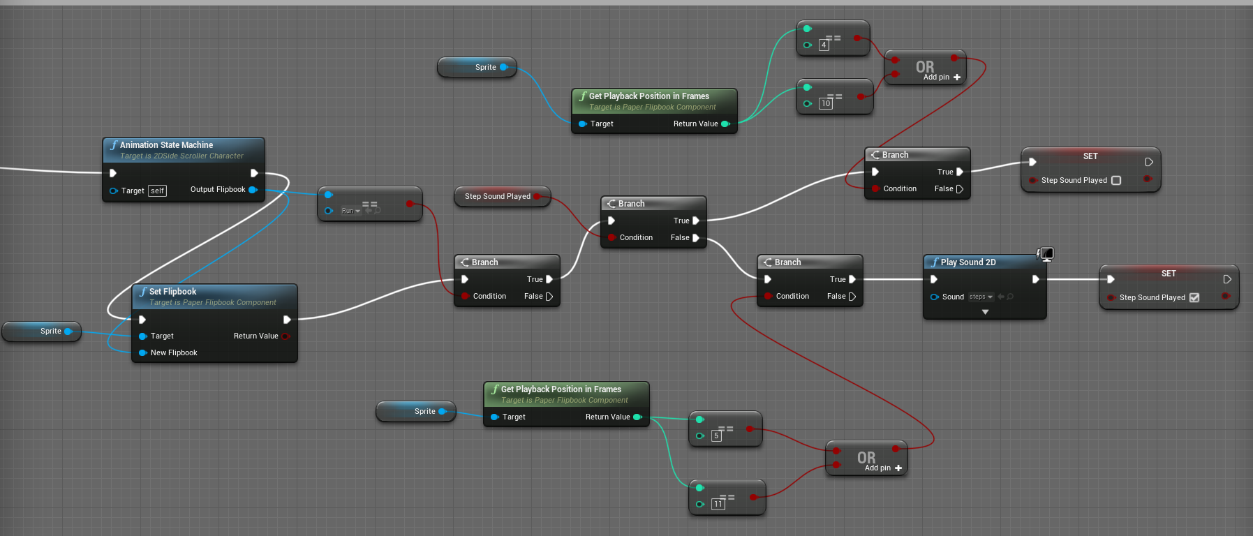
I had forgotten something essential about the way the game engine works. The time unit for the game engine is ticks, whereas animations are broken into frames. Frames are not the same as ticks, and ticks occur much more frequently than frames. In order to check what state the character was in, I was checking it each tick. Then, if it was discovered that the run animation was active, and that the current frame was a foot contact frame, the sound was triggered. But the problem was that this loop was happening every tick, and because multiple ticks occur in the time space of a frame, the sound was being triggered multiple times in a row. This meant I needed to set up my node graph a bit differently:


So, again, there's probably a more elegant solution to this, but here's what I came up with. I created a boolean variable called "StepSoundPlayed," which I'm basically using as an on/off switch. I'm still running through the same series of checks - if the run animation cycle is currently playing, and what frame we're on if it is - but whenever it's time to play the footstep sound I'm now setting "StepSoundPlayed" to true. And at the beginning of the loop I'm checking "StepSoundPlayed." If it's true, it means the sound just played and I don't want to play it again, in which case I'm waiting until the frame before the next footstep (frame 4 or 10) and then resetting it (switching it to "false").

With the boolean switch in place, it worked great!

That's it for this update. More to come soon.

Submitted

Alright, this update is a big one for me. Up until now, the aspects and mechanics I've been hooking up are pretty standard to platforming games - character animation cycles, pickups, sound effects, pause menu, etc. - but this update marks the first time I've been working on implementing a non-standard mechanic that's specific to this game. At this point it's not super pretty, and not entirely completed, but it's functional enough to be used in-game:

So, here's what's happening in the video above:

  • Design-wise, the idea is that a few of the stars the main character picks up will give her special abilities. In this video, you're seeing the character use a star that gives her the ability to create a platform.
  • When the player presses the "X" button on their gamepad, the world freezes. An overlay appears on the screen, with a highlighted radius that centers on the character.
  • Ideally, when this is completely implemented, I want the player to be able to place the platform anywhere within that radius (as long as it's not overlapping other objects in the world) while they're holding the "X" button, but until I figure out how to get that working I'm simply spawning the platform beneath the character.
  • The character changes to a "throwing" pose (again, the idea is that she's throwing a star out, and the star is creating the platform). The character's throwing pose changes depending on if the character is currently on the ground, jumping, or falling.
  • When the player releases the "X" button on their gamepad, the overlay disappears, the world is unfrozen, and there is now a platform in the world that the character can stand on. The platform is flashing between those colors because I was testing to see if I could create and use a flipbook animation on the platform, so I made an animation with obvious transitions between frames so I could easily tell if it was working or not. It works! So now I need to make one that isn't ugly.
  • The player is only allowed to create one platform at a time (after all, it's a specific star you're throwing out that is creating the platform). So if the player presses the "X" button again, the platform is removed from the world (and ideally I want to show the star returning to the player to visually represent what is happening). Now that "the star has returned to the character", the player is able to use the platform ability again.

Again, I know it's nothing super amazing, but for me it's definitely a small breakthrough. This is my first time where I needed to use the knowledge I've acquired of Blueprint scripting to think outside the box and create something in which there weren't already tutorials specifically relating to this mechanic existing on the internet. As janky as it is, I'm happy with it.

Now to try and make it better!

Submitted

I'd been hacking away at it for a couple days but still haven't figured out how to let the player interactively place the platform. I feel like the way it should work is that...

  • When the player activates the platform ability (by pressing and holding the "X" button) a platform pawn is spawned
  • I want the player controller to then possess that platform pawn
  • The camera should stay in the same location, facing the same direction, fixed on the character location and not follow the platform
  • The player can move the platform up, down, left, and right within the highlighted radius. The platform is not affected by gravity
  • The platform can only be positioned in a place where it does not overlap other objects in the level. If it's hitbox is intersecting with other hitboxes, the platform will not be placed
  • When the player releases the "X" button, if the platform has been placed in a valid location, a platform is created there.

I feel like I understand this flow, but whenever I go to implement the above I seem to run into various errors. I'll have to do more digging for research and reference, but for now I need to switch tasks so I can make progress.

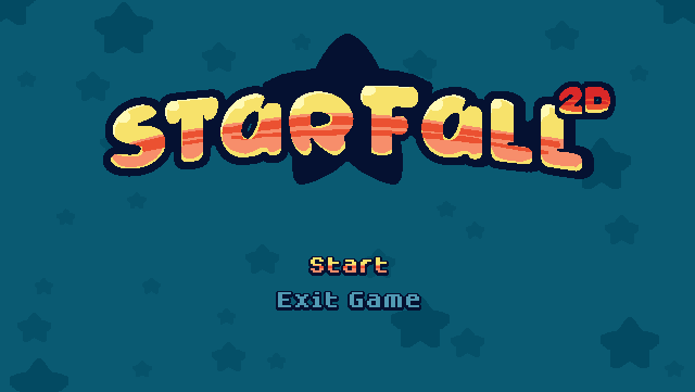
I decided to switch to something a bit easier, and last night I created and implemented a start menu:


I also went back and hooked up the functionality for the "quit to main menu" button on the pause menu, so now when pressed it sends you back to the start menu.

Gonna see if there's some other easier tasks I can knock out before returning to the platform placement issue.

Submitted

I've been so busy trying to get stuff done on the game that I haven't had time to write about it! There's just a couple days remaining so I'm trying to tie up the loose ends and get the most vital stuff in. Recently I've...

  • Added new music for the start menu and the level
  • Added in an options menu where you can set the volume levels for music and sound effects
  • Reworked the level design to make it so you have to get and use the platform star in order to pass the level
  • Added the first half of a "how to play" screen

I wanted a more elegant solution to teach the player how to play, but given the time I have left I'm going to have to settle on a "how to play" screen that gives players basic instructions.

Here's how some of the above things are looking:

The only things left on my "must do by Friday" list are...

  • Finish implementing the "how to play" screen
  • Add a "game over/thanks for playing" message at the end, when you leave through the door

Oh, and I need to figure out how to export the project from Unreal so people can actually install/play it on their machines!

Submitted (1 edit)

Submission and Post Mortem

Well, I just submitted my game! Again, I apologize for not writing much over the past week or so. This last leg I was really focused on getting the last few essential things in before the deadline and didn't have time to write about what I was doing. I wanted to write up a little post mortem, though (also because it's apparently a required part of the submission process).


What Went Well

My main goal for this project was to use this process of making a 2D platformer as a means to getting some experience working in Unreal, and by that regard it was an overwhelming success. I’m obviously still no pro, but I’m way more familiar with Unreal than I was before and, more importantly, I’m not intimidated anymore and now feel empowered to try experimenting with my own game ideas.

I’m also happy with the amount of the game I was able to put together. It is not a “full” game as we’ve come to expect of commercial releases, but I wasn’t expecting to achieve that within the one month time limit of the jam. I feel like it’s a pretty decent vertical slice, and I could show this to someone and they would get the gist of what the game might be like. Beyond adding more than one level there is other content I would have loved to get in, but the product as it stands now is playable and has a start, middle, and end, and I feel pretty good about that.

I also got to try another program (Pyxel Edit) and get some more practice doing pixel art, which was another area I was not very experienced in before this project.


What Could Have Gone Better

I would have loved to have implemented some dialogue and cut scenes, but after spending a few days researching it I wasn’t finding the answers I needed and needed to move on to other things. That being the case, the “how to play” screen was an addition I made because I felt I needed to put it in, but ideally I wish I had a more elegant way to teach the player in-game what to do.

Obviously the project could have more content, as I mentioned before, but as I also mentioned before I don’t feel like that was the point of this game jam, and I’m happy with the progress I made.

One thing I do wish I’d gotten in was setting up keyboard support. I don’t think this would have taken that long, but I was too excited about other aspects of the game and never looped back around to this. Sorry, people that don’t have a PC gamepad!


I think that’s about it! I had a lot of fun with this project. I would love to come back and work on it more, but for now I need to step back and take a break from it for a while. Here’s to my first Devtober in the books!