Play game
Lost in the Sea's itch.io pageResults
| Criteria | Rank | Score* | Raw Score |
| Theme | #2 | 4.250 | 4.250 |
| Innovation | #2 | 3.625 | 3.625 |
| Audio | #7 | 3.375 | 3.375 |
| Graphics | #8 | 3.375 | 3.375 |
| Overall | #9 | 3.125 | 3.125 |
| Mood | #10 | 3.125 | 3.125 |
| Humor | #12 | 1.875 | 1.875 |
| Fun | #12 | 2.500 | 2.500 |
Ranked from 8 ratings. Score is adjusted from raw score by the median number of ratings per game in the jam.
Leave a comment
Log in with itch.io to leave a comment.


Comments
I like the theme at all, I was even thinking about doing a game like that before, it just motivated me again!
But there are things I didn't like about it:
The font used for text-reading is really really messy so it makes it hard to read and that discouraged me from reading what is on-screen(The font is nice, but for reading common text is a lot).
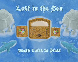
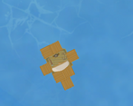
The graphics are awesome, but I think that controlling the raft a bit frustrating as the time to change its direction takes a lot of your health, with that said, I think that the game item's appear is either too random or they move too fast, as It was very very hard to survive
Thanks a lot for playing and sharing the feedback!
I agree about the font. Not the best for dialogues, but unfortunately, didn't have time to search for a better one.
Yeah, I did the controls tough on purpose to fit the theme. I've now uploaded a post jam version of the game where the difficulty is more balanced. The controls are still frustrating, but it takes more time to die there.
P.S.: Picking up the mast lets you accelerate faster, so it helps a lot with maneuvering. You will find it if you go to the South-West corner from the spawn point.
Btw I would really like to know how you did the level design for your game :D
Thanks a lot!
Great graphics and a neat idea. I found the raft hard to navigate (or the parts and food where moving in a swooshing pattern).
Thanks for the feedback! Well, that's how it is navigating the raft in the sea, I tried to reflect it the best I could. And the swooshing pattern was supposed to represent waves. =D