Play game
Moving makes you smaller's itch.io pageTheme inspiration
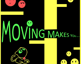
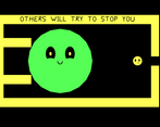
A game where you have to make yourself smaller so you can PASS through narrow gaps.
Sensory info
N/A
Content info
N/A
Extra Credit Challenges
Extra CGA
Extra Zoey
Leave a comment
Log in with itch.io to leave a comment.


Comments
Wow! this is an incredibly good idea and excecution of that idea. I'm impressed! The game mechanics are fun, the levels are challenging, but not too hard. The messages have been cleverly thought of, it's looks a bit simple, but that is a design style as well, it doesn't stop anyone from having fun. this is a great game!
I really enjoyed this mechanic! I was only confused briefly before I picked up on it, so you did a great job of making it intuitive. The theme is really cute as well, keep up the great work!
Awww this is a real charming game with a really good message!
Also clever mechanics! It really makes you think whether or not it's safe to just bum rush your way to the finish line. Kudos for that!
The first time you pop you begin to understand how this game works, then it slowly begin to be a action-puzzle game with a very entertaining mechanic. Really nice work!
The game itself is nice, and the level design has no obvious problem. The messages for each one don't connect very well to the actual mechanical challenge though.
Hello, thanks for the reply!
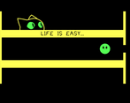
I think the later levels have a better message attached to them.
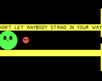
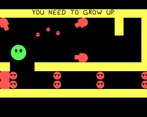
What do you think about these two?
In this one you need to make one cannon shoot the enemy blocking your way
In this one you need to be big enough when you enter the tunnel bellow, otherwise you won't make it
The top one makes sense, though I think the yellow enemy seeming more angry or mean would make the context more solid (so it doesn't seem like redirecting enemies to a neutral party). The bottom one is less solid, because when I was actually playing it, the part I ended up focusing on was going through the bottom at the best pacing to keep up the size.
In case it wasn't clear, I think the levels being fun is more important than how well the messages work with them. On that end both of those levels are good.
Interesting, I thought I made it so you couldn't get thru the bottom without getting smaller.