


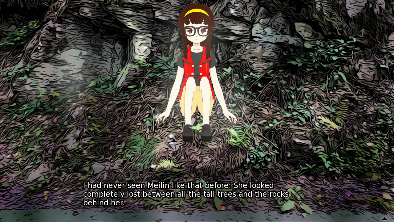
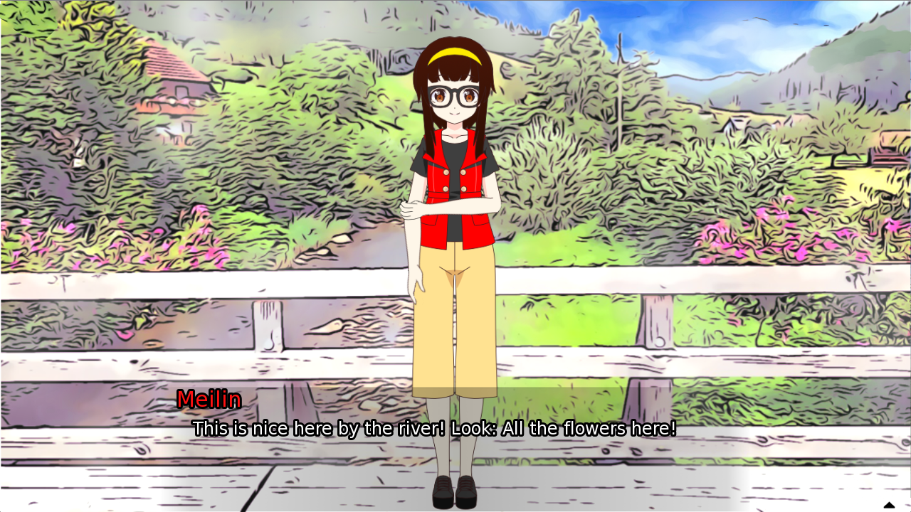

Play game
THE LAST SECRET's itch.io pageResults
| Criteria | Rank | Score* | Raw Score |
| Sound/Music | #1 | 4.444 | 4.444 |
| Overall Fun | #2 | 4.333 | 4.333 |
| UI | #3 | 4.222 | 4.222 |
| Art | #14 | 4.111 | 4.111 |
Ranked from 9 ratings. Score is adjusted from raw score by the median number of ratings per game in the jam.
Leave a comment
Log in with itch.io to leave a comment.
Comments
Just made my let’s play on your game as a regular player (so it’s without voice comments). I hope it will be useful for you to see how fresh players may started your game for the first time :) I’ll provide text comments later, probably after finishing the videos for other projects :)
As I've said already over on Discord: thanks a lot for the positive feedback and the let's play video. I'm glad that everything worked well with the game. – No surprising bugs or something! 😅
P.S.: The end of your video is seconds before a surprise turn of events... ;)
Pros:
Overall the story is laid out with good intrigue, the pacing starts out slow but builds up really nicely presenting the mystery. It's a game with a lot of information to give you, rather educational for me so far. The cinematics presentation of the game is very strong, characters are likeable and relatable with their quirkiness, it's a game with a lot of thoughts put behind the story.
Cons:
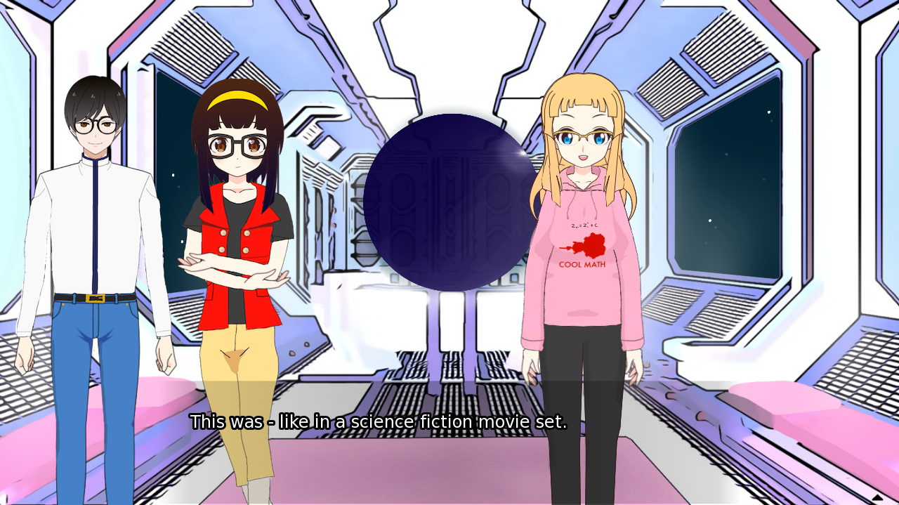
My feedback is I wish the art can use more improvements, especially if this game is related to Visual novel genre where at most the gameplay is clicking choices, it's pretty important to have good visuals, if nothing else, I say improve on the backgrounds will help a lot, and a bit of tweaking in character anatomy on the lower half of the sprites and some of the CGs, bgs looks clearly like photos being rendered by filters, currently the dark edges of the background fights with the characters' lineart its rather distracting, line art in background arts need to be thinner than the characters themselves in order to fall back visually and not draw as much attention, it is consistent, but not pleasant to look at unfortunately. Since you did pick the anime style, it is important to keep to the look of the genre and not move away from it too much.
The text also does need a UI help too, the current version I played have no text box frame, the text fights with the background visually so it's straining to read.
For BG render update, maybe this plugin will help if you don't have a budget for the bg: https://fotosketcher.com/
Another quick way to fix the bg is turn all of the black lines in the BG arts brown for modern/historical places, blue color to replace sci-fi spaceship places, that would stop competing with the characters and you can run it with a simple brown/blue filter and it will still work quite well.
Hope this helps.
Thank you very much for your detailed feedback and your recommendations! That was super helpful!
I'm currently working on the graphics - actually pretty much on exactly the points that you have mentioned:
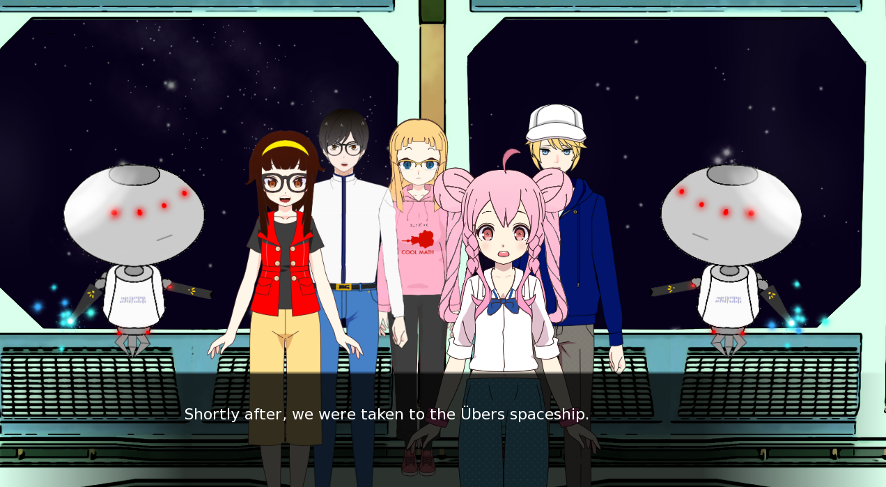
- I have already improved some of the backgrounds substantially for the full release. The software I use, however, often adds quite strong lines. Changing their color might be a way out indeed. The software you have suggested looks very nice, too, although it only runs on Windows (and I have a Mac). Let's see what I can do there. (The problem is that the number of backgrounds is very high: around 300 pictures! - Hand-drawing each of them was therefore out of question.) - If there is any particular pic that you find an eyesore, please send me an email (thelassecret @ gmx.ch), then I'll take care of that first. :)
- The text has now a frame again, but a very faint one. That was the compromise after some experimentation. But maybe I'll make it adjustable for the final release. It's always a matter of taste: some people like it more transparent (one can see the background better), some more colored (one can read the text better).
- A friend is helping me with those sprites where the body geometry needs improvements, so that will definitely be settled soon.
I'm also happy that you like the story. I hope you enjoy how it continues - there are quite a few surprise twists ahead... ;)
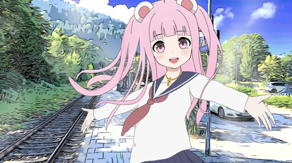
Below some example of the improvements I'm working on:
I can see you are making good effort for the next update, glad my feedback can help.
One suggestion for anatomy if you are just starting out to deal with it, it is to use reference, pose for the exact pose for a photo and use it with modifications to the anime face, it will come out more natural looking.
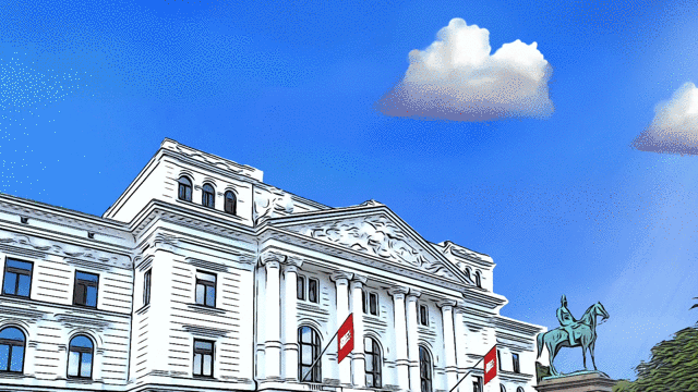
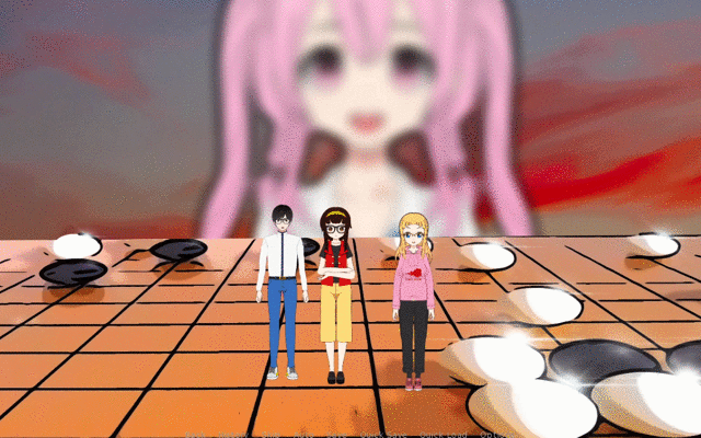
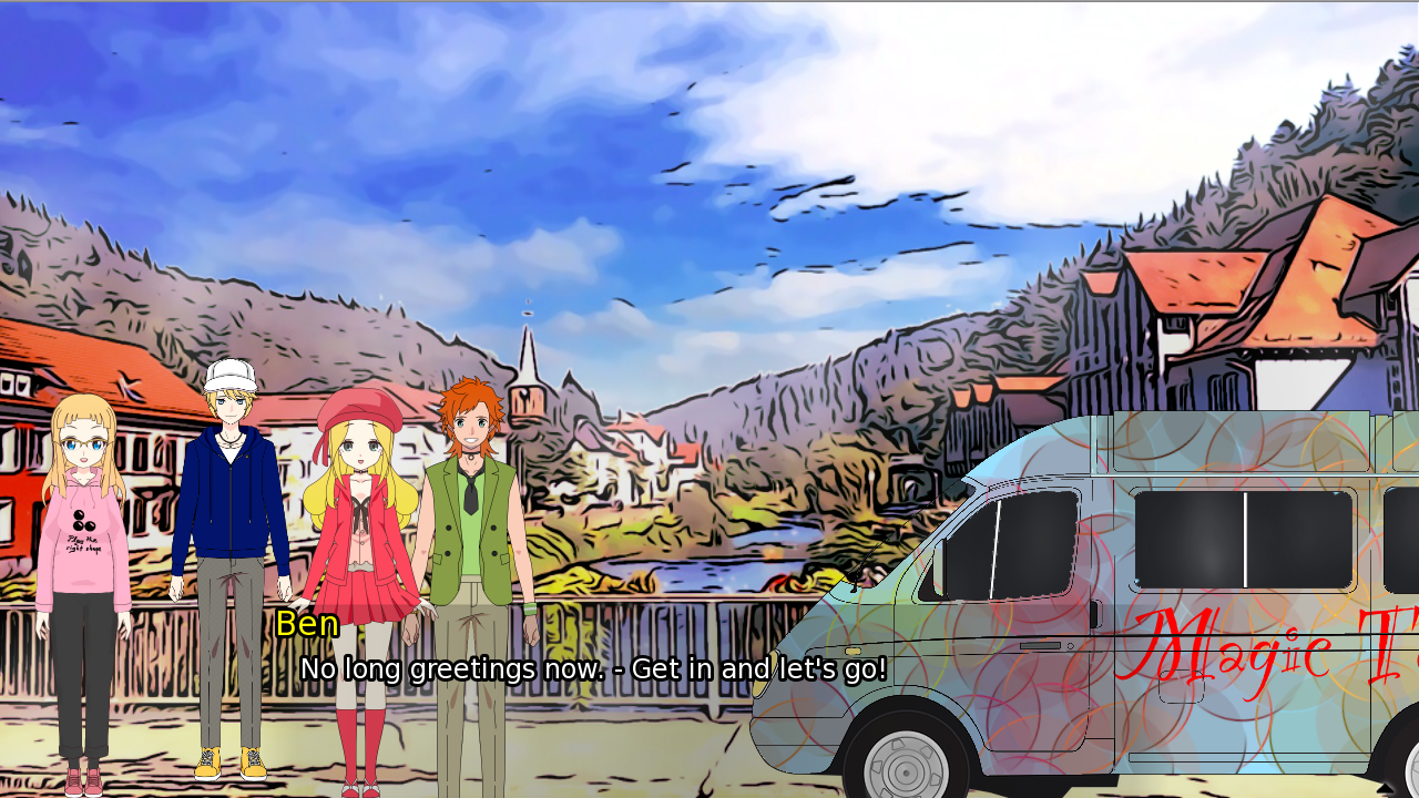
300 backgrounds are indeed a looot of work to modify, I say start with the batch the story would use the most, with the most repetition, the go rooms were fine but bus stop area, the white building, look for bgs with strong contrast and tone it down as priority. Your least distracting ones are the 3D generated bgs of the spaceship, those are fine you don't need to touch up.
Thanks a lot! The go room pics were also 3D generated... so that seems to be the best method (when possible). I'm going to work on the bus stop. You mean this picture, right? (I had an older version and not sure what's in your version of the game, that's why I'm asking.)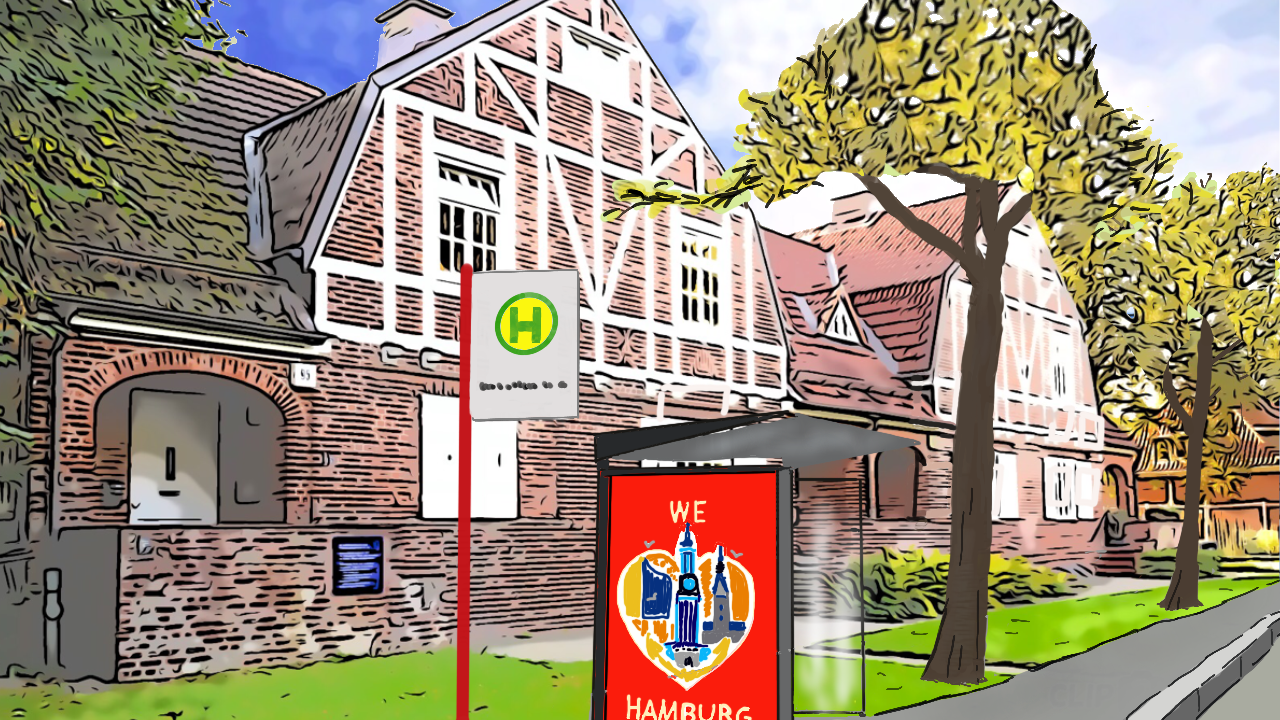
I have improved the graphics a bit. Here's the result. :)
thumbs up
Die Charaktere sind sympathisch und toll gestaltet.
Mir gefällt die Handlung... Lustig und mit guten Aufgaben
Danke! :) Wie weit bist Du schon gekommen?
Epic quest with puzzles!