Thank you very much for your detailed feedback and your recommendations! That was super helpful!
I'm currently working on the graphics - actually pretty much on exactly the points that you have mentioned:
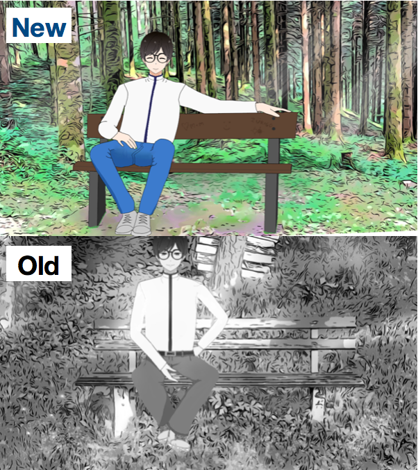
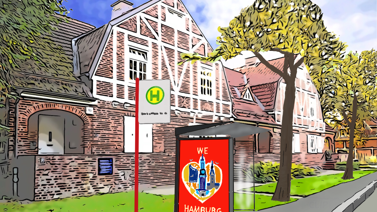
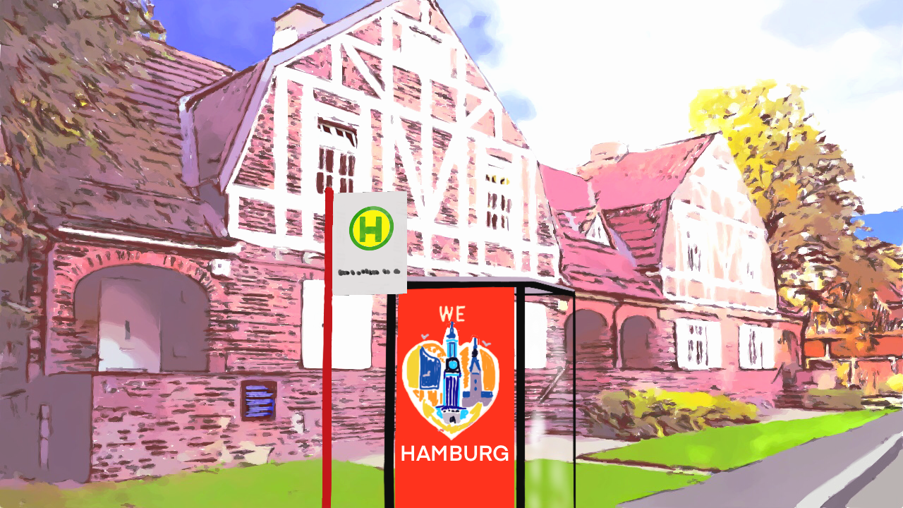
- I have already improved some of the backgrounds substantially for the full release. The software I use, however, often adds quite strong lines. Changing their color might be a way out indeed. The software you have suggested looks very nice, too, although it only runs on Windows (and I have a Mac). Let's see what I can do there. (The problem is that the number of backgrounds is very high: around 300 pictures! - Hand-drawing each of them was therefore out of question.) - If there is any particular pic that you find an eyesore, please send me an email (thelassecret @ gmx.ch), then I'll take care of that first. :)
- The text has now a frame again, but a very faint one. That was the compromise after some experimentation. But maybe I'll make it adjustable for the final release. It's always a matter of taste: some people like it more transparent (one can see the background better), some more colored (one can read the text better).
- A friend is helping me with those sprites where the body geometry needs improvements, so that will definitely be settled soon.
I'm also happy that you like the story. I hope you enjoy how it continues - there are quite a few surprise twists ahead... ;)
Below some example of the improvements I'm working on: