Play game
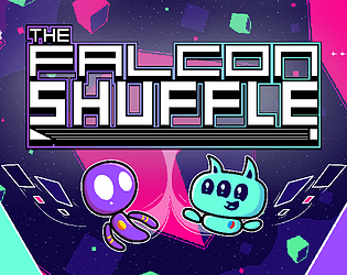
THE FALCON SHUFFLE (Early Access Build)'s itch.io pageResults
| Criteria | Rank | Score* | Raw Score |
| Sound/Music | #25 | 3.888 | 4.600 |
| Overall Fun | #32 | 3.719 | 4.400 |
| Art / Graphics | #34 | 3.719 | 4.400 |
| Controls / UI | #38 | 3.550 | 4.200 |
Ranked from 5 ratings. Score is adjusted from raw score by the median number of ratings per game in the jam.
Leave a comment
Log in with itch.io to leave a comment.


Comments
I am going through all submissions to make all developers aware of an important Google form I've made
I'm joining the IQ folks to help organize smaller events in between the main FQ event in order to help prevent us from getting too many games in main events. Right now, I have a planned structure for these events but I would like to hear from everyone who was in this event in order to tune things better. The survey is a bit long, but it covers as much as I could think of. If you can take the time to do the survey by June 1st, I would immensely appreciate it!
You can find the form here: https://forms.gle/9NE2rAxGMPssPwrK9
Hello from tonight's stream!
This game was an absolute blast for the sort of challenge it created. I also loved the characters. For so few lines of dialogue, they have so much personality to them! I can't wait to play more of this!
There were three things I noticed while playing that I felt could see improvements. I'll order this from what I think is least important to most important.
1. When you finish a run, the screens where you put your points into gems and then add the gems to your total is rather long and cannot be skipped or sped up in any way. Since these screens are intended as an important part of the game, they're going to be seen a lot. Making it that hitting a button (likely space or enter, but not all) allows you to skip to the end total for each to speed this up.
2. At the start of the first wave on a new planet, the characters are kept stuck in their starting positions for several seconds. During that time, the wave begins and enemies are present on the screen almost immediately. The inability to move when enemies are present is disconcerting. This doesn't happen at the start of all other waves, though. Making it that the wave timers don't start until the player can move would fix this.
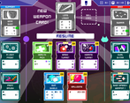
3. There are so many fun weapons in this game, and while you do get main and secondary weapons to give you more spots, the weapons system isn't set up to try and plan ahead a bit (assuming your luck holds). Allowing players some additional slots to hold one or two weapons cards in reserve (with the ability to upgrade and hold separately) that they can try to upgrade before switching it in to replace another weapon would solve this. This could also be done with upgrades, though I think it's not as big of a deal for upgrades since you get double the number of slots.
Hey thanks so much for playing and for the kind words! :D
Really happy you liked it and thanks for the feedback!
1. Yes I'm planning to add a way to skip through the lil animations where it draws your route and totals up the gems and stuff, it's on my endless to-do list haha
2. Yep I know what you mean, there's a few seconds at the start you can't shoot yet but enemies start appearing - I've thought about tweaking this a few times, something I'll look into at some point for sure
3. I've thought about adding some sort of reserve slot(s) for cards like you've said, I'm slightly worried about overcomplicating the user experience in the pause/card screen, but it's something I might well look into playing around with!
Thanks again ! :D
Personally, I think it wouldn't complicate things at all. Things were so straight forward when I played. :D
That's good to know thanks! :) The original card screen was pretty much the same as it is now but looked less polished and I think felt a bit much to look at sometimes, so been a tad wary of adding too many more options to it, but I might add a drop down with a few reserve slots or something, something I'll play around with for sure!
Playing this as a single-player was pretty hard! I got past the first boss, and died to the second. In the waves of the second stage, I was pretty much just trying to avoid getting hit by the bullets more than trying to kill anything.
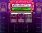
I liked being able to upgrade the ships. I had some cards that could only go in my hand, but I had no idea what to do with them. They seemed pretty useful, like being able to heal my ships, but I didn't know how to use them :(
The font for the text was kind of hard to read, but the flavor text of the merchants was nice.
Thanks for checking it out! :) Yeah it's pretty hard for sure! I think by design it's always gonna be inherently pretty tough (controlling two things at once!) there are a bunch of difficulty options that can hopefully help ease players in and I'm always looking into tweaking the game's balance too off of feedback!
Oh to use the cards in your hand you press spacebar during the game BUT I totally understand missing that - at the moment I've just got that kinda long "How to Play" section at the beginning as a bit of a temporary measure that I think throws way too much at the player at once, I need to add some better tutorials and explanations as things go along! (I've been thinking about including the button to use hand cards in the UI on screen at the bottom at all times too to make that way more obvious)
And I'm thinking of adding an optional non-pixel font to the game if I can work out how to do that lol (it'd need to be at a higher resolution than the rest of the game so I'm going to try and figure that out at some point!)
Thanks again for giving it a go! :D
I only got till the second level, but its amazing.
- The mechanic is very unique and makes you keep changing focus between the two ships while sitll needing to constantly move, which makes the slow moving enemies sitll a big challenge to overcome.
- The first boss was really cool as an introduction to the concept and wasn't too hard nor too easy.
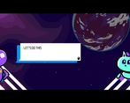
- Art and music were amazing, I really love the purple guy design and the shop seller, though the cat could see a little extra style and being a little less cute to feel more like a space pal and less of a mascot.
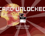
- The cards mechanic is good, but I would like if it didn't cover the whole screen when getting a new card.
Overall, really fun, I think you should change the page description a little cause it make the game soundtoo complex when in reality its some great arcadey fun.
Thanks so much for the kind words!! :D
Yes with getting new cards I totally get what you mean, it can be a bit jarring when one pops up in the middle of the action, I might not manage it but I'm thinking of ways I can potentially tweak getting the cards to appear (maybe store them til the end of the current wave or something)
And thanks about the art and music!! Haha the cat looking one is definitely a bit cutesy but honestly I do like them that way (possibly because I've been staring at them all for two years now lol), but I do get what you mean and I was thinking I might change some dialogue in places to maybe make him feel a bit more of a competent partner at times underneath the cutesiness! (like you say, more of a proper pal!)
And good shout on the page description for sure, it's tricky trying to find the right balance between mentioning what makes the game unique vs not making it sound too complicated. Like you say when you're in the game it's mainly an arcadey shmup (just with cards and two ships at once haha) I need to find a better balance with how I pitch the game!
Thanks again for taking the time to give it a shot, really glad you liked it and thanks for the useful feedback! :)
I tried out your game today and honestly... I'm surprised this isn't getting more love and attention. I had a blast and thought this was very well done! Here's my feedback...
FEEDBACK:
1. I think you should REALLY push co-op/playing with a friend. I don't know if you intend for this to be co-op, but my friend was over, and I was like... I'll take WASD, and you take Arrow Keys. We had a LOT of fun playing this together! Fighting over cards, talking during combat... have you considered adding co-op? Online, couch, etc.
2. I know controller support is coming and the keyboard is great. However, the ability to proceed through chat with space bar or another button on keyboard would be nice. You use WASD and arrow keys to control your ships, so when dialogue pops up, it would be nice to just keep my hand on the keyboard. Not a huge deal, though.
3. I'm not a fan of how cards auto-pop on-screen mid-combat when you acquire them. It would be nice if we chose when this happens—end of level. I press a button. I know we assign the cards once we get them... but it really took away from combat during certain moments. Maybe newly acquired cards sit in a pool, and then I assign them at another point in time?
THE GOOD:
1. Great opening tutorial. Ability to skip for repeat players would be nice (not sure if you can).
2. Love the music. Very fitting for the game. Just the right energy and it doesn't get repetitive.
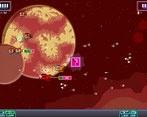
3. Combat is the best part. I love how we need to watch both sides of the screen, and controlling both ships made me think. It takes some getting used to, but it adds a nice challenge and level of difficulty. Really fun!
4. Love how you get to choose the next level after you beat one!
5. Playing with a friend, sharing the same keyboard, was a LOT of fun :-)
6. Obtaining cards and assigning them to your two ships adds some nice variety. Loved this.
Overall-loved this. Top marks! Keep up the great work!
Oh wow thank you so much for all the kind words and feedback! :D
FEEDBACK:
1. Yes I'm definitely planning on adding couch co-op! Online might be beyond my means lol but once I've got controller support sorted I'll be adding local for sure (glad you two had a good time with it!)
2. You know I've heard this before actually, I'll probably add in the option for both mouse+spacebar to work there!
3. Totally get what you mean and it's a tricky one, I like having new cards appear quite regularly but I get what you mean that it can stop things quite abruptly when one pops up, I'll have a think! (maybe they store up and you get them at the end of each wave or something, hmmmmmmmmmmmmmmmm)
THE GOOD:
1. Thanks! I'm worried it's maybe too much info in one go but glad you found it good! Oh and it should only automatically show up on your first run, then you can just revisit it from the menu later if you want to
2. Oh man super thanks for this one! I made all the music and don't super know what I'm doing so I'm never really sure if it's any good, I just like making music haha! :D
3-6: Thanks so much!! :D
No problem. Glad to help. I'll give you a follow too. Will your game be on Steam? I can wishlist to support further.
Really appreciate it! And it will be on steam eventually but I've not gotten that far yet, thanks though :)
A little hard to get the hang of managing two ships at once but really looks good and plays smoothly.
Thanks for checking it out! :D Yeah it's definitely a challenge and there's certainly the possibility for adding some more easing in for players early on (I sort of think of it as, it's easier than say a bullet-hell shooter, but the difficulty comes from controlling two things at once instead! I enjoy the chaos haha) I'm always adjusting the game's balance too! Long term you can unlock permanent upgrades to make things more forgiving too along the way
And really glad you liked the look and feel of it, thanks! :)