Play game
Starlight Destiny's itch.io pageResults
| Criteria | Rank | Score* | Raw Score |
| Sound/Music | #13 | 4.017 | 4.400 |
| Controls / UI | #16 | 3.834 | 4.200 |
| Overall Fun | #29 | 3.651 | 4.000 |
| Art / Graphics | #66 | 2.556 | 2.800 |
Ranked from 5 ratings. Score is adjusted from raw score by the median number of ratings per game in the jam.
Leave a comment
Log in with itch.io to leave a comment.




Comments
Hello! Welcome to Feedback Quest 6! My name's Hythrain, and I'm one of the hosts and streamers for this event! This feedback is being written live on my stream.
TENOUDDATEN NO COMMENTS.
I joke, but legit I had to stop when it just became super CCS despite enjoying myself. For using only RPG Maker elements, you've made an entertaining and funny game. The main things I wish is that status rates were worked on to reduce the difficulty of certain fights, and making all stats work. Right now, DEF and MDEF buffs and debuffs mean nothing at all.
Thanks for the critique! And yeah, fine-tuning the combat numbers is something that certainly needs work for this.
Hello. I gave this a small try. Pretty good game you have there. I am not a fan of the cyberpunk (is that the correct word? sorry bad english haha) tone in most games but you did pretty well here.
I do feel that sometimes some of the graphics were looking a bit clashing with each other.
Music is great. Story is interesting and has potential.
All in all a really nice game!
Thank you for your review!
I knew who made this game just by looking at the miniature.
I spend like two hours playing the adventure of magica-girl Flora, colour-swapped Angel and magica-boy Edwin. It remind me a lot of Pretty Pyro who was a fun jam game.
What I like about this game:
-The absurdist writing is still there
-There are even more fairies in this game!
-Aaron's music
What this game need (in decreasing order of importance):
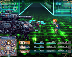
-A way better artistic coherence for the battlers. Most of the enemies don't seem at their place in this game, and look like they have been ripped from the internet.
-I feel the timer for enemy to respawn is way too short. I had multiple case where I entered a room with multiple ennemies and the first one I defeated came back shortly after i defeated the last one.
-Fixing the volley equipment that doesn't do anything, the offensive skills that can be used outside of battle and give all skills a proper description.
-It is very hard to impossible to select certain enemies with the mouse.
Thanks, great to have your review again! I'll work on the bugs and yeah the sprite coherency needs work, glad that you still enjoyed this!
Hi, fellow RPGMaker dev! It's nice to see another one of us out here!
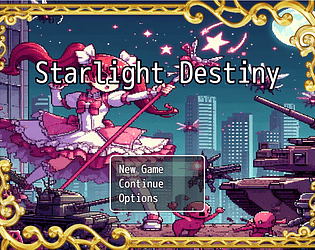
So, first bit of feedback: the splash art is fantastic, and the loading screen music is lovely. If I were making this game, I'd turn off "draw title" on the start screen and also remove the frame. You've got a really nice piece of splash art here, and it's a shame to cover it up with RPGMaker assets.
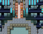
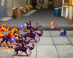
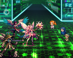
Second bit of feedback is also about the RPGMaker default assets-- I'm not one of those people who say "you should do everything possible to hide that your game is made in RPGMaker and if anyone can tell it's an RPGMaker game you're doing it wrong". But the different asset packs don't really cohere well. Your pixel art uses different sized pixels- like, look at the fourth gameplay screenshot. You've got big chunky pixels on the tank and the riot guys, tiny delicate pixels on the red eyed drone, and something in between on Flor and friends. The art here's real inconsistent. The characters, backgrounds, and enemies don't look like they're from different worlds; they look like they're from completely different games.
I get why you're using RPGmaker default assets-- no shame in that-- but you might want to either search itch.io for different asset packs or get some bespoke art made specifically for your game. Right now, there isn't a sense of cohesion between the different parts of your game, and that's a shame.
As for storytelling: I like the wry sense of humour you've got going on, like the message you get when you try to go back to school after the intro cutscene. Flor and Azuli are immediately likeable, fun characters-- especially Flor. Who hasn't been a bored kid in school just wanting to play? The staff is also pompous in a really fun and enjoyable way. You've got some texture to your world here-- the fact that commoners and rich folks have to pay for different air sources is a nice touch.
But there's some inconsistencies in your tone in the first couple scenes. I get what you're going for here- you're trying to establish that this is a cyberpunk dystopia and set a darkly satirical tone. But it feels like some of the minor characters - especially Flor's teacher- don't have clear motivations for why they're saying and doing what they're doing. Does Flor's teacher love
Big Brotherthe Supreme CEO? Is she conflicted and trying to teach her students things they shouldn't know? Is she lying to herself and trying to convince herself she's okay with something she's not, or does she genuinely believe the propaganda?Similarly, I can't tell if you're going for "a serious story with a pinch of dark satire" or "all of this is too silly to take seriously"- some of the things the NPCs say in particular make me think you're going for the latter? The CEO destroying the entire biosphere, and the sun and moon, is so over-the-top evil that I can't think of this as a realistic story at all. But the music and visuals are giving "this is meant to be taken somewhat seriously".
I enjoyed the time I spent with this game, and I think you have a story here that's worth telling. But I think you need to do an edit pass- for both your story and visuals- in the name of creative cohesion. How do you want this world to feel? How do you want your players to feel while exploring it? Do you want them to be laughing uncomfortably, do you want them to feel like this dystopia is oppressive? Do you want the upper levels of the dystopian city to feel sterile and cold? Elegant and cruel? Beautiful and full of life? Figure that stuff out, do an edit pass to emphasize what you want your players to feel, and get some art- bespoke, DLC, or Itch asset pack- that can really sell it.
Do that, and you'll have something really special here.
Hi, another RPGMaker dev!
There's quite a lot of nice feedback in there and yeah the coherency between the graphics, music and story needs work. My basic starting idea here was trying to mix the classic cheerful silly magical girl story with over-the-top mega-dystopian sci-fi setting.
Flor's teacher was primarly meant as a source of exposition, a glimpse into the lower levels of the city. She isn't meant to exactly believe in what she's saying, but rather imply that she's under constant surveillance and if her love and loyalty to the supreme CEO are ever in question, she'll probably lose he job and be unable to afford even air anymore.
About the more general tone of the game, as Fortunastreet pointed out, I'm aiming more at an absurdist story that's not supposed to be taken too seriously. I would like the players to experiment different things, like one higher level of the dystopian city being a sterile and cold scientific sector, another being an elegant and cruel elite mansion, then actually finding an actual beautiful garden full of life that restores the protagonist's hopes after going through the previous areas. It's meant to be a big mega-city with plenty of sights to see. Then needing to decide which of those areas Flor is going to support (actually was planning for some space travel visiting different planets, following the classic strategy of "each planet actually only has a few areas you can access" ).
Although that may be probably too ambitious so yeah focusing the game on something more specific sounds like a more viable idea.
Thanks a lot for your critique, and happy to hear you enjoyed the character's personalities!