Play game
Verloren's itch.io pageResults
| Criteria | Rank | Score* | Raw Score |
| Controls / UI | #11 | 4.000 | 4.000 |
| Sound/Music | #12 | 4.125 | 4.125 |
| Art / Graphics | #23 | 4.000 | 4.000 |
| Overall Fun | #36 | 3.375 | 3.375 |
Ranked from 8 ratings. Score is adjusted from raw score by the median number of ratings per game in the jam.
Leave a comment
Log in with itch.io to leave a comment.


Comments
Hi again!
Took the chance to continue an old save with the newest version, so this was from after the school graduation
Good:
-Lots of fluffy details, like the big castle library has different stuff for every book section, also every mirror has different reactions, love that kind of stuff!
-Liking where the story is going.
-Nice puzzles!
-Changing party members around helps keep things fresh.
Bad:
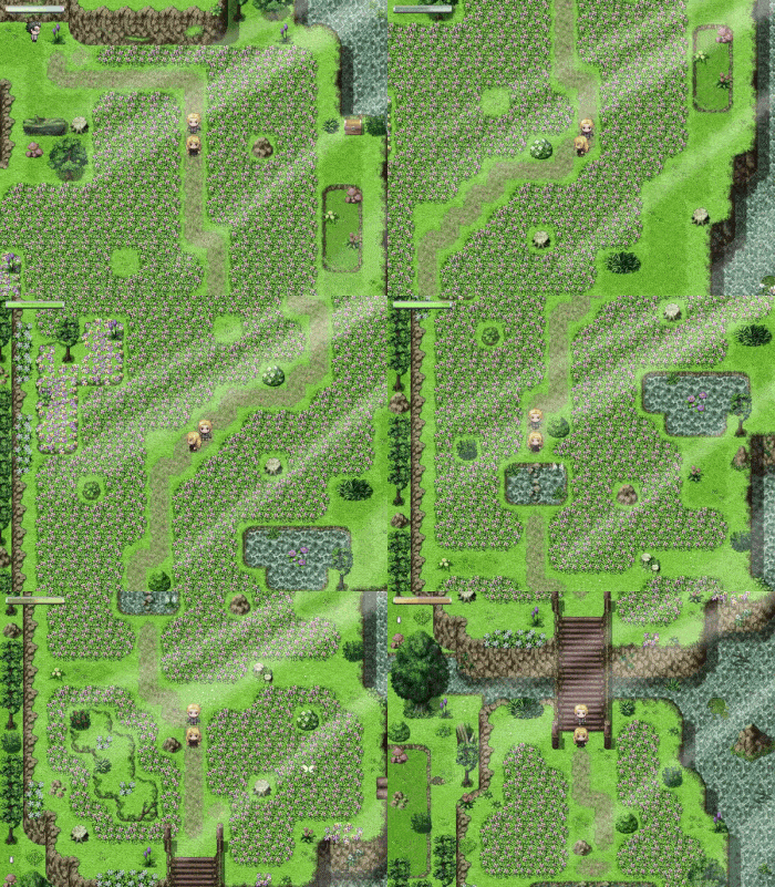
-Too little action. Like after the school graduation there's that massive area, and despite looking around there was not a single battle before just moving to the next big area. Also it just doesn't feel right that there's such big open area yet most things either can't be interacted or are dead ends. Sprinkle some enemies and treasures to find around said big areas?
-Some cutscenes feel longer than they need to be. Lots of talking is one thing, but then showing the characters moving around from one place to the other would probably be better served by some fade-in and fade-out.
-Why is the barmaid at the adventurer's guild looking so gloomy?
Great work!
Hello again, magica girl!
Thanks you for playing again. 🧚♀️🧚♀️🧚♀️
Out of curiosity what are your thoughts on the new additions (the illustrations and costumes)? And how far did you progress? 🧚♀️
Concerning your remarks:
-From your says, it seems you didn't find the optional dungeon of the first "big area" (the flower field to the east). May be it should be more highlighted by a signboard or something?*
-You are referring to the cutscenes at the House of the Republic?
-She probably had a bad week.
*(By the way, there is another optional dungeon in the second big area, but this one is rarely missed.)
Illustrations are pretty nice, noticed there were clothing options but didn't really get to play dress-up because I was too cheap to buy any additioal clothes >< (still I support player customization).
Managed to make it right after the abandoned mine crossing.
-Yeah, completely missed that dungeon. Reloading a save, just two tiles of flowers, probably could use better visual clues, in particular since the map is filled with bigger features that the player cannot enter. I did manage to find the battle area in the second area.
-Yeah, the "tour" around the House of the Republic felt like it dragged more than it needed to. I would prefer if you just let the player explore on their own (doubly so because then the access to the lower area just gets blocked anyway).
You've made good progress, you're over halfway through the game.
Thanks for the advanced feedback! 🧚
As a reward, here is a little preview of a certain costume for Angel. 🧙♀️
Second play still has not get very far I was trying to speed up too. X_X
When you are ready to redo the title art I will be here to help with it. As for the beginning of the game, on replay I would have to agree with others try to reduce the info dump on the players at the beginning, like the maniac mode explanation can be called out if the player decide to select it, then hit confirm after message display, rather than before; more info before starting the story the more disengaging it can be. But if info dump is not avoidable as your game is quite deep in the system design, you can spice it up with some personality, like using your Fairy persona to narrative it all to make it fun. The Indiegame advantage is that we don't need to take our projects too seriously, just like how you designed the skills for your characters, explanation can be done with some humor as well.
I will take another look afterwards and hope to get further in the story. Thanks for your support on my stream as well.
Thank you for your review, fellow fairy.
I was very happy when you came back today, as I really craved to see you have a look at illustration number 2.
Yeah, completing the remake the title screen and improve the initial options explanation tour will be priorities for the next deadline.
There is one thing I would really like have your advice on, as you were one the people that gave me the idea to implement that feature in the first place: what would be your thoughts, after having experienced briefly with it, on the new "Costume" equipment slot? 🧚🧚🧚
all votes for the costume slot. :D
DUNGEON MASTER!
The hardest part is all Tutorial/Intro stuff before the action starts.
Was still need to use a keyboard to call a Menu. Binding it to [Start] gamepad key alongside of [Y] would be great.
🧚♀️🧚♀️ Icicle Fall! 🧚♀️🧚♀️
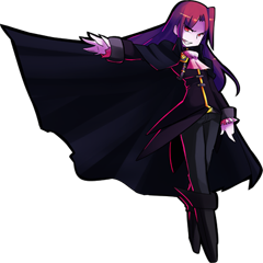
I would have one little question concerning your post:
Is the dungeon master you are mentioning this one?
Yes, that is definitely a Dungeon Master!
Wow, you progressed until the end of the school chapter? 🧚♀️
That's quite impressive!
Time for me to add some Touhou to my agenda.
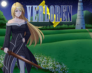
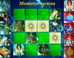
I liked the setting of the game and the combat system seemed to go deep. I found the characters passives to be really funny and a nice touch of extra personality. One suggestion I would make is I notice the quality of the character art in your thumbnail is not as well rendered as the growing up sequence art of Angel in game. I think this is a really missed opportunity, as you should try to put your very best visuals up front to attract people to click on your game page.
Can wait to see your experience in video. 🧚♀️
Concerning your suggestion:
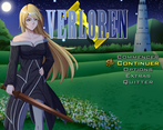
Unlike the most of the artworks, this title screen was actually made by myself some years ago, way before the VN-style artworks were added to the game. So it has some sentimental value, but I totally agree it didn't age that well compared to the rest of the project. My current plan is to remake it myself, but the result will probably be below the quality of the VN illustrations. Do you think I should just commission an artist to do the job instead and call it a day?
Hi Fortunastreet,
I think that it's also perfectly valid if you want to keep the artwork as it is for your own personal reasons. I should preface that it was just something I, a random stranger, had a random opinion about XD;; At the end of the day most of us are just doing this for our own fun and you should do what you feel is best. If it sounds like a fun challenge to recreate the image yourself and see where you can polish it a bit more, then you should! But if it seems like tedious/annoying/frustrating/expensive, then maybe not.
For a game which at first glance feels like basic RPG Maker stuff, you sure surprised me. Quite a good game you have go here. Loved the title screen. It can get a bit too much with info at times.
My main piece of advice would be to try and give ample space between "how to play" tips and not throw it all at once at the player. Hope that makes sense lol. English isnt my first language.
Thanks for playing! 🧚
A little question: which of the "how to play" seemed to you the most culprit of throwing too much at the player? The black screen at the start? One of the tutorial fights?
If i had to choose then i would say the black screen
Hey there! I just got done testing this title!
My feedback is somewhat negative, but I do really like the presentation and vibes of the game, and I find the combat promising. If you'd like to see my full playthrough notes,I've made a Google Doc for you!
Overall, my biggest recommendation would be to trim the fat. This game has a very nice presentation, and generally the vibes are great. I get what it’s going for, but this intro is going to lose players extremely quickly if it doesn’t introduce a good reason to keep their engagement. It already opens with a deluge of settings for the player, most of which should just be put in an options menu for the player to use on their own time. The prologue chapter had a lot of downtime in Lady Helen outwitting the guards and doing a bunch of attacks on them, guards walking around looking for her, and generally none of it was really necessary to the actual important parts of the game (the gameplay and story). After the prologue, the game starts with you needing to roam around your house picking up various items, and after that you have to explore an enormous school and do another lengthy tutorial fight, all without really being given a reason to care about the plot, characters, or gameplay. Even for a slower burn game, players should be given a reason to care so they can get through the slower parts with anticipation for bigger moments, rather than just waiting for the game to start.
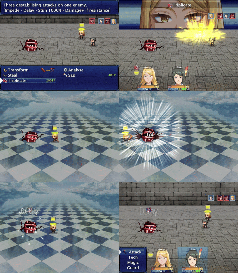
Overall Fun: 2 / 5 - I think it’s likely got potential in the mechanics department. The ability to switch weapons and interrupt enemies sounds extremely engaging. Unfortunately, the extremely slow intro whittled away at my patience, and after a half hour without any interesting gameplay I finally decided to call it quits.
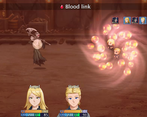
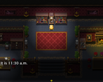
Art/Graphics: 4 / 5 - Outside the custom artwork which is pretty appealing but so far used very sparingly, the graphics are just ordinary RTP. This is above average presentation for this engine however, with custom backgrounds on the menus, and special tiles created for certain locations. It’s clear a lot of work went into the presentation here, so while I would normally give an RTP heavy game a 3 for being “good enough”, the clear effort that went into how the game looks despite the prefab assets deserves an extra point.
Controls/UI: 3 / 5 - It functions just fine. I don’t really see any particular areas where it’s especially bad, but overall the presentation is very cluttered and could use some cleaning up (e.g. all the settings at the start of the game, or the menus inside menus inside menus all over the pause screen). It’s good enough but could definitely be cleaned up.
Music/Sound: 3 / 5 - It’s mostly ordinary and generic sound. Nothing stuck out to me as especially bad nor good, other than the school theme having a very pleasant atmosphere and getting stuck in my head. It’s perfectly functional but nothing special.
I have just finished reading your review and playthrough notes.
Thank you for taking the time to share your full experience as you may imagine it is pretty hard getting comprehensive feedback from people who drop the game quickly. One thing that surprised me a lot was that you felt stuck... in the starting room? It is a first time for me, so I would love to know how it happened. 🧚 I got the impression you felt obligated to search the whole room looking for something, so my question would be, what gave you this sentiment?
So, of course my first instinct was to interact with the large crystal in the room, to which I got a message that I was forgetting something. Then when I try to leave the room, I got the same message. Grabbed the sword, got the same message. At this point I started looking for anything sparkling, so I went and interacted with a couple objects, and couldn't get the money on the counter because I was a little unclear that you need to interact with the paper tile in front of the desk (I'm not entirely sure why that's even there) before getting the money, and after this I tried interacting with the crystal again figuring it was probably where I'm supposed to go, and still got the same message. At this point I interacted with basically every tile in the bedroom before finally leaving down the stairs instead.
Oh, you thought the teleporter crystal was the way to go instead of the stairs?
I guess I could remove the "Angel is about to use the teleportation crystal, but she feels like she forgot someone..." text and put directly the "Due to the breakfast rush, the teleporters are currently overloaded." dialogue as the teleporters can not be used until the breakfast cutscene anyway. I wasn't expecting anyone would be so confused by that crystal. 🧚
Changelog since Feedback Quest 5:
TLDR:
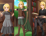
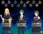
-Added VN-style illustrations
-Added new artworks for some key items
-Added 2 hours worth of gameplay at the end of the game
-New feature: the costumes. They allow you to change the appearance of all the playable characters
Full changelog (Feedback Quest 5 was version 42, RPG Feedback Quest was version 53)
Note: For anyone who has saves from an older version of the game, those are 100% compatible with the newer updates. Any illustration added in the mean time can be seen in the picture gallery after loading your save and any costume you missed will be automatically added to your inventory.