Play game
Murder At Beedlesbrick Manor's itch.io pageResults
| Criteria | Rank | Score* | Raw Score |
| MOOD | Did the game have atmosphere or make you feel something | #70 | 3.667 | 3.667 |
| IDEA | Was this game super interesting or innovative | #111 | 3.333 | 3.333 |
| Overall | #168 | 3.033 | 3.033 |
| AUDIO | Did the game have great music or sound design | #182 | 2.833 | 2.833 |
| FUN | Was the game satisfying to play or did it bring you joy | #211 | 2.833 | 2.833 |
| VISUAL | Did the game have nice graphics or art direction | #256 | 2.500 | 2.500 |
Ranked from 6 ratings. Score is adjusted from raw score by the median number of ratings per game in the jam.
Let people know how long you've been working on the game
I created the first draft of this game at the end of last year, and let my parents playtest it. Since joining itch.io, I've been working to make it much more "user friendly", and finally got it ready for public release!
Leave a comment
Log in with itch.io to leave a comment.


Comments
I still haven’t finished the game, but with ratings closing soon I guess I’d better say something!
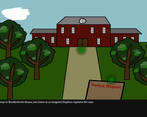
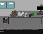
The whole style of the game, both visual and auditory, sets the mood really well. The simple—dare I say it, MS Paint-looking—graphics say “placeholder art”, but I wouldn’t want them replaced with anything too fancy; they add a certain humour to the game. The voiceovers are great, and my only audio complaint is that there isn’t more sound outside those lines—ambient sounds, background music, etc. The voiceovers could do with transcripts/captions, too.
Yes, the interface is peculiar, but I actually found it a really interesting way to play. Whether I’d come to like to more or less over the longer term, I don’t know.
I have to be honest - this game has one of the oddest control schemes and user interfaces I've ever seen. Is there a reason you didn't just use Unity or even Twine? (This would be relatively easy to make in Twine; possibly Game Maker too.) I was initially confused as to how to proceed because I didn't realise that the input area was the input area - I thought it was an unused button on the interface. Once I figured it out I played through and got to the end but I had to brute force the ending because I came to a different conclusion and then was stumped when that wasn't the right one. I agree that there needs to be better differentiation in the voice acting but you do have a really pleasant speaking voice, which can be the other trap with voiceovers, so I was happy to listen to the audio. I liked the music too.
Thank you for the honest feedback - it's good to know what didn't work, as well as what did.
The honest answer about the UI is that I was a software engineer first, and when I first started making these games, I was far more interested in writing the engine that actually making the game. Playing submissions for this Jam, I've seen how much better things are in actual game engines, so that's definitely something I'll be looking into.
Obviously it's hard to say anything without giving spoilers for others, but was there any particular clue that pushed you in the wrong direction? Brute forcing these sorts of games is always disappointing, so I obviously want to improve it to help avoid that!
I've added placeholder text to the input box, to hopefully make it a little more obvious. It does look slightly too much like a button at the moment.
Yeah, I had a sense that you were an engineer first :)
I think I was just overwhelmed by the clue possibilities and so my brain picked the one it liked the best ("a lady's generational revenge" - I wanted to be less overt to describe it but when I went back in to see what the code for that was it was a bit buggy - it started a new game but with residuals of my previous game still in the sidebar, and the skip codes weren't working at all, and then the text box stopped working... so you also need to flush whatever data is being saved long term).
As I was saying, I think the clues are a combination of too many possibilities plus little details that can get lost in a sea of other information (for example, I went back to confirm that the name of the pills was in the toxicology report because I hadn't noted the information when I read it but then it occurred to me afterwards that it was probably there, and it was). There were a lot of plausible theories, most/all of which you then detail in the narration, and the right one didn't stand out to me so I guess what I'm trying to say (apologies - I'm typing this while in a bit of a rush) is that you need to make the important clues more obvious and the red herrings more recessive, if that makes sense.
Also, bear in mind that I was fighting with a very difficult user interface so that pulled my attention away from the narrative aspects of the game. I got used to it and got better at playing the game using it but it took a while and I subconsciously missed a lot of the narrative in the beginning of the game because I was struggling to play and that's where my focus was - "How do I do [x]?" instead of "Hmm... that's a suspicious clue."
The important thing, though, is also that you made a full game and as a player I got to the end (and had a good narrative experience in doing so, even if I had a usability struggle) so it's fully functional and that's a great start. Hopefully you've learnt some things and will apply those lessons to your next game. That's what game dev is. (Along with: don't make your own engine when you are starting out; use the standard engines that are out there. They are refined and they result in gaming interfaces that players know and understand.)
Thank you, this was really helpful feedback.
I think you're right, and I may have done a little too good a job hiding the evidence! Of course, to me the obvious clues seem really obvious, because I know what they are. Emphasising them a little more for the players, and minimising the red herrings, is probably a good idea.
Definitely some really good things to think about for the next one. Thank you for taking the time to play it, and to give detailed feedback!
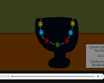
Yeah, there's a lot going on in your game and different people think in different ways. For example, I noticed immediately that the jewels were in the wrong order but although that was odd and I knew it meant something it didn't make me think of forgery because to me a good forgery is something far more subtle and hard to discern. So my advice is use a standard game engine, while you're still starting out, which solves lots of usability and UI problems, and test with as many people as you can to observe how they approach problems and interpret the information they discover.
Good stuff.
The visuals are super charming, and I liked the overall vibe. I thought the puzzle aspect was interesting. I would love some additional background music!
Thank you, this is very kind. I'm glad you enjoyed it. More music is an idea I toyed with, perhaps I'll look into it more!