Indie game storeFree gamesFun gamesHorror games
Game developmentAssetsComics
SalesBundles
Jobs
TagsGame Engines
A jam submission

SmugglerView game page

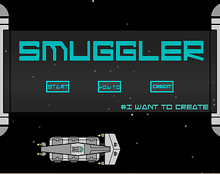
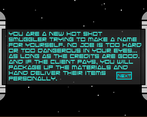
You are a hot shot smuggler trying to make a name for yourself in a galaxy full of danger.
Submitted by Seth Konoza — 4 days, 13 hours before the deadline
Add to collection

Play Smuggler

Smuggler's itch.io page

Results

CriteriaRankScore*Raw Score
Originality#13.5453.545
Overall#102.6362.636
Gameplay#112.4552.455
Overall#112.7732.773
Presentation#132.4552.455

Ranked from 11 ratings. Score is adjusted from raw score by the median number of ratings per game in the jam.

Leave a comment

Log in with itch.io to leave a comment.

Comments

Submitted (1 edit) (+1)

It's a great concept, but it didn't feel super intuitive, though I have a tendency to skip text instructions, and come back to read it first when I get stuck.

The loading minigame seemed hard to understand at first, but after reading the instructions it felt nearly pointless.

The gameplay was slow and not that interesting, though since it's a shooter it should be pretty straightforward to make it more fun to play, shmup is a very mature genre, and there are countless great games to take inspiration from.

Submitted(+1)

I wasn't a fan of this, couldn't find a pause button, you had Vector graphics mixed with pixelart graphics and found the how 2 very long.

Improvements I would recommend are: Keep the art style the same throughout the game, either choose clean vector style images or choose pixelart, make a tutorial instead or as well as a how 2.

Check over your grammar, placement of full stops, capital letters etc.

I will keep playing and edit my review if a have further/changed thoughts.

Developer

sorry you did not enjoy it that much but the critique is greatly appreciated 

Submitted

No problem, I hope you continue with it as the idea could be really awesome, just think you need to lead the player through the experience more clearly.

Submitted(+1)

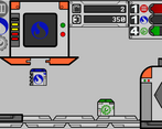
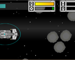
This was a very interesting concept. Liked the assembly line. Only thing I'd suggest is during transport it does feel a little slow paced and repetitive. Might suggest adding enemies and less asteroids or a way to speed up and slow down maybe.  But definitely original and nicely done! Enjoyed it!

Submitted(+1)

Great idea, creative ways to build upon the idea, but for me there wasn't enough polish. Anyways, I very much liked all the parts that made this a whole, and can barely imagine all the code behind the scenes. Solid.

Developer

What would you like to see more polished? Thank you for the critique.

Submitted(+1)

I will be very specific, to what exactly I noticed could be improved.

The animation of the box creation machine was shaking, but the inside icon wasn't. You either have the whole thing shaking (making an impression it's producing a crate) or nothing.

The mission picking was an amazing idea, but just wasn't followed through. I didn't see why I should pick either one of the options. It didn't tell me how many crates I need to make, or how much I get paid. I think this is the easiest thing to improve, since it's not too complicated, and it would add to the game greatly.

When in the spaceship mode, I got the asteroid encounter almost every time :( . I don't know the code, but I assume it's random, and I really didn't like that. Either have it always change, so no encounter can come twice in a row, or make it custom random, meaning after you already get asteroids, there's a much bigger chance to get shooting spaceships the next round.

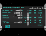
But most importantly, the user interface. The first few times I got into the shop, I was extremely confused. And I read the tutorial first, so I more or less knew what each button does, but I really wasn't sure. I just think the whole things needs to be reworked. If you only want icons in the shop, make it so the player can mouse over the icons, and gets shown details about that upgrade. The text that made you buy an upgrade looked exactly the same as the text that was just there, and I had no idea if I click something what it's going to do. Also, there wasn't any way to reset after I make a mistake (which really isn't that important, but ^^reread my previous sentence and you see why I personally missed it).

I think these are the bigger things, that worsened my experience, but don't get me wrong! I very much liked the game, surprisingly spent a lot of time on it, and was grinding until I got all of the things on maximum. I really think if you rework it a little and polish it all the way to the end, it would have a lot of potential.

Anyways, thanks for reading. Hopefully, the feedback wasn't too long, too confusing, or made you angry, mad or sad. None of these are what I want, I would just love to see your game improved, since I really liked it and feel like it could get much better.

Keep it up!

Mravec

Developer

thank you the more detailed the better. This is greatly appreciated 

Submitted(+1)

Definitely a cool idea for a game you've got here. Could use some work in regards to repetition, but it's pretty fun anyways.

Submitted(+1)

Interesting game.

Submitted(+1)

A lot of thought must have gone into the game variables, nice work.

Developer

thank you, many many variables