Play game
SALVAGE's itch.io pageResults
| Criteria | Rank | Score* | Raw Score |
| 3D Art | #8 | 2.733 | 2.733 |
| Original Audio | #16 | 2.733 | 2.733 |
| Technical Accomplishment | #16 | 2.800 | 2.800 |
| Use of Audio | #18 | 2.733 | 2.733 |
| User Interface | #19 | 2.600 | 2.600 |
| Level Design | #21 | 2.467 | 2.467 |
| Itch Page | #22 | 2.400 | 2.400 |
| Game Design | #23 | 2.533 | 2.533 |
| 2D Art | #25 | 2.000 | 2.000 |
| Overall | #26 | 2.600 | 2.600 |
| Fun | #27 | 2.267 | 2.267 |
| Commercial Viability | #31 | 2.133 | 2.133 |
| Use of Theme | #32 | 2.267 | 2.267 |
| Narrative | #33 | 1.533 | 1.533 |
| Art Direction | #35 | 2.133 | 2.133 |
Ranked from 15 ratings. Score is adjusted from raw score by the median number of ratings per game in the jam.
Number in Team
3
Does your game include Art packs?
Yes.
Does your game include Sound packs?
Yes. All sounds are made by @AnirudhDabas .
Does your game include plugins or pre-coded content?
Yes. We have used some assets from assetstore.unity.com for which we have the permission to use.
Please provide a full playthrough YouTube video of your game.
http://We haven't made a gameplay video.
Please provide a link to a 30 seconds gameplay YouTube video of your game.
http://We haven't made a gameplay video.
Leave a comment
Log in with itch.io to leave a comment.


Comments
Great job! The mouse sensitivity felt quite low for me, but the music was excellent - for me the lighting and general visual style fitted really well with the music in particular and gave the whole game a nice vibe!
wow amazing game!!!!
Definitely a huge undertaking, and overall it went pretty well. Just missing some refinement in the tutorial, UI and playtesting. I would reiterate the less levels feedback as a way to accommodate for those other things a little better in a one-week game. Nice work
This was a very ambitious attempt for a game jam! I respect how much you accomplished in the short time we had to make so many levels with so many moving parts!
The biggest issue I had was the mouse sensitivity was very low. I can adjust my mouse to compensate and the highest setting I have was still too low, a setting I have never ever used because on everything else it is wild. The variety on the levels was nice, but I found the design choices and colours a bit hard on the eyes and honestly can't say I enjoyed this experience very much. I can see a lot of work has gone into this game. I think maybe a good idea for the next jam would be less levels and more playtesting to make sure the user experience was really fun. It's great to have lots of levels but they are wasted if the user does not feel like they want to go any further. It has potential for sure it just needs to feel better to realise its potential. All the ingredients are there.
Really fun game to play but you could improve the UI art a little bit
For something that clearly seems to be one's first attempt at designing an fps with multiple levels (gotta give credit there), I thought this was okay.
My advice if you want to try another fps, more walls and cover would be nice as well as some guardrails to shield from the precarious bottomless pits so the player has the option to retreat somewhere they won't be shot at from all directions (the fifth and sixth levels are the biggest offenders imo). Also, if you want the guns to have infinite ammo, make them behave like power-up pick-ups instead of letting them all be used at any time against any enemy because there's no incentive to use anything other than the machine gun aside from the long weapon reload times.
I do also think it's weirdly redundant how unlocking cages requires keys but the player is given all the keys they need right at the start and never needs to collect any in all of the levels. If expanded, this could become a fun little Metal Slug riff (with ghosts).
Thanks for the feedback.
"My advice if you want to try another fps, more walls and cover would be nice as well as some guardrails to shield from the precarious bottomless pits so the player has the option to retreat somewhere they won't be shot at from all directions (the fifth and sixth levels are the biggest offenders imo)", I'll add this to my next fps.
"Also, if you want the guns to have infinite ammo, make them behave like power-up pick-ups instead of letting them all be used at any time against any enemy because there's no incentive to use anything other than the machine gun aside from the long weapon reload times", I tried to implement this, but it was a bit complex and we were short on time, so had to leave it as it is.
"I do also think it's weirdly redundant how unlocking cages requires keys but the player is given all the keys they need right at the start and never needs to collect any in all of the levels", didn't get you there. In the start of the level, player has 0 keys and has to collect keys by killing enemies.
Nice! Lot of content in a small time frame :o
I'd say the first feedback that came to my mind is that the mouse sensitivity was prety low. For me, what made the game really hard was that I had to move my mouse a ton to turn the player, maybe you could add a mouse sensitivity option ?
Yea, we thought of implementing that, but didn't have time. I might update the game later and add this.
I appreciate both the number of levels and the variety of ideas explored within them! A lot of mechanics were implemented in the time available and it gave you the space to experiment which is admirable!
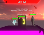
I was not a fan of the tutorial level although I do appreciate that you have one. Having worldspace text is great but try not to allow the text to overlap on the screen. You could have blocked the player's eyeline using the maze walls from later levels and more progressively exposed the player to concepts rather than dropping the player onto a plane with all the game rules.
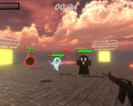
Personally, I would have picked a different level order. Being dropped onto a plane with several ghosts as the first actual level resulted in my repeated death as I figured out how combat worked. Pretty high stress environment with nothing to hide behind! Perhaps the first maze level could serve as a neat introduction to combat with ghosts.
I'd introduce the ghosts one at a time too; make a bigger thing about what makes each of them different. They clearly are different; don't be afraid to take a level to just show off what you've done to make them interesting.
I noticed that the ghosts fired physics objects while the player fires raycasts. This lets me cheese them by standing just next to a corner that they can't fully shoot around and shoot the edge of their hitbox. Perhaps not the intended gameplay. I'd be tempted to remove the collision with the ghost projectiles and the environment and just say "Well they're ghosts. They're well known for going through walls!" Just be sure to introduce that idea before making it a question of life or death.
I liked that some of the levels felt like a puzzle while others felt like a more traditional shooter experience. I did get lost a few times in the bigger, emptier maze but it was super cool to see multiple styles of gameplay going on!
Thanks for the feedback.
To be honest, we bit off more than we could chew, hence had to reduce the number of levels and wrap the tutorial in one level.
Secondly, the enemies shooting physics based objects was intended. We did try to resolve the bug where you could "cheese them by standing just next to a corner that they can't fully shoot around and shoot the edge of their hitbox", but we were short time, and had to leave it as it is.
Thirdly, "Well they're ghosts. They're well known for going through walls!", this is a great idea, we didn't think of it LOL, I might update the game after the jam and implement this.