Awesome, I like the mechanic of trapping your opponent in a bubble :)
Duncan Gallagher
Creator of
Recent community posts
I'm happy you enjoyed the atmosphere, as that's all we had time to really work on haha! I did spend far too long getting the life recording and playback working, and by that point we were already so far behind that the whole thing felt a bit rushed. But all in all I'm fairly happy with the idea, and I agree it would be cool to work further on it :)
Animations felt really fluid, and overall I felt the visuals were excellent - a lot of detail in characters, environment, and UI especially so for a one-person team. The idea of losing character's you've built an attachment to reminds me a lot of how I felt losing characters in the XCOM series - don't know if that was an inspiration for you? I really liked the flow and overall feel of the fighting sections, but I wonder whether there is any way to introduce a little bit of prediction/skill into the otherwise randomised nature of a rock, paper, scissors-based game? Overall, great entry and good job!
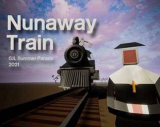
The music reminded me of the Monkey Island series a bit, which feels in line with your overall style for sure. The dark electronic drop with the vocal line was really interesting and memorable too - contrasts a lot to the quirky bassoon melody. Wonderful visuals, and very structured introduction of different mechanics as you play, which makes things feel very smooth. I find the idea of a dodo squashing hunters by jumping on them pretty satisfying too haha!
The lack of audio made things feel quite eerie on the whole, and while you might not have intended to have complete silence throughout the game, it does fit somewhat with the grey, misty atmosphere - maybe there would be something in a minimalistic approach to sound if you take this further! The way the story progressed as you climbed up the building gave it a very clear and literal direction, and it feels like the start of a dystopian sort of world which could potentially be quite engaging. As others have said, the movement feels awkward, but at the same time I don't think I've played anything with quite these movement mechanics, so perhaps refining them and neatening them up while keeping their uniqueness would be a good shout.
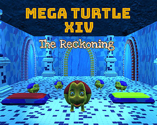
The music gave me Unreal Tournament 1 vibes, which I was into haha! Very detailed environment, and had I not been fighting off a giant green germ I would have loved to explore the level more. Feels like there are a lot of moving parts to this project and you've done really well to bring everything together in just a week! I especially appreciated the opening narrative segment - always helps me get a bit more invested in a game when there's a nice bit of story.
The flavour text/instructions on the itch page were excellent :D I enjoyed scouting around the map with the metal detector, and the SFX when finding a gold nugget made things feel really nice! I wonder whether the beeping of the metal detector could increase in frequency based on how close to the gold you are? The overall aesthetic and visual presentation were great too, very eye-catching title screen and UI!
Ah nice to hear you managed to play it through as if I'd had time to put all the colliders in! Strange and eerie are definitely words that fit with what we were aiming for :D I agree that the idea has the potential for some cool puzzles, I just wish we'd managed to work on the visuals a little more. I also quite like the telescope - the original idea came from a puzzle in Myst, but far simplified!
Thank you! I agree that the map feels a little big, which also makes it a little dull as the player waits around for the previous life to perform the actions needed to progress. I'm glad you got a sense of the atmosphere too - since we overscoped and had plenty of technical problems getting the general gist of something was the best we could do haha ;)
Thanks for you comments Andrew! I agree that it does indeed only just fit the theme ;) Certainly a lot of glitches in this still, and the inclusion of a trigger to reset the lives on falling off the level would have been a nice thing to add. I'm glad you felt that the gameplay had some sense of a story - we were limited in time and hilariously overscoped (every jam I do this haha) so we were very much going for a prototype level more than anything else!
I appreciate your comments, thank you :D I agree with your points about the way the lives interact with each other - I feel like it just about works but there's a lot of waiting around atm, and is indeed super buggy. I am a massive fan of Braid haha, it hadn't actually occurred to me but that game was probably in the back of my mind when we were coming up with ideas!
Great stuff! The graphics were excellent, and the comic strip at the start of the game was a really concise and fun way to do your exposition. It wasn't immediately clear to me that the enemies were pillows/cushions (I think?), so perhaps a particle effect of feathers or something would have helped clarify that. I found the enemies also quite challenging, and couldn't reliably avoid their attacks. Music and SFX also great, especially loved the cat's meow when health reaches zero ;)
No problem, and great job! Yes that's it I reckon, I think because the minimap was so full of red points which I think were zombies, it took me a little while to realise that the big blue one was the church - I think you start facing away from the church too so maybe that was another reason I didn't find it until my third try ;)
I love the combination of riding a motorcycle and a zombie apocalypse, feels pretty unique! The handling of the motorcycle felt good, and it certainly was satisfying smashing into all those zombies. The visual style is great, and it feels like you've used lighting really effectively. The objective was a little bit confusing at first for me, even having read the guide, but as with the other comments after a few tries it became clearer :)
Really funny concept, and the choice of music was just perfect xD So much potential, will definitely be following this and seeing how it develops! I would have loved to see items being checked off the list as you collected them, and maybe different audio cues for collecting items that are/aren't on the list to make things a bit clearer for the player. I wasn't quite sure what the Speak to Manager powerup did, but I'm sure you could come up with something hilarious if you're working on it again!! Great work, really enjoyed it.
Wow, cool stuff!! The exploding goo added such a sense of urgency to the game, kept me really on edge trying to avoid where I'd literally just been! I had insane framerate drops on the bridge of boxes on the second level due to the sheer amount of explosions haha! Loads of really interesting mechanics at work here, and feels like quite a refreshing platformer in general :)
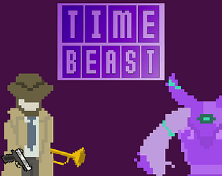
Really enjoyed playing! Loved the visual effects of the various attacks, and the Almighty Monster's combo attacks felt very cool with all the elements together ;) I left behind the fire wizard, then the ice wizard, and was left with the lightning wizard for the last two fights. As others have said, it's really nice to play this style of turn-based combat game, and has got me thinking I'd like to have a go at making something like this in another jam! Nice job :D


