Play Game
SUS MANAGER's itch.io pageResults
| Criteria | Rank | Score* | Raw Score |
| Graphics | #23 | 3.000 | 3.000 |
| Adherence To The Theme | #24 | 3.167 | 3.167 |
| Innovation | #25 | 2.750 | 2.750 |
| Overall | #27 | 2.750 | 2.750 |
| Audio | #34 | 2.500 | 2.500 |
| Game Design | #45 | 2.333 | 2.333 |
Ranked from 12 ratings. Score is adjusted from raw score by the median number of ratings per game in the jam.
Leave a comment
Log in with itch.io to leave a comment.


Comments
Took me a while to learn to play, but after that, it was pretty good. I liked the simplistic graphics and the audio very much. Kudos!!
Do check out my game as well
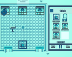
There is a lot here that could be interesting. The art style and color palette give a really nice vibe to the game, but I found it very hard to learn. I see you added a tutorial, which is helpful but there is a lot more the could be added to the game itself to help players learn the game better. For example, it took me a good while to figure out what the differences between the buildings are, and even now I don't know what any of them do. If you could communicate what they are, either in the art or with titles that would help a lot. Overall making better communication for this game would help a lot. I also found it odd there appeared to be a grid but that the pieces didn't follow it.
This game seems to have an amazing core but its main problem is its complexity and how well it explains its complexity. It took me a while to even figure out the ui cause they’re these additional steps to using it. There probably should have been some in game tutorial somewhere showing how it operates. i say its really good but it does need some form of ingame tutorial cause just looking at this and trying to play it is frustrating. amazing adherence to the theme and i like the arcade graphic style but game play is frustrating trying to understand without an ingame tutorial. Good job nonetheless :)
Just gave this game a try and it seems really promising but I just can't seem to get some things working. I tried following the tutorial on the game page but I had a lot of issues placing certain things and moving them around, and even after waiting 2 in game days I had 0 patients. Since I can't really critique the parts I wasn't able to experience I'll say this: the art style is cool, kind of reminds me of old school game boy 2-color games. I think the buildings need names above/below them in the building page since they all look pretty similar. Moving things around needs some work, and it would be nice if they snapped to the grid when placing. Solid effort though, I hope you can update it with a more in-depth tutorial because I'd really like to experience the rest!
To move you have to press for a long time, and you cannot move things on the UI side, this is a problem with the engine that I use, if you are not able to click try to move the camera, because sometimes the buttons overlap , if the npc is not spawning try to move the constructions a little bit, and the webGl version has a bug that the npcs don't move, try to download version 0.3 which is an old version in the link that is in the warning area, I'm done to play your game, I really think your game will win
I will add a tutorial
Nice submission.
But I didn't understand what to do.
Maybe it was a webgl thing.
Do play our game as well
Looks good but I don't understand what to do :/