Play game
Beacon's itch.io pageResults
| Criteria | Rank | Score* | Raw Score |
| Audio | #36 | 2.500 | 3.333 |
| Fun | #46 | 2.333 | 3.111 |
| Visual | #46 | 2.667 | 3.556 |
| Originality | #51 | 2.500 | 3.333 |
| Overall | #52 | 2.417 | 3.222 |
| Design | #56 | 2.000 | 2.667 |
Ranked from 9 ratings. Score is adjusted from raw score by the median number of ratings per game in the jam.
What was the most challenging part of making your entry?
Collision & Music
What was the most fun part?
Messing with Collision and creating each Room, as well as the characters!
Anything else to add? (important controls, assets used, special mentions, etc)
Unfortunately, collision isn't perfect, but its good enough to not impede on the game's playability.
Leave a comment
Log in with itch.io to leave a comment.


Comments
Wow! That was really good :)
It reminds me of Undertale by Toby Fox
Thank you! ^-^
Wow! What a great entry. It has a fun little story, some dialog, platforming, puzzles, it's all here. Well done. Was stuck until I discovered I could indeed jump, I was spamming z/enter trying to climb over walls!
Thank You! ^-^
I probably should have had a more in-depth controls section, but I wound up thinking from my POV instead of a Player's POV... Im glad you figured it out though! ^-^
Nice job! Music was very fitting. I like the design and layout of everything - simple, but effective. You even put in an icon for the game - feel like that's an oft-neglected detail in jams! It took me a minute to learn there was a double jump but that was a big "Ah-Ha!" moment. I like the purple palette / cave-like feel, but platforms blend in with the ground and it was tough to have a sense of depth in some areas? Fun over all though!
Thank you! Im glad you enjoyed the music! I was really worrying that I didnt get it right <x).
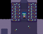
For the depth issues, I had some problems with it while testing the game as well, so I tried to make it so the platformers were a darker shade than the regular tileset. In Hindsight I probably should have added more of a outline to make it standout more, which wouldve also helped a bit with depth. Thank you for the feedback! ^-^
Found the green character, but couldn't figure out how to get past that point. Kept getting "stuck" on walls.
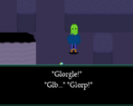
Ah, sorry for the collision issues! If I'm correct that's caused by the player character still moving in the last direction slightly before the collision is checked, so you wind up slightly in the wall/object. If the green character you're speaking about is the slime in the second room, can I ask what jump you're getting stuck on? Thank you for the feedback!
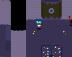
This is as far as I could get
Ah okay. Is there any specific jump you're having trouble with, or are you not able to get onto the platforms?
I couldn't get onto the platforms in that area.
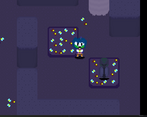
At the entrance of the room, the first platform to the left is another platform you are able to jump on. It's half the height of the other platforms.
good little game was stuck at the v for a bit.
the rest has already been said but good job on the music.
And it seems you got the collision to work good enough so good job on that as well.
Really cool game, liked a lot the music and the art style, the platforming sometimes is really tight but still really cool :D
Thank you very much! ^-^ I'm glad you enjoyed it!
It seems you said you've made the music, i liked it! Really fits the ambience and the mechanic of teleporting.
I would recomend a lot that you should highlight the doors because the look exactly like a normal wall.
About the V letter, it should have been fine that you put it some readable text like
"This big V has something writen. Press V to see whatever happens, yay!". Im talking seriously, these both problems almost killed my experience.
About the game, it has a lot of personality! Good choice of art direction!
*edit* I meant Great choice of art direction!
Thank you!
I did make the music, but it's a bit rushed since it was the last thing I added, but I'm glad it fits! ^-^
For the Doors I tried to make them look like hidden passage ways, but In hindsight they do look like they're just part of the normal walls.
For the V I did consider having a textbox appear from a plaque, but I wound up getting stuck working on other things like the collision and button/door stuff and wound up forgetting to implement it xD.
I'm glad you enjoyed the game aside from those issues! ^-^
Thank you again for the feedback and suggestions!
Sorry, i meant about the normal passages, they should be highlighted. Anyway, it seems like you had read my mind because i forgot to say that I've got a little confused about the ominous doors, but i tought that was fault of the V puzzle tutorial.
I meant actually about normal passages, those that look like a black rectangle in the north, but it shows nothing when they point to the west, the south or the... not west-? ive got a thick.
Yhea, they should have their own look, like a gradient shadow or so. Im gonna say it again, cute game!
Ah okay. I get what you mean. I tried to make it look like they lead into somewhere by adding extra ground tiles in that direction, but a gradient fade would've helped convey that they lead elsewhere.