Play game
Mages 'n Monsters's itch.io pageResults
| Criteria | Rank | Score* | Raw Score |
| Juice | #59 | 3.182 | 4.500 |
| Fun | #66 | 3.064 | 4.333 |
| Overall | #84 | 2.946 | 4.167 |
| Visuals | #95 | 2.828 | 4.000 |
| Audio | #111 | 2.357 | 3.333 |
| Theme | #118 | 2.475 | 3.500 |
Ranked from 6 ratings. Score is adjusted from raw score by the median number of ratings per game in the jam.
Leave a comment
Log in with itch.io to leave a comment.



Comments
Really fantastic! You got so much just spot on, it was a joy. I think a little bit more juice on firing and especially on hitting enemies would've been really nice. The screen transitions and story were both cool additions that both seemed a little slow. I felt like the difficulty was just right for a jam game, though I wouldn't have minded a little more personally. This might be personal preference but the teleport going to the mouse is a little unintuitive compared to being based on movement direction. I do think you could potentially have done more with the theme - bullet hells are already a genre where you rarely want to stop moving, so what does not being able to shoot without moving bring to it? Would've been nice to see that space played in a little, like enemy patterns that are easier to dodge while standing still, that kind of thing. Also real minor thing but I think the mage sprites were actually too shaded, a simpler approach would've stood out a little bit better.
All in all this was a really, really great entry and you should be proud!
Oh, and just fyi had a weird bug playing on a 2560x1080 monitor, where the first level started zoomed in entirely on the player's face - i quit and played on my normal sized monitor and it was fine. Catering to extra wide monitors certainly isn't something anyone needs to do by default.
Thank you for playing!
A bit more juice and in general more polish/consistency is planned as post-jam update.
I'm aware of a zoom bug that can happen sometimes, however it isn't resolution bound. I develop on a 2560x1080 monitor as well.
Criticisms:
1. Game felt too easy after I realised u can just hold right and left click at the same time to utterly obliterate everything including the boss
2. Might just be personal preference but I really disliked the dissolve colours you used like the red and the grey, that effect could have looked way cooler with different colours and some glow I think.
3. Maybe some more juice, like camera shakes and few extra particles.
But overall, honestly its insane you did that much of a game during only 8 days so massive congratulations.
Also good job for making checkpoints as it quite hard to start with.
Thank you for your feedback!
I've made the game easier than originally intended because it's a jam game, I don't want to frustrate others.
People have mixes feelings about the dissolve colors, some really love it and others find it meh at best.
There is camera shake, but barely since I didn't want to over do it, but I'll look into it after the jam. Adding more particles is a good suggestion tho.
Yes always make the game easier in a jam I learnt that from a previous game lmao.
Okay obviously everything is up to you and what you like for the colours as it does seem that some love it, and yeah defo more particlesss
Really not bad. Gj and let's continue this project if you would create something cool. I really like the movements and the final boss hahah
Thanks for playing! The boss was kind of implemented last minute, but made it in the game nonetheless :)
Wow those screen transition are great ! The juice is there ! Especially for the teleport which feels really powerful ! And the cutscenes are perfect ! You even had the time to make a boss, I'm quite impressed !
The blend of 2D and 3D art is really good, and the charadesign is really cool, I just feel that the style of the mage and the enemies are a bit too different to my taste, especially in terms of proportions. The character looks chubby compared to the enemies.
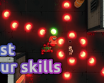
In terms of balancing, the combo of big character hitbox, huge projectiles and bullet hell make the game really hard, even frustrating at times. And the "don't stop" mechanic doesn't help, because it prevents you to hide behind corners when you'd need to.
Thank you for the feedback!
I'm aware that the hitbox needs more balancing and that it can be hard at times, but it isn't meant to be frustrating and I'll work on that as a post-jam update.
The mage sprite is made by someone else and all other 2D sprites are drawn by me, which explains the style issues, This is also something i'll keep in mind for the post-jam update.
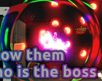
You're really good at working with UI and I love the way you combine 2D and 3D aesthetics so nicely! The bullets especially looked really nice imo, even if they were just coloured orbs lol
I did have the same bug KelTi6 mentioned, but it worked perfectly after that.
I will say something you might want to consider is reducing the size of the player hitbox. In some (but certainly not all) bullet hells this is done to give the player more of a fighting chance against literal mountains of bullets, and I think it would work well here too. The SFX also don't feel like they fit the rest of the environment you set up, so reworking those might be something you consider.
Great job overall dude! Keep at it!
Thank you for your feedback, I'm aware of the dashing issue and will fix that after the jam ends.
Also, making the player's hitbox smaller is great feedback, especially if the gameplay gets more intense!
I've had issues with SFX and couldn't get the feel of it right, I'm going to learn more on that after the jam as well.
I'd recommend going to freesound.org or some other site like that to get used to what different objects can sound like/if you don't want to make your own. It'll be up to taste, but I personally like to use sounds made from either paper or ceramics and will start there, then maybe change their pitch a bit to make it sound better (randomized pitch, in general, is pretty good idea too). Sound design is definitely hard, but like the rest of game design, it just takes practice to do lol
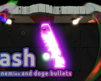
mmmm that's some juicy stuff. 1 con: when you try to dash but your mouse is out of range of dash it takes last mouse position instead of the mouse direction which is pretty annoying. Also on the first try the game bugged and it was very dark, guess lights didn't instantiate or something. Despite that the game is awesome
Thanks for the feedback!
I'm aware that the dash mechanic doesn't function correctly in some cases when the mouse position isn't updated. Due to time constraints I couldn't fix it for the end of the jam and will push a fix for it after the jam is complete.