Play game
Cyberpunks's itch.io pageResults
| Criteria | Rank | Score* | Raw Score |
| Overall | #1 | 4.350 | 4.350 |
| Gameplay | #1 | 4.167 | 4.167 |
| Themeness | #2 | 4.417 | 4.417 |
| Sights & Sounds | #2 | 4.667 | 4.667 |
| Enjoyment | #2 | 4.250 | 4.250 |
| Giant Bombitude | #3 | 4.250 | 4.250 |
Ranked from 12 ratings. Score is adjusted from raw score by the median number of ratings per game in the jam.
Team Members
Ungrateful Dead
Leave a comment
Log in with itch.io to leave a comment.


Comments
Lovely, well made game! I included it in my compilation video series of all of the Giant ROM 3 games, if you’d like to take a look. :)
Art and music was absolutely on point, it felt production quality and I loved it. Character creation was also awesome, but like many people I had trouble with figuring out where I could walk, or what platform level an item was sitting on. Amazing game though, really enjoyed it!
Very nice! Really tight gameplay and a lot of great unique art. I am really impressed.
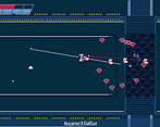
Nicely done. Good art and music. Clever integration of hacking into a wave based shooter. I had a lot of trouble discerning what was walkable terrain and what wasn't. The level could have used more colors or contrast to differentiate where you could and couldn't walk.
Had alot of fun with this game! Character creation was cool and worked great with the great artwork.
Like a few other people advised didn't know where I could always walk, could do with getting harder quicker and maybe a weapon icon. But none of that really took away from the solid game you've created, well done!
Wow, that was really solid stuff! All the way from presentation to feel. Every weapon was satisfying in its own way, and I found myself switching through them a lot. Love the touches at the start with character customisation. Didn't expect that level of polish from a week's work.
I would say that everything's a bit dark and it was hard to tell what could and couldn't be traversed, so I found myself backing into corners wondering why my guy wouldn't move.
I feel like if you had an icon in the corner displaying the current gun, I would have been able to tell what I was holding from my periphery, rather than taking my attention away from my enemies to look at my character.
I will be loading this up again, because I wanna feel that shotgun. Really great job!
Really great art, solid mechanics, my only complain is that it's hard to tell where exactly I can walk sometimes.
I'm genuinely struggling to find some constructive feedback I can give this other than it's bloody excellent. The only things I can think of are: The controls disappear too quickly, I didn't realise I could switch weapon for ages and round round with no ammo; and that it's really hard to tell what you can walk through and what is solid.
Art is gorgeous, love the character designs. Love you can customise your look. Love the weapons (GAL GUN) and gameplay felt great, if a bit too easy. I got to Wave 11 and decided I probably was never going to die so had to give up I'm afraid haha. Really good work.
Wow, really great job! I love the art and smoothness of the gameplay, really polished. Fun weapons and the hacking is a cool mechanic.
My only real gripes with it is it was unclear where you could and couldn't walk, and I wish the HUD area that showed your ammo gave some indication of which gun you were using. I know you could see it on your duder but I instinctually kept looking up at the ammo counter when switching!
Awesome job!
Loved it! Great work on the intro, enough story, gameplay feels great, there's a knife bat, plenty of customization options, good use of the Lang Zone.
Only bad thing I could say is there are some placed on the map where it's hard (impossible?) to tell you won't be able to walk through. Also, does it ever end?