Play game
Gravimancy's itch.io pageResults
| Criteria | Rank | Score* | Raw Score |
| Enjoyment | #1904 | 3.207 | 4.000 |
| Overall | #2269 | 3.237 | 4.037 |
| Creativity | #2438 | 3.296 | 4.111 |
| Style | #2626 | 3.207 | 4.000 |
Ranked from 9 ratings. Score is adjusted from raw score by the median number of ratings per game in the jam.
How does your game fit the theme?
Everything is scalable by the player and gravity is controlled by scale.
Development Time
(Optional) Please credit all assets you've used
UI Pack by Kenney
License: (Creative Commons Zero (CC0)
https://kenney-assets.itch.io/ui-pack
Necromancy Summoning Magic Spell by qubodup
License: Creative Commons 0
https://freesound.org/s/740776/
Impact zap#1 by beman87
License: Attribution 3.0
https://freesound.org/s/169685/
full auto impacts future weapon by harrisonlace
License: Creative Commons 0
https://freesound.org/s/739538/
Sci-Fi Gunshot - Heavy Blast Weapon by Headphaze
License: Attribution 4.0
https://freesound.org/s/742583/
Music: Darksynth - Pendulum by White Bat Audio
https://www.youtube.com/watch?v=ogYfXonbp1s
Leave a comment
Log in with itch.io to leave a comment.


Comments
loved the music
Super polished game !
SO COOL! YOU DESERVE MORE CREDIT!!!!
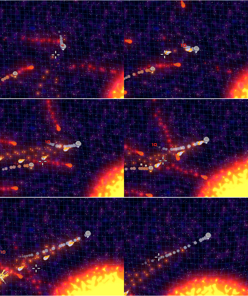
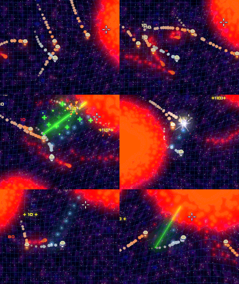
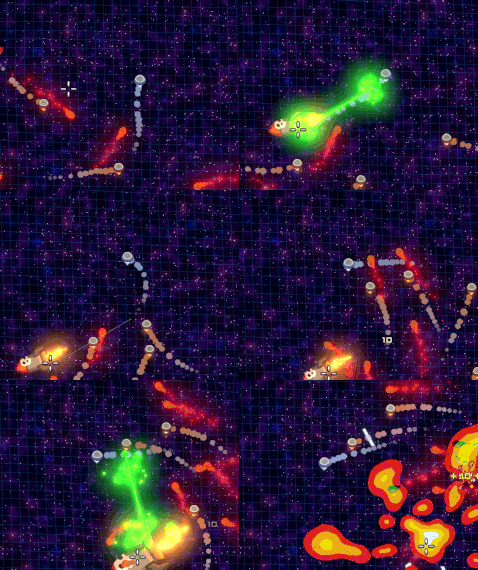
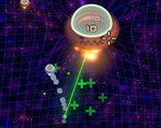
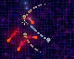
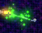
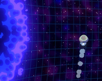
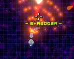
The concept is super cool. I love how the spacetime grid warps as you make planets bigger and smaller, and it shows how the gravity affects you and other things. Genuinely a sick concept.
I do wish there was a tutorial however. I wish that the planets and stars could stay big as well, I felt like they would shrink immediately as soon as I made them grow. I also wish I could hold down my fire button instead of having to spam it too. I wish the camera was a bit more zoomed out so I could see more, the UI takes up too much of the screen. The controls felt very slick and jank as well unfortunately. With some polish, this could become a sick game.
YOOOO
the graphic was soo sickk xD
This game was sick, it took me a minute to understand how the growing and shrinking ray worked, it may be good to have a screen that explains the controls. Anyway once I figured it out it felt very good to grow planets and stars to suck in enemies. Very cool idea. I loved the art style, especially the retro looking control panels along the sides and also the space fabric grid in the background to make the gravity mechanic more intuitive. Nice job
Thank you! We over scoped a little XD.