Play game
Bun-Rooms's itch.io pageResults
| Criteria | Rank | Score* | Raw Score |
| Style | #1368 | 3.706 | 3.846 |
| Overall | #2363 | 3.212 | 3.333 |
| Creativity | #3077 | 3.113 | 3.231 |
| Enjoyment | #3174 | 2.817 | 2.923 |
Ranked from 13 ratings. Score is adjusted from raw score by the median number of ratings per game in the jam.
How does your game fit the theme?
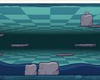
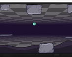
You move around different rocks to build and scale your route to victory.
Development Time
48 hours
Leave a comment
Log in with itch.io to leave a comment.


Comments
really cute! enjoyable puzzle game, clever gimmick with the parallel rooms. I did notice some struggles with scale- pushing the parallel rock a certain amount often did not move the other one remotely the same amount, which could be frustrating.
True, I myself struggled too at times. The thing is I didn't have time to patch things out xD
Hey!
Lovely little puzzle game with cute art!
Sometimes it was hard to figure out which rock I am actually pushing while on the flipside - maybe colorcoding them would help a little?
Good entry, Good job!
Really cute and creative, but if there's one thing I think would relieve a lot of the sometimes frustrating trial and error bits could be more clear indicators of which blocks are counterparts to one another, perhaps just marking them with the same symbol or adjusting their colours in-engine the same way, perhaps both.
Possibly having a view into the other room while pushing the blocks would help too, I know that there are surprisingly simple ways to do that in most of the major engines.
Hi, yes this is something planned for a future release since I received this criticism a lot (don't worry, not mad ^^)
it is simple to implement, I was actually debating to add a sneak-peek mode that shows you a mini view of the other room, tho that would only be desktop exclusive due to the way I want to add it! :D
very cute art style, gameplay tricks are quite cleverly implemented.
Thank you :D
A cute game, stylistically very pretty! Would've liked if the rocks that correspond with one another had a marking of sort, so that you wouldn't have to switch between the two rooms after every little move until you realize that the rock you were looking at was the wrong one. Super pretty though!
Thank! And I appreciate the criticism too, this is something a friend of mine pointed out too. I am planning to hopefully work on it after the vote time ends and release a more polished and less confusing version with more levels, etc..