Play Wild West
High Time Showdown's itch.io pageResults
Criteria | Rank | Score* | Raw Score |
Style | #2867 | 3.113 | 3.231 |
Creativity | #3077 | 3.113 | 3.231 |
Overall | #3473 | 2.891 | 3.000 |
Enjoyment | #4315 | 2.446 | 2.538 |
Ranked from 13 ratings. Score is adjusted from raw score by the median number of ratings per game in the jam.
How does your game fit the theme?
The cards have fit each tile, i.e. their scale has to be the same in order to be played.
Development Time
96 hours
Leave a comment
Log in with itch.io to leave a comment.
Comments
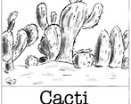
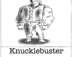
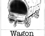
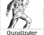
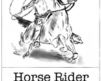
Like the others, I'm basically unable to see anything on the cards because of the resolution and the lack of fullscreen. (You can maybe try to enable the fullscreen button under Embed options>Frame options in the edit game screen?) Ergo, I had to figure out what each vague shape was by comparing them to the cards shown in the description.
Nonetheless, I could sort of play this, so here's my thoughts:
I like the concept, and the art is great when you can see it. The gameplay feels like it's missing something though; all the pieces seem to do basically the same thing better or worse. E.g. having a fast guy that does less damage is worse in every way to having a slow guy that does a lot of damage, because being slow has no advantage. (This could potentially be mitigated a bit by having "build" times and having some be faster or slower there?) Also, the wagon that blocks enemies' paths doesn't seem all that useful either, since it doesn't seem like there are ranged units? I'd have imaged the gunslinger is ranged, but I never managed to get someone who shoots from a distance, i.e. over the wagon (though it's entirely possible that I never placed a gunslinger because I couldn't see which one was it).
Anyway, cool concept, maybe needs a bit of work on the balancing between the different cards/tiles.
Hi! Thank you for your valuable feedback. I really appreciate your long comments, especially the "build" time idea. You're right to add more variations and specialties to the cards, but sadly we couldn't put in all those contents within the game jam period. We will definitely expand and juice up the game later on. Thanks!
I think the game's design is very well put together and overall it's a great game. However I agree with someone who commented here earlier about the 'resolution'. It's actually quite hard to read the cards!
Creative ideas and I like the artstyle, but the cards are really hard to read on the resolution and I'm not sure the enemies are visible? It's a little hard to see what's happening/what I'm fighting.
Thank you so much for your feedback! We are also trying to fix the resolution issue, but we couldn't figure it out. Do you have any suggestions? Thanks (Your game is awesome too!)