Play game
DICE INSIDE's itch.io pageResults
| Criteria | Rank | Score* | Raw Score |
| Creativity | #1050 | 3.500 | 3.500 |
| Presentation | #1383 | 3.450 | 3.450 |
| Overall | #1659 | 3.167 | 3.167 |
| Enjoyment | #2813 | 2.550 | 2.550 |
Ranked from 20 ratings. Score is adjusted from raw score by the median number of ratings per game in the jam.
How does your game fit the theme?
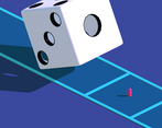
The main goal is to avoid the rolling dices by entering their holes
Did your team create the vast majority of the art during the 48 hours?
Yes
We created the vast majority of the art during the game jam
Did your team create the vast majority of the music during the 48 hours?
No
We used pre-existing audio
Leave a comment
Log in with itch.io to leave a comment.


Comments
In this post-mortem you will find a short development log for the game, the tools I used, and what I learned while making this game.
https://curiositypath.notion.site/DICE-INSIDE-GMTK-Game-Jam-2022-post-mortem-d5d...
It's a very cool concept, thoug I feel what holds it back most is missing visual feedback and the controls. Most isometric games I do play use the up button for top-right movement, so the top-left movement feels off to me. Also I feel that the shadows, could have been used more to indicate where the die itself is in the space. Right now I find it difficult to gage where the die is flipping over from, so I die (haha) a lot of times to not being able to determine the position of the dice and myself in space. Aside from that I think it's a good start for a arcady game.
This game is tricky to play, but I liked the minimalistic design and the music choice. Also there is something magnetic about the giant cube and a tiny character.
Thanks for playing my game and for the feedback :)
In terms of design, for example, the colors of the main menu doesn't match with the game color as I designed the menu really early in development with no plans to change it, i just wanted a funtional menu, thats why i used neutral colors (black and white). This saved me time.
Another detail that improve the aesthetic ingame was to add a really gentle purple directional light, which gives a soft mood to the entire scene.
Cheers
Suuper fun and addicting game !! I found myself playing this one for a while and a well polished game too :)) Good stuff overall :D
Thank you for playing my game and for the feedback!
Glad you liked it. I will upload a patch that will improve the experience, making the game less frustrating. As It's my very first game there is a LOT of things to polish.
Cheers :)
The game is just a gray screen for me :( and after a while I get hit with a game over screen. I wish I could've tried it
Ouch... sorry to hear that... have you tried in another browser?
I wish have an executable version (downloadable) but it is not possible as uploading files is locked.
It's my first game jam and I have learnt from mistakes for the next one :D
Cheers
Nice minimalist aesthetic. more juicy effect could be great.
Glad you like the aesthetic and thank you for playing my game :)
I don't really understand what do you mean with more juicy effect, can you explain to me? I will take note for my next game!
By 'more juicy', i mean to add some effects and polish to your game. For example : some screen shake when the dice is landing. :)
Alright all clear, that would be an interesting feature, I take note for a next patch ;)
Nice concept, and I think the minimalistic aesthetic you have going is quite strong (I also like the shader where the player outline shows when inside the object). I do think it's quite difficult as the first dice lands perfectly in the square you can move around in, which makes sense, but other dice don't land in the square perfectly so it becomes really hard to get the position right, especially with a fixed perspective. If you want to keep it that way, maybe having the sun shadow position be different so the holes you need to stand in become nice and visible, a la the gameshow Hole in the Wall?
Thanks for playing my game and really thank you for the positive comment and feedback it helps a lot!
I played with the idea of the sun proyecting a dice's shadow where you can see the holes more clear, but It didn't work like I expected (pic attached). And on the other hand, the dice don't land perfectly in the player's square as I would be so easier as you only have to memorize two "safe spots".
Cheers :)
Top marks for creativity and presentation. I would only change the source of difficulty coming from the random placement of the dice, I'd let them be consistent in their position. Instead, I would make the speed ramp up. The speed may be ramping up, but I could not survive long enough to experience it. Great game!
Aw.. Im really glad that you like the idea and presentation.
The random placement of the dice was a feature that I added as if the dice lands perfectly in the player's square I would be so easier as you only have to memorize two "safe spots". And yep, the speed is increased every dice that the player avoids.
PD: I added an additional camera and makes the game more enjoyable but the game jam has finished.
Thank you for playing my game :)
the only complaint i would make would be to have the dice land pefectly in the square. it seems with some cubes they do ad others they dont.
First, thank you for play my game :)
And second, the dice don't land perfectly in the player's square as I would be so easier as you only have to memorize two "safe spots".
Cheers
Nice game! It's just pretty hard to judge exactly where the holes are going to land. Sick overall.
Glad you like the game, and thank you for playing it!
You are absolutely right, its too hard and frustrating as isometric view complicates the prediction of where the dice is landing. I fixed that hours later when the game jam was already closed, simply adding an additional camera near the player. I'm a bit sad as It would be more enjoyable game with this little fix but well... I have learnt a lot of things for the next game jam :)
Cheers