Play game
Robot Thrown Away's itch.io pageResults
| Criteria | Rank | Score* | Raw Score |
| Graphics | #50 | 2.394 | 3.167 |
| Audio | #53 | 1.890 | 2.500 |
| Theme | #55 | 2.016 | 2.667 |
| Fun | #57 | 1.764 | 2.333 |
| Originality | #60 | 1.890 | 2.500 |
| Overall | #60 | 1.800 | 2.381 |
| Accessibility | #64 | 1.512 | 2.000 |
| Controls | #70 | 1.134 | 1.500 |
Ranked from 6 ratings. Score is adjusted from raw score by the median number of ratings per game in the jam.
Godot Version
3.3.2
Wildcards Used
N/A
Game Description
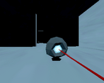
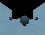
A PS1-style short game where you shoot guard robots as a robot to escape a building.
Source
No
Discord Username
The Mango Effect
Participation level (GWJ only)
my first time participating
Participation level across all jams
this is my first jam
Leave a comment
Log in with itch.io to leave a comment.


Comments
I really like the graphic style but not the controls of the good old days. It was hard to aim.
Thanks for the feedback!
This game has an interesting concept, but I would agree with Lazarwolfe. In order to aim directly at an enemy you have to move your character in such a way that the character's body blocks your view of the enemy you are shooting. You could probably fix this just by moving the camera up a little, so that the player character isn't in the center of the screen, and you can see past him
Another thing that could use improvement is the feedback. Sound effects add a lot to the experience you have in a game. I would recommend adding a sound for when an enemy is destroyed, when the player is moving, and when an enemy spots the player.
The game's retro shader is good, but there just isn't very much to look at. Having a few simple decorations on the walls or the floors would make things better.
One last suggestion. It would make things more interesting if a few of the enemies moved back and forth, or looked around while they were idle. This way, the player would have to carefully time when they attack.
This game has potential! Thanks for submitting it!
Thanks for the feedback!
I really liked the low res aesthetic of the game.
I think that I see the way that aiming is intended to work, however, having the player character blocking such a big portion of very relevant screen real estate made it extremely hard to aim at the enemies.
Maybe a couple of shaders that show both the outline of enemies once the player character is overlapping them from the viewport and a little dot signaling the crosshairs, or raising the camera enough so that we could see the contact point of the laser would make drastic improvements to the game.
Thanks for the feedback!
I liked the pixelated post-process/shader for the viewport. I found the controls were bit hard to use. I couldn't aim where I wanted to as it kept snapping to 90 degrees. I would have liked the camera to be higher up as behind the player while aiming was impossible to see my target. Congrats on your submission.
Thanks! Yeah i defo could have done a few things better, thanks for the feedback!
Cool music and awesome visual aesthetic. Funky controls, though - I enjoyed it.
Thanks!