Play game
Buying Light's itch.io pageResults
| Criteria | Rank | Score* | Raw Score |
| Audio | #62 | 2.739 | 3.000 |
| Accessibility | #65 | 2.465 | 2.700 |
| Originality | #77 | 2.921 | 3.200 |
| Overall | #91 | 2.387 | 2.614 |
| Graphics | #98 | 2.465 | 2.700 |
| Controls | #98 | 2.008 | 2.200 |
| Theme | #99 | 2.465 | 2.700 |
| Fun | #100 | 1.643 | 1.800 |
Ranked from 10 ratings. Score is adjusted from raw score by the median number of ratings per game in the jam.
Godot Version
3.5.2.stable
Wildcards Used
N/A
Game Description
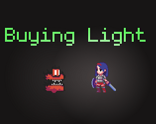
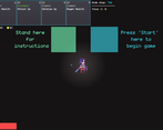
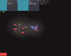
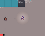
This is an action survival game where the goal is to make it up as many floors as possible. Each floor possesses tougher enemies, but along the way you can pick up upgrades in the shop that can be rolled for. In addition, this shop is also where you can buy light that will illuminate random areas of the map. If the exit is found you have the choice of either going to it and leaving, or sticking around the floor.
How does your game tie into the theme?
My game fits into the theme by having some enemies that are dependent on light to sometimes be seen, as well as there is an exit that can only be found by illuminating light onto it. All characters and enemies also implicitely has light around them.
Source(s)
https://github.com/Bmoel/GodotWild-Illumination
Discord Username(s)
N/A
Participation Level (GWJ Only)
1
Leave a comment
Log in with itch.io to leave a comment.


Comments
This is a gauntlet-style horde game. Can't say I've seen a lot of these this jam.
The mechanics appear to be implemented well, but the polish is lacking. This is likely a solo dev using asset packs.
I can tell when Navigation Agent is being used. Though there's not much else for it to do in this case, this is a reminder that it's not a smart tool.
I get the feeling that this is a dev in the unfortunate position of being in a jam by their lonesome self. Hopefully, we see you back in January, and if you do come back, hop on the Discord and try to find a team for yourself. Your skills will be elevated in that environment.
You’re not wrong lol, I do enjoy making stuff solo but having teammates would definitely be nice, I’ll have to check the discord out. Thanks for playing!
I really liked how you handled the shop, buying and rerolling was super fun, and spending money to progress/find the next floor is smart. The game could definitely benefit from environmental art, would love to see cool levels.
Thank you! Agree on the art and more level variety, those definitely fell lower on the priority side but I would love to implement those sometime.
The resolution made the game pretty hard to play. The sword attack was a bit too sluggish, it was hard to time it to get the attacks to hit just right. Thank you for submitting!
Thanks for the feedback! Definitely a learning experience about the sword and resolution yeah, will keep that in mind in the future
Wow the art and animations in this looked very good! I also really enjoyed the credits :D Cool game!
thanks! Glad you liked the credits (:
The initial size of the game in the web build is hard to work with, because it's pretty huge. I normally try to keep mine at or under 1280x720, a really standard game size. I had a lot of trouble also figuring out how to play the game ultimately - my sword attacks or whatever never seemed to hit anything, and I just got pummeled to death very slowly. Overall, it looked very interesting and I'd play it again with some resolution fixes and some more direction on how to actually play it. I did really like the directional indicators, that was very useful, since there was no real background.
thanks! Appreciate the feedback, I’ll keep the resolution in mind in the future that makes a lot of sense. The sword was also something I kept bouncing back and forth on, I actually increased the hitbox right before submitting thankfully but sounds like I should have done it more