Play game
Hysteria's itch.io pageResults
| Criteria | Rank | Score* | Raw Score |
| Graphics | #6 | 4.225 | 4.385 |
| Historical Accuracy | #17 | 3.929 | 4.077 |
| Audio | #26 | 3.187 | 3.308 |
| Overall | #41 | 3.187 | 3.308 |
| Gameplay | #42 | 2.817 | 2.923 |
| Thematic Relevancy | #46 | 3.632 | 3.769 |
Ranked from 13 ratings. Score is adjusted from raw score by the median number of ratings per game in the jam.
On what countries' history is the game based ?
United States
Put anything you want to be immediately visible on your jam page here:
Based on the Salem witch trials in the 17th century. We explore the possible defense of a person accused to be a witch. You take on the role of an attorney tasked to prove the innocence of a witch.
Credit the makers of any assets you used below:
All assets made by members of our team. Used FMOD studio for sound management and Unity for game development.
Leave a comment
Log in with itch.io to leave a comment.



Comments
Stunning looking game! I adore this type of graphics and you've made a great job here.
To begin with I need to repeat what others have said about the font, it would've been okay with a few elements perhaps but since reading is a main thing in this game, I felt I missed a lot because I simply didn't get a flow in reading.
Took me a while to figure out first how I read the papers at all and spent an even longer time to find out how I was suposed to put stuff back. But when I had found both of these I enjoyed it a lot. I don't know why, but the first play-test, before I knew about the cards and the fact the pages were readable - I accidentally gave the orders to the pigeon and got the "Innocent" screen. xD
Other than that, what you've really nailed is the feel and the theme of the game. I spent quite some time just looking at it. The package is inspiring and I would love to see an extension for this game.
So good! :)
Thank you so much for your perseverance 🙌
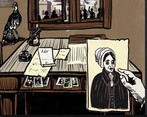
The art style is based on woodcut printing And was a lot of fun to draw.
You are totally right with that the fonts is entirely illegible 😂 I made it based on some calligraphy of the era
We would have loved to have implemented a tutorial - next time!
I adore the graphics and style, and also found the sound design and gameplay creative and interesting. However, it was a bit tough to understand, and the font in the instructions manual was very hard to read, which probably made the understanding part a lot harder.
Overall though, well done! :)
thank you so much for trying our game - I made the font for the jam based on some 16th century calligraphy and just didn’t have enough time to implement anything more legible 😅
I agree that our sound design is amazing so huge shout out to Colin 🥳
Awesome art! One can see in so many details how much dedication went into this.
What makes it hard for me to play your game is the typography your were choosing for your texts. Having so much text to read, I would prefer an easy to read font. I can understand the motivation of using a hand-written look, though.
Nevertheless a nice game that for me shines with its consistent, atmospheric art style!
Thank you so much for trying to get through the game!
I made the fonts for the jam based on the style of the calligraphy of Edward Cocker and if we decide to go anywhere with we will definitely address The fact that no one can actually read it 😂😂😂 style over substance!
The art is really amazing! I enjoyed the mechanic of searching through papers to decide what to do. Really cool game, Congrats!
Thank you for playing! I based the art style off woodcuts printing and it was heaps of fun
Like the game, it's pretty, the sounds and musics are really good, and it was fun
thank you for playing 😻