Play game
Sundered Helix's itch.io pageResults
| Criteria | Rank | Score* | Raw Score |
| Fun | #8 | 3.333 | 3.333 |
| Overall | #9 | 3.333 | 3.333 |
| Sound/Audio | #14 | 2.833 | 2.833 |
| Visuals(Graphics) | #16 | 2.833 | 2.833 |
| User Interface (UI/UX) | #18 | 2.333 | 2.333 |
Ranked from 6 ratings. Score is adjusted from raw score by the median number of ratings per game in the jam.
DevLog Link
https://cv33games.itch.io/sundered-helix/devlog/570037/sundered-helix-devlog-2
Leave a comment
Log in with itch.io to leave a comment.


Comments
Hello there!
The game has a great potential, really. But of course it has a ways to improve.
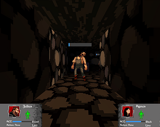
First, in my own opinion, graphics can be made better - these walls with a HUGE squares (pixels) does not look good, and a grey rectangle as a "chest" obviously needed to be drawn as a chest. Next, the font is decorative but very hard readable. Many of HUD elements are too small, and some item icons (Longbow, Mace, Arrows) are missing. And last, adding some animations for movement will be just great.
I would like to recommend to play/watch "Shining In The Darkness", a great 16-bit dungeon crawler released for Sega Mega Drive 2 in 90s, so you will see the clear idea of what Your game would like to be. I really would love to see something similar in "Sundered Helix" in future builds. Keep Up the Great Work!
Thanks for trying it out! I'm glad to hear you liked it.
I will have to check out Shining in the Darkness at some point soon.
Hey CV33 👋,
I enjoyed playing Sundered Helix.
What Stood Out:
Exploration:
The twists and turns, unlockable doors, breakable tiles, provided a means of exploring the world you've created in a way that didn't feel forced.
Art Style:
The sprites look good, and blend well with the tile sets of the world.
Team Play:
I'm a big fan of team play, and being able to watch the team members level up and grow stronger (although I'm not sure how they got stronger, but they were leveling up ^^) was fun.
Feedback:
Team Selection UI:
As others have already mentioned that first team selection screen can be overwhelming, until the stats, that you'd use to determine which members to pick are explained, it becomes difficult to understand what I'm looking at. At the end I just went with the recommendation of choosing a row.
I'd suggest splitting up this process:
1. Base stats
2. Secondary / Specialized Stats
3. Portrait and Name Customization
This might help with the pacing of information.
Trader UI / Tooltips:
I appreciated the tooltips when hovering over items in the inventory, however, upon checking the traders goods I noticed that some of the items (chest armor for example) didn't have a tool tip other than showing the price. So I was unsure of the benefits the item would bring.
Screen Resolution:
3440 x 1440 p prevents me from seeing the close and confirm buttons, I first thought I was stuck on the into lore screen, and tried installing other builds to make sure it wasn't build specific, I then later realized, upon messing with the settings, that elements are out of view in 3440 x 1440 p.
I like this game, and it has a lot of potential, keep it up 👏 !
Thanks for playing! I'm glad you like it!
I guess it never crossed my mind to actually explain what happens when your characters level up, lol. They just get more max heath and if they have magic they get more MP too. The skills level on their own as you use them and each rank provides benefits based on what skill it is. For now, just a flat bonus. Later on, well we will see about that.
I'm planning on a big re-work to the team selection in the near-ish future. I want to give the player the option of either using a premade character or creating custom members (or a mix of both). There's a few things that I need to work on in the game before I can get to that though. The advice on splitting it up is great for helping me organize the process though.
Thanks for letting me know about the trade menu not giving you all the info you need. Most of my tests involve teleporting myself to a WIP dungeon level or focusing on a single mechanic and its been a while since I did a full playthrough and checked over everything.
Thanks for letting me know the issue with your resolution, I will have to look in a fix for that.
This is a cool dungeon crawler, and the second game in this jam that has given me Daggerfall vibes. It is cool to see that style coming back in some indie games! Gameplay was solid as well, seems like a well made tabletop style rpg with graphics. I think one of the gold pickup icons glitched and just showed on my screen for the rest of the time playing but I was still able to click and interact with things so it wasn't game breaking for me.
I would personally love to have a little village to run around in during the town sequences, maybe with different shop keepers or quest givers that could add additional objectives during the dungeon crawls. It was pretty fun just running through dungeons and trying to keep the party kitted out either way so for sure off to a great start, I'm not sure if this is more of a quick jam game or something you were intending to build up a bit.
Fun game though, nice job.
Thanks for the feedback I am glad you had fun! I had recently recovered from a Daggerfall addiction shortly before I first started the project, lol.
I noticed that icon glitch that happens sometimes when you first open a chest. It is not always gold, but it is the first item that spawns in the chest. I haven't been able to figure out more than that to fix it and I only discovered it a few hours before this jam was ending. I think I might have broken something because it never happened in previous versions.
Right now, I am just planning on developing the game until I feel it is 'done'. I don't know if that is going to include a town you can walk around or not, but I have been thinking about it actually.
I have mixed feelings about this one, but I'll come back to that at the end. I never played the original version of this and kind of went in blind.
I found the character selection menu intimidating and confusing, and there were some visual bugs with different font sizes in different cards. I also found the loading screen with the story-so-far nearly unreadable. The UI is just too big when made fullscreen on a big monitor- it feels like it's sized for a much smaller window- and the font is stylish but hard to read.
The aesthetic of the game itself, on the other hand, is very nice and pulled me in immediately. It's retro styled and even has some nice touches like the way the pixels blend together. The subtle lighting of the dungeon is great.
Combat is... once I figured out how it worked I liked the concept but it took me a while to get there. It's not clear what the blue bar above the enemy means; the colour suggests it works like the characters' ACT bar but it seems to be a backwards health bar. It wasn't clear at first why characters weren't attacking when attacks were selected; there isn't clear feedback when characters are attacking on their turn (or when they're taking damage, for that matter).
I finished the dungeon and got out into the town. Trading seemed to be bugged or not implemented; I selected an item but couldn't do anything with it. I don't think I had any money; if there was loot in the dungeon I didn't find it. And then I accidentally quit to the main menu; it's way too easy to choose that option by accident.
This game probably isn't for me but it's hard to separate out what I don't like from what's a real flaw. I'm not really into games that are visibly numbers-driven, which I think is what is meant to be part of this game's appeal. It also definitely feels like an experience that you need to sit down and take your time with, and I just didn't this time around. I think the UX in the menus could be better and the combat could be improved, but that's all I really feel confident in saying. I did like the look of the game and I feel there's merit in some of the concepts even if it isn't really my thing.
Thanks for trying out the game even if its not the kind of game you would normally play. It is geared more towards the numbers driven side of RPGs.
UI/UX is something I struggle with the most of the things that I worked on, thanks for the feedback on that as it will help me further refine it. I'll send a message to the artist to let him know you liked the aesthetic, if he hasn't seen this already.
The trading was implemented, but the chests in the dungeon are still using a placeholder sprite so they don't really look like chests. You start with no money in the game so if you don't click on the chests that don't at all look like chests then you are just broke in game lol.
Hi. This was nice. I enjoyed playing it. Although a bug prevented a chest to close and I had to quit the game losing my progress :-(
Given time and polishing, it may become really good. I do not know if you plan on continuing, or what exactly you have in mind, but you might want to include some minor tweaks like: the buttons remain pressed for example even if the mouse moves away, when in town to train, it says zero funds, although when trading it shows the funds and they increase/decrease. I also suspect you plan to include graphics for the missing items :-)
It was not clear at the beginning that when opening a chest you could switch between the party characters and actually move stuff from one another, but it is a great feature and the inventory system is pretty neat. Observation: When you move an item to equip it, it goes behind the slot until you place it in it, losing the item visibility for a while.
Thanks! I'm glad you had fun. So the close button wasn't working when in the chest inventory? I had that bug once and thought I fixed it. Thanks for letting me know its still occurring.
For the foreseeable future I am planning to keep going on the game. Alternating between focusing updates on polish and focusing on expanding what is there.
I've noticed the items disappearing behind grids and slots, but there always seems to be something else that I need to fix first so I just never sat down and focused on figuring out how to fix it yet.