Play game
Epsilon Indi's itch.io pageResults
Criteria | Rank | Score* | Raw Score |
Visuals(Graphics) | #7 | 3.833 | 3.833 |
Overall | #8 | 3.500 | 3.500 |
Fun | #9 | 3.500 | 3.500 |
Sound/Audio | #13 | 2.667 | 2.667 |
User Interface (UI/UX) | #23 | 1.833 | 1.833 |
Ranked from 6 ratings. Score is adjusted from raw score by the median number of ratings per game in the jam.
DevLog Link
https://crashdumpsoftware.itch.io/epsilon-indi/devlog/675138/models-map-and-fog-of-war
Developer Feedback Questions
Are the controls intuitive enough, or do I need a tutorial? What do you think about the graphics? Is it fun? Do you think it could become fun when extended with different units & resources?
Leave a comment
Log in with itch.io to leave a comment.
Comments
Are the controls intuitive enough, or do I need a tutorial? I think just having some basic information pop up in a tooltip would go a long way to helping new players understand what different structures and units do at a glance.
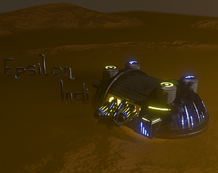
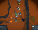
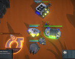
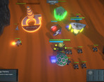
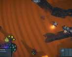
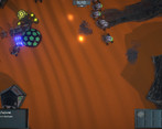
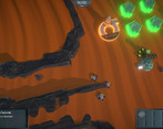
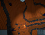
What do you think about the graphics? I like them! The give me an old school late 90s vibe.
Is it fun? Do you think it could become fun when extended with different units & resources? I enjoyed it, I found myself going back again a few times to try another strategy or build combo, so I think you have a good foundation. I think different units and resources could be used to add more tactical complexity, but another option could be to mix in building upgrades as well. That way I could start to specialize things from my original rail gun buggy factories, maybe upgrade one to build faster units and upgrade a second to build stronger units, etc.
Other Stuff
I think you have a great start to your game.
Great start to a game! Keep it up~ Please check out my game when you have time :D
Good work on the entry! Small disclaimer, I do not play RTS usually so feel free to discard anything that does not make sense from me lol. Best of luck working on this game further!
Feedback:
Are the controls intuitive enough, or do I need a tutorial?
What do you think about the graphics? Is it fun?
Do you think it could become fun when extended with different units & resources?
Many thanks for your feedback! Great that you gave it a try. I will definitely work on the things you mentioned!
> Are the controls intuitive enough, or do I need a tutorial?
The controls were intuitive enough for me. A tutorial would have been nice for guiding my first steps, though. When looking at a game for the first time, there are really a lot of questions. Some things are already going on (drones going back and forth) there are some dark, glowing thingies. Some numbers are shown. But what am I supposed to do first? (I figured out, don't worry. but this is what I had in mind in the beginning).
> What do you think about the graphics?
For the stage your game is currently in, graphics are totally okay. I think more important right now is getting the main game loop straight, adding more variety, finding out what can make your game special etc. For the mid-stage, graphics need a boost in my oppinion. I can see really strong visual connections to either the game Kenshi (Border Zone or The Great Desert in particular) or Dune Spice Wars - these would be the games I would have a very close look when it comes to lightning, terrain generation, environment transitions, colors, shapes etc.
> Is it fun? Do you think it could become fun when extended with different units & resources?
I am not a particular fan of RTS - it is tressing me a lot :-D But I like passive game mechanics/unit control like you implement it in your game. I played&enjoyed Banished a lot, also Oxygen Not Included and just lately discovered Against The Storm which has brilliant mechnics and a perfect, butter-smooth game flow. Not sure if these references can help you, though.
I wish you good luck with your next steps, and the endurance to carry on. A good start has been made.
Many thanks for testing it out. That is really useful feedback ... I will check out those games you mentioned.
I could have used a really short tutorial, or tooltips explaining what each thing does. Could use some UI/audio feedback when selecting stuff or building new things. The graphics style is OK, could use some filling out of the world, but I think its a good direction to go in. It was pretty fun! I thought I was going to easily destroy the AI with a couple early attack vehicles, but they focused more on economy and came back to beat me instead. Having more unit variety, or some upgrades to specialize, would have a huge impact I think.
I mostly liked the map, except for the 'lane' in the center, made it feel a bit too much like a straight tug of war vs the AI. Having some different paths would be good. It might be out of the scope and possibly something you don't want to do in this game, but I thought it would be cool to give general directions to your units, like 'Patrol' or 'Defend', can give you some control while still keeping it relatively hands off.
Overall I liked it, I think with some more work it could become a really cool game! Good work!
That is very useful input. Thank you! I will work on the UI and add some tooltips to address the issues you found. Having a less "straight forward" map sounds also like a good Idea. Maybe I add a second map that is less straight than the first one. For the commands for the units: I will keep that in mind, but for now I will stay with the complete "indirect" concept. But if I fail to add strategic depth by adding more units, buildings and better maps - this may become an option. Many thanks to you!
The game was really fun once I got a hang of it. The controls are intuitive to someone who has played RTS games for sure. Maybe have some in game text with the same information as the itch game page. I know that you are working on updating the UI, the current one is a little hard to see, especially when there are dark game models (like the walls or dark alloy) behind the texts. Sometimes I couldn't tell why I can't build a building at a location (maybe due to the slope), a little more feedback would be nice. Another improvement could be to provide a visual feedback when a game is selected. Maybe having a queue of building a few units in the could also be nice as I would not have to keep clicking back to my buildings too see if the units has finished building and I have to start a new one. Overall loved the game as an old school RTS game enjoyer, but too old to micro units :P
I think extension with new units would be great. I'm excited to play this more in the future.
Many thanks for the detailed feedback. Some of your points I did not have on my list, but I will put them on it! It is really good to get feeback from someone else - after testing the same things over and over again I developed some blind spots.