Play project
Shrink 'n' Stretch's itch.io pageResults
| Criteria | Rank | Score* | Raw Score |
| Overall | #10 | 3.000 | 3.000 |
| Visuals(Graphics) | #12 | 3.000 | 3.000 |
| Fun | #13 | 2.667 | 2.667 |
| Sound/Audio | #14 | 2.667 | 2.667 |
| User Interface (UI/UX) | #17 | 2.333 | 2.333 |
Ranked from 6 ratings. Score is adjusted from raw score by the median number of ratings per game in the jam.
DevLog Link
https://plide.itch.io/shrink-n-stretch/devlog/363850/improve-my-game-jam-20-shrink-n-stretch
Leave a comment
Log in with itch.io to leave a comment.


Comments
you joined this one
What did I join?
Cool little game, I like how the tables throw bottles at you. I like the game mechanic of shrinking objects in a puzzle. I do find the enemies a bit hard to deal with, since the direction of the player's attacks are in tiles. But overall I enjoyed it!
This was pretty cool, kinda felt like an old Crash Bandicoot or Spyro game with the colors, music and floating maps. I admit the last couple puzzles confused me at first but I finally figured them out after a few tries. It helped that the game is pretty generous with the checkpoints.
The mechanics are simple but you made good use of them as both weapons and puzzle solving tools. The regular enemies weren't all that thrilling and I found it kinda hard to avoid getting hit on the one level with a lot of chairs. But I was able to get around that by luring the enemies to fall off the map by the ramp.
The boss was nice, first trying to maneuver around this slow-moving behemoth and then in the later stages dodging a tiny fast moving object that could do more charge attacks. It was definitely tense and the difficulty scaled quite well I think.
I think a way to change the camera position might help in some areas, or atleast a way for the camera to see through geometry between the camera and player.
Overall I enjoyed it, good work!
Thanks for your feedback. I am glad the style reminds you of Crash Bandicoot and Spyro, because I was going for an ps1/n64 style actually. I was lazy with the enemies though. I had plans to make another enemy that was a wizard that moved away and shot projectiles, but I ended up scrapping that idea because I put them far back in the development plan, and by the time I got around to them, there was only one day left. On the original release, I had a bunch of build errors delaying the release, so I got anxious about that happening again with the second release.
Earlier on in development, I experimented with the ability to move the camera, but I couldn't figure out any intuitive buttons to map it to on keyboard, and imagined some people accidentally pressing 1/2 (what camera was mapped to) and spinning the camera to a terrible angle. I also couldn't figure out how to get right-stick input on controller, and I thought using the bumpers for the camera was confusing.
Glad you liked the boss battle! I've always loved bosses that have visible damage outside of HP-bars, and since you use a shrink bolt in the game, I thought it was perfect to make the boss get shrunk more and more, but go faster and faster to make up for it's smaller size. It also doubles as having a boss that gets harder as it goes on. Thank you for playing, and I loved your game too!
For rotating the camera you could perhaps have it switch between four possible angles, and to change angle you can press Q/E on keyboard and LB/RB on controller. To make it a bit less disorienting you could lerp the camera to smoothly rotate rather than immediately jump to the new angle. And you could try setting the timescale to zero while the camera is rotating so nothing can move and kill the player while they're adjusting their view.
Yeah visible damage on enemies is great, much more punchy and visually impressive than a health bar. It was a great reuse of an already implemented and familiar mechanics. And thanks for the kind words lol.
This is great!
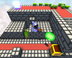
There's some really good puzzle design in here, making full use of the mechanics. I particularly enjoyed the one shown in the screenshot, and the final puzzle before reaching the end boss.
Speaking of - the final boss is fantastic! I found it to be exactly the right level of challenge, and very fun to fight. I thought it was a great touch making it faster as it shrinks, and felt it scaled really well at a pace that kept me under pressure even as I got more familiar with the controls without becoming frustrating. I love the track too, reminds me of OG Crash Bandicoot music.
I found that the regular enemies weren't especially interesting to fight by comparison to the boss, but with most of the game being puzzle based this wasn't a big issue.
Thanks for providing so much detail in your devlog by the way! I love SpryTile, but hadn't heard of Aria Maestosa or the Xiaod Bank Soundfont. I really enjoy playing with Soundfonts in general, so I'll be sure to check it out.
Cool concept for a puzzle game. I really like how the shrinking mechanic works with the platforming.
I'd suggest adding a health system to improve the combat because as of now it is tricky to avoid the enemies and their attacks without constantly returning to the checkpoints. Great job!