Play game
The Bookmaster - Hit the books ! (JAM version)'s itch.io pageResults
Criteria | Rank | Score* | Raw Score |
Overall | #1 | 4.000 | 4.000 |
User Interface (UI/UX) | #1 | 4.333 | 4.333 |
Sound/Audio | #1 | 4.000 | 4.000 |
Fun | #1 | 4.167 | 4.167 |
Visuals(Graphics) | #2 | 4.333 | 4.333 |
Ranked from 6 ratings. Score is adjusted from raw score by the median number of ratings per game in the jam.
DevLog Link
https://arcade-eleven.itch.io/hit-the-books-jam-version/devlog/431160/update-improve-my-game-jam-23
Leave a comment
Log in with itch.io to leave a comment.
Comments
I had fun playing the game and it looks and sound great! I found it a bit too hard because of the short time and many things you have to look for. Maybe playing several rounds that get harder or having multiple characters would be a nice addition.
I really like the addition of the hand for the enemy. It adds more preasure and feels more like playing against an opponent.
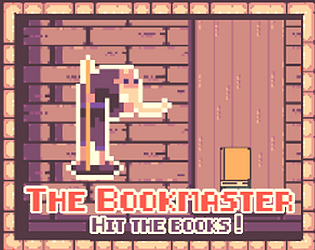
I liked the game, and since I know Bazar Bizarre it was fun to find its game mechanics in a totally different world! Great job on the title screen/introduction, they were probably a lot of work, and work great to make you want to protect the books from the knight :D
If you're planning on expanding the game, I'd really like to see some more characters, with maybe a progression in the difficulty, maybe with two criteria to start with, because I like the challenge of playing with find different criteria but it's good to let your brain get used to each set progressively. Plus, I'd like to meet more characters and learn more about the universe!
Some technical detail, if it doesn't break stuff to allow fullscreen, would you please consider checking that box on the itch page? It would make playing easier on the eyes :)
Thanks for the game!!
Thank you LaChapeliere.
You're right with the introduction, it was actually more work than I expected when I started. I did not track the time, but I'd say around 50% of the time spent. Additional characters and ideas are ready, and they should be added in one of the first patches, if feedbacks on the game continue to be positive.
Fullscreen seems to work, the button has been reactivated. Please note the only difference is that it's displayed on black background, there's some additional work to be done to have real fullscreen.
Again, thank you for the feedback. 👌
Really like the art style of the game. I couldn't beat the knight but had fun trying. I think if the differences were just in the book covers, it'd be better for me as there seemed to be too much info to look at and the bookmarks are not as interesting to look at compared to the artwork on the covers. I like how the colour of the books and pictures on them can change, perhaps the picture could be moved down on some, maybe there could be subtle differences in the pictures rather than completely different. Having the knight picking at the same time was really good and I like how you can lose points for getting them wrong
Thank you for your great feedback !👍
I will take it into account for potential updates. ✍
I like the art and the pressure mounted when the knight told me getting one wrong give HIM a point?! I couldn't let that knight take my books.
Haha, true, true warrior spirit ! 😁