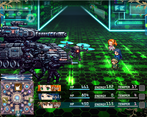
Play game
Starlight Destiny's itch.io pageResults
Criteria | Rank | Score* | Raw Score |
Fun | #7 | 2.828 | 4.000 |
Overall | #9 | 2.828 | 4.000 |
User Interface (UI/UX) | #9 | 2.121 | 3.000 |
Overall | #9 | 2.546 | 3.600 |
Sound/Audio | #10 | 2.828 | 4.000 |
Visuals(Graphics) | #12 | 2.121 | 3.000 |
Ranked from 1 rating. Score is adjusted from raw score by the median number of ratings per game in the jam.
DevLog Link
https://braveking.itch.io/starlight-destiny/devlog/810323/version-046-release
Developer Feedback Questions
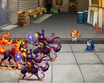
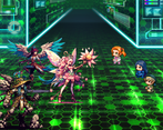
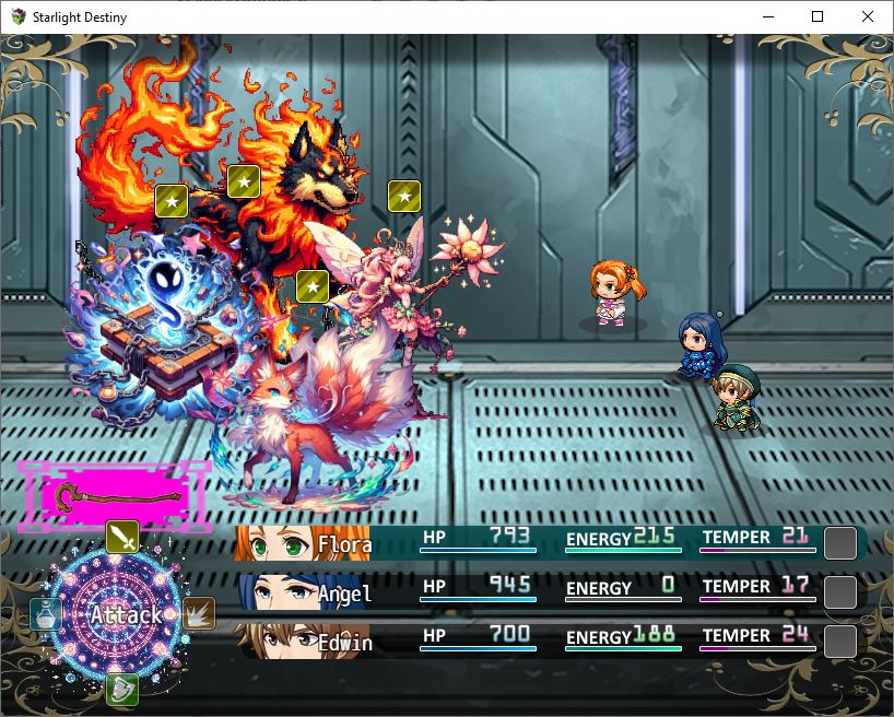
How does the new battle UI looks?
Leave a comment
Log in with itch.io to leave a comment.
Comments
So I tested the game, in my "don't capture any digimon" run. I reached the space sector and played a little there.
Some random thoughts so I can say I did my job 🧚:
-I missed the treasure chest with the propaganda AI. If i wasn't a fairy dev who could easily get it back in an hacky way, I would hope there are other ways to get them.
-The more I play this new version, the more I have the impression of playing a persona game trying to guess the weakness of each opposing enemy.
-Storm of feeling doesn't seem to have the same element as Anemos despite the common icons.
-There is no space between Crypto and the amount of money won at the end of the battle, and that troubles me.
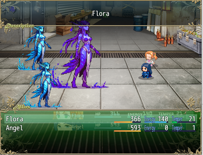
-Space-Flora looks silly on the battleback2 picture.
-Good point on missable stuff since often you can't come back, it's something I had been thinking about and I've got a couple of ideas for that: 1)special shops that sells the unique equipment found in the previous areas and/or 2)a special magic side-dungeon that can always be accessed and where you can find the unique stuff you missed (plus re-battle bosses with buffs and whatnot).
-Ooops, good catch, Anemos elemental type wasn't the correct one, fixed, thanks!
-Will add space there.
-Will tweak those battlebacks too.
I already played this game not very long ago. Since saves are said to be non-compatible, I restarted a game until I got a good feeling of the recent changes listed in the devlog.
I think most if not all the remarks I had during the last feedbackquest are still relevant (except for the bugs I saw were patched), so I won't repeat them here.
What I linked about this game:
-It is still Starlight destiny and there are still fairies there
-It seems like someone found out Moghunter's library and saw the battlehud and battle transition plugins
What I think could be improved upon:
-The ally selection window still use the old UI and doesn't look good compared with the new one
-The newly added screen sprites n the maps look very weird animated as they are right now, I suspect you messed somehing up
-The magic command looks more like a limit break command, I wouldn't be surprised that it would confuse some players
Random thoughts:
-Giving Space-Angel 15 TP each time Space-Flora is hit is quite cute, but it is also a massive buff to Space-Angel who usually struggles to get enough TP to use her skill. I hope you know what you are doing
-I would have centred a little better the command selection picture
Hi, great to see you around one more time!
-Yes guilty to using MOG's plugins to help customize things ><.
-Will check the map screen sprites closer and change the magic command icon.
-Although I may've yet not been able to work on all the remarks you gave last time, I did go around adding icons to the chest reward descriptions, changed the spaceship sprites and increased the respawn timers, with the enemies on later levels where you can go between maps, defeated enemies shouldn't respawn at all until you exit and come back (running away will still make them respawn though).
-Azuli gaining 15 TP when Flor is hit is experimental and will be adjusted as I get a better feel how it works out.
-Centering the UI better, got it.
Thank you very much for your continued help!
Mog's plugins are nice, they are meant to be used. ^^
I will try to test the game a bit more before the end of the jam so I can see all the progress on your third point. 🧚
Seems like you will have to have at Moghunter's documentation a little bit more...
Haha, yes... Changing the UI itself has been a quite new experience for me.