Play game
Verloren's itch.io pageResults
| Criteria | Rank | Score* | Raw Score |
| Sound/Audio | #1 | 4.000 | 4.000 |
| User Interface (UI/UX) | #3 | 4.000 | 4.000 |
| Fun | #3 | 3.667 | 3.667 |
| Overall | #4 | 3.800 | 3.800 |
| Overall | #5 | 3.667 | 3.667 |
| Visuals(Graphics) | #6 | 3.667 | 3.667 |
Ranked from 3 ratings. Score is adjusted from raw score by the median number of ratings per game in the jam.
DevLog Link
https://fortunastreet.itch.io/verloren/devlog/808936/version-71-improve-my-game-jam-update
Developer Feedback Questions
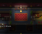
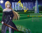
I'm particularly interested in feedback concerning the quality of the writing, the menus' and combats' UI, and the brand new options menu.
Leave a comment
Log in with itch.io to leave a comment.


Comments
Hi again! Since it seems like the latest update for Verloren was about the new UIs and writing, I'll be focusing on that this time, loaded some previous saves and went around talking with NPCs, checking stuff and reading all the menus I could.
Good:
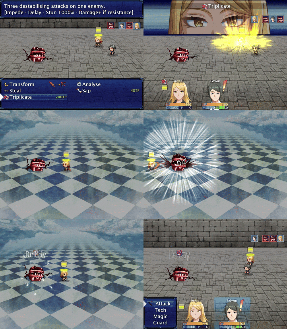
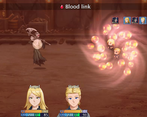
-Really liking the new changing portraits in battle!
-Yay can loop around the main menu to reach the right side faster, thanks!
-Sword cursor is nice too.
Random suggestions:
-Several enemy battlers show up at the center of the screen while the party is at the right, leaving the left side of the battle empty which isn't very aesthetically pleasing.
-Most monsters have long bestiary descriptions filling all the space and describing their main attacks, but a few like the frog have just a couple of lines and no mention of their skills.
-Could we have some way to reset the skill points to relearn skills? I find myself facing decision paralysis on what to learn, in particular when this time I completed the valkyrie bracelet quest, but if I had spent all my skill points then the reward wouldn't be doing much. Or is there already a method for that and I missed it?
Typo:
-Green Bird bestiary entry has "Preperation", shouldn't it be "Preparation"?
Anyway overall more polished than the previous version, very nice work, looking up to what comes next!
-Actually, most enemy groups are like this, with one or two main monsters, with more coming depending of the player's level and knowledge of the monster in an area. So they fit in the centre so the other ones can have some space.
-Monsters with a short description usually have a very simple pattern (like the smile who can either attack or cast flame). But it is true that the frog could get some extra love, as she has two nasty unique techs.
-I have already planned to have guilds where you can reset your skill points in the next city, but it seems to be a bit late. Would you appreciate having such a building earlier, like for example in Alzano?
-I love typos, typos are my favourite.
Thank you for your continued support. 🧚
-Ah, dynamic encounters, nice! May I then suggest that the "first" one to appear is one placed more to the left?
-Guild building to reset skills would be very nice yes, but something like a NPC who resets skills hanging out at the inn would be good enough too (and could be easily copied around each of the early areas).
-You can propose it, but I won't do it. As the rightmost enemy is the one selected by default, I want the "first" monster of the pack (usually the stronger one) to be selected by default, just so the player has to think about their target more. 🧚
-I will add an earlier place to reset skills points in a coming update.
Further feedback:
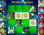
I was delighted to find a small card game: Monstrocards. I’d like to know about it and play more :) Did you design it as a mini-game for Verloren?
-That student wants to speak to Edwin in particular, like his dialogue when Angel is alone suggests.
-100% true, it is just the best Scan animation I ever found.
-It is actually an interesting point; do you think skills that target the user should have a selection at all?
-That's the intended behaviour that almost all rpg use, otherwise it would be a lot of extra code to take into account all party sizes for something not that important.
-I use bigger font size when the character is shouting and smaller font size when a character is whispering. It could be made more clear?
This minigame is inspired a lot by a mini-game in Final Fantasy 8 so I didn't exactly invented it. However, as I coded it all by myself, I also added some unique mechanics so it doesn't feel too much like the original.
Thank you a lot for your suggestions in any case. 🧚
Change Weapon: I would say skip character selection, and just trigger it for the character whose turn it is now.
Font size: Not sure what the standard is. Sometimes I've seen all capitals being used to indicate shouting. Whispering, not so sure.
(This is a partial review… Will spend more time on this.)
Again, game feel is great as always. Lots of stuff going well here, won’t repeat myself from the FQ7 feedback. I’ll focus on points of improvement:
Thanks for your initial thoughts! 🧚
-It isn't that complicated to make the highlight on hover, however such addition would make the selection being changed each time you hover a new possible thing you can click on, so I fear it would be more distracting than helpful.
-You are proposing to add this functionality as an option to the option menu so only those who want it have it?
-Thank you a lot for your suggestions to improve on the dialogues!
-Noted, I will see what I can do
-When you say 'the characters', you mean the player character or all character in general?
-I tried finding a better text colour since last time but I didn't find anything better in the palette , I should probably try to look for another background picture
-I just give a more reactive interface to an unlucky guinea pig, who hated it. Turns out it messed up with the regular keyboard/controller controls. I will have to be extra careful with this one.
-Idle animations are not unheard of in 2d RPG, but they're more like extra touches than actually useful for gameplay. Usually the player is simply at the centre of the screen, and if not, one can just move to see where the player character is. I will still keep the idea as it would indeed be a nice touch to add at some point.