Indie game storeFree gamesFun gamesHorror games
Game developmentAssetsComics
SalesBundles
Jobs
TagsGame Engines
A jam submission

BeexonView game page

A remix of the 1982 arcade game Zaxxon, but with bees!
Submitted by Privnoval016 — 4 days, 8 hours before the deadline
Add to collection

Play game

Beexon's itch.io page

Results

CriteriaRankScore*Raw Score
Visuals#44.1674.167
Sound#43.9173.917
Overall#53.6673.667
Spectator Appeal#53.4173.417
Overall#53.6113.611
Engagement#83.4173.417
Ease of Learning#133.0833.083

Ranked from 12 ratings. Score is adjusted from raw score by the median number of ratings per game in the jam.

Leave a comment

Log in with itch.io to leave a comment.

Comments

Submitted

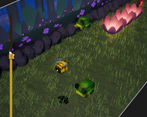
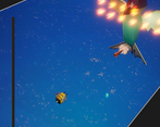
I'll agree with a lot of the other comments here, wherein my biggest complaint was the overall lack of spacial awareness that I really feel ended a lot of solid runs I had going. The angle just feels kind of awkward for something where very specific positioning is important to success. I think this problem was even more compounded once you pass the grassy area and get to the sky portion, which has basically visual indicator of where anything besides you currently is within the game space. The height bar on the left helps, but I do think that being able to tell where you are naturally is a lot more effective vs a UI element. Maybe a simple change of camera could do a lot of work in resolving the issue of determining your place in the world? On the other hand, I did like how the angle made it feel somewhat more cinematic. Perhaps just keeping some form of ground visible in the world, which really seemed to help in the first portion of the game? Maybe clouds, or anything that would let me see where I am. Just a bit of research into Zaxxon, and it looks like you could always see the shadow of the player. The aspect ratio also threw me off a bit at first, and I wasn't sure if the game was imagined being played on a mobile screen?

As for the visuals and audio, they were great! The simple 3D aesthetic really felt cohesive. Very whimsical, and I totally could tell I was grinning through each of my playthroughs. Just a fun ad relaxing vibe, which is what I think you were going for!

I was also really impressed that you managed to fit in a boss battle. I only made it to the boss once before dying and running out of steam to start over, but it really helped make the game feel a lot bigger and more epic.

Submitted

First, I will echo complements on aesthetics - I particularly liked how you pulled off the parallax scrolling effect from that diagonal perspective. It makes me think of a stage play or a puppet show. You could potentially lean on that aspect,  using elements of said shows to help address the challenge of positioning and perspectives (player/enemies hanging off string, maybe?)

A lot has already been said about positioning, but I will add one thing that I don't think anyone has mentioned yet - I haven't played zaxxon, but in most scrolling shooters when you die, the player typically respawns right away. Maybe I'm sticking to tradition too much, but I feel like this game would benefit just a little bit more in doing that, rather than having the screen fade out and fade back in. The way it is now, I felt as if I've lost all momentum, and have to re-orient myself to what's ahead.

All that aside, I think the game feels good when it comes to movement and shooting, and your music doesn't loop too much nor is too distracting - going to interesting places and knowing when to move on to another chord or melody. I think once the positioning stuff is down, you got a real solid framework for a full game here.

Jam HostSubmitted

I like the 3D visuals, are they homemade for the jam? Combined with the post processing, the game has a nice aesthetic.

I don't like having shoot and WASD all on my left hand. I can't press these at the same time. 

I could see a lot of potential for good play to earn high scores here, nice job!

Submitted

The first thing is that the controls felt very awkward to me with WASD to move and X to shoot, since that's what the instructions ingame say. Especially in a game where I feel very heavily incentivized to be shooting constantly in order to tell where I am relative to the walls - which feels like its own problem. This gets compounded by the fact that there's no autofire holding down X, meaning my right hand was just stacked underneath my left hand mashing the button constantly. There is also no cooldown for firing, meaning that you can just mash as fast as you can and fire very quickly. I only realized after my first playthrough or so that space would also shoot. I felt a little foolish, but the instructions ingame should probably say that X and Space will both shoot.

Back to the "shooting to tell where I am" problem - it does not feel clearly communicated to me where I am relative to obstacles. Some enemies or obstacles can feel like they come out of nowhere since the camera angle doesn't let you see very far forward at all. This is a lot worse if you're specifically in the upper right corner. The section with waves of hornets I entirely gave up on shooting them and just mashed the fire button in place, since it was a much safer option and I could not reliably aim my shots to hit anything. Without walls, there's nothing my shots can consistently hit, which meant no way to tell exactly where I was in space.

The boss enemy exacerbates the mashing problem, since to kill the boss faster you just mash as hard as you can, look at where the bullets hit the boss, and then use that as a reference for dodging the attack patterns, then alternately move in any direction to dodge the attack that fires towards your position. With quick enough mashing the boss can only get in a few attacks.

The flowers that fire sideways also seem a bit awkward - I was never threatened by them, since they always fired way ahead of me in a spot where I couldn't possibly be, and then didn't seem to fire again. I'm not sure if it's possible to get hit by the projectiles those shoot.

The pollen system as well didn't feel very consequential. I was able to beat the boss without ever shooting a flower, but keeping your pollen topped up is generally pretty easy anyways. 

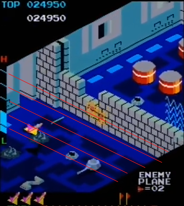
I'd also like to note that the height meter on the side isn't very helpful, and in my opinion misses why the height meter in the original Zaxxon was important and useful - in Zaxxon, the height meter is oriented on the same plane that the ship moves on, with bars on the meter which correspond to the lines along which the ship is controlled horizontally. This, especially in the indoor sections where the wall is also easy to trace relative to the height meter, makes it much clearer where the ship is in the physical space of the game, as I've tried to illustrate below

Without the meter being exactly relative to the space, alongside height markers angled for perspective grounding the meter in physical space, it becomes much less useful to the player for determining their vertical position relative to enemies and obstacles. The provides clarity - you know the top of the high section of the wall on the left side goes to the top of the height meter, so you can also tell about how high you need to be on the height meter in order to clear the rest of the wall at a glance. The Beexon meter, though, doesn't directly correlate in this way, so it doesn't cement the player's

I know that this was kind of an essay, but I hope this is helpful critique for you. I love these kinds of modern adaptations of old retro games, and I love the character of this version of the game - especially the little frogs

Very creative take on the basic flappy bird formula, it felt very engaging having to figure out your path as well as your height as you go. The art was also solid. Nice work!

I did get killed by a random (hornet?) that flew through one of the barriers which wasn't very fun because I didn't see it coming. Also it was a bit hard to guage the height needed to enter the barriers sometimes (which would probably need an indicator if you're about to fly into it or not on the barrier), as well as the position of things like the frogs jumping (maybe just a shadow underneath them would have helped).

Submitted (1 edit)

I spent more time than I care to admit on this one! Great stuff! I love the sketchy (is that the right word? I’m a bad at art terms.) art style, and the music got stuck in my head for a little after I played it. I've never really played zaxxon before, but having given it a shot right after this I can clearly see the influence. You all wear it on your sleeves, and you wear it well! Controlling Mr. Bee felt great! There were a few times where I was certain I'd go through the hole, but would crash. Keep in mind, I am stupid, so maybe THAT's the issue, so take that with a grain of salt or two. I also had a hard time telling what the gusts of wind were supposed to be. I flew into them thinking they'd maybe do something since none of the other holes had the wind, but it killed me instead. Now having seen Zaxxon, I can tell its trying to replicate the laser on top of the walls, but without that context I ended up losing a solid run. Maybe thorny vines would get the message across while still being able to have spots you can see through? I loved the boss fight at the end, BUT i would maybe recommend adding some sort of shadow to the playfield, because I lost many a life not being able to tell where I was in relation to the evil wasps. The boss fight against the bird was super sick as well. Overall great stuff! I think you could totally make a mobile version of this or something and it'd do great!