Play game
写真 - Replicate Reality (jam edition)'s itch.io pageResults
| Criteria | Rank | Score* | Raw Score |
| Story & Plot | #11 | 3.373 | 3.556 |
| Overall | #14 | 2.872 | 3.028 |
| UI Design | #15 | 2.951 | 3.111 |
| Gameplay/Usage of the medium | #16 | 2.635 | 2.778 |
| Usage of Theme | #16 | 2.530 | 2.667 |
Ranked from 9 ratings. Score is adjusted from raw score by the median number of ratings per game in the jam.
Team Members
ghostchibi
Program
Twee/Sugarcube 2.X
Leave a comment
Log in with itch.io to leave a comment.


Comments
Allow me to echo what has been said already: your writing (in particular, your descriptions and dialogue) are very good. In terms of playability, I found myself frustrated and getting lost by clicking what felt like the same directions over and over. Some kind of indicator would be a big help, or perhaps dramatically fewer navigation options.
Overall, though, very nice job.
Thank you! I tried to keep the navigation direct while also being intentionally confusing to a degree. Would you say written indicators would be better, or something visual like a map?
I think for the sake of it being "text based," I might prefer written indicators would be better in this instance. "You are in ___. You see ___. You can go ___ or ___." Something like that might work!
This was neat! The descriptions of the rooms and halls, as well as the dialogs, were great! It really pulls you in. The little of bits of horror were also a nice touch.
I think the UI design worked well considering the setting of the story. However, the lack of map made going around the rooms confusing (left/right kept changing when you enter a room, which is normal in real life, but made it hard to keep track). I think a system of North/South/East/West would have help, because the cardinal points don't change. That or having a picture of a map.
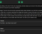
The way you designed the dialog was also nice, and made me thing of those J-RPG design. I would have liked to be able to choose my own name though. Or have a choice between Ghost and a textbox for player input.
(little bug: when you are in full screen and close the top bar, you can't open it again. You need to leave fullscreen to open it)
Overall, really nice experience. Def gonna check out what else you've made.
I'll check what's going on with that top bar, since it shouldn't really be doing anything particularly special in fullscreen. I change it to be perpetually open or only visible on hover in that area.
Regarding the player's name, technically you're not playing as yourself. I hoped that writing this in second person would add to the disorientation of the player so that they would feel like Ghost, not knowing who he is and what's going on while discovering things. I may change the perspective or the descriptions in order to clarify that a little more.
I may see how a NSEW cardinal direction orientation works. I did consider a map, but I didn't want too many visual elements in a game that relied heavily on text to convey images.
It is very common in IF to use the second person for the player, rather than the first/third, as well as having the possibility to choose one's name (especially when the player doesn't know their name). Personally, it didn't feel like it added to the confusion and I am not sure where the game needed more disorientation. The story itself was pretty disorientating to begin with :)
I think the NSEW would then fit best with your need (or have a map menu that uncovers parts as the player passes through rooms?)
Pretty much all of my IF is in second person, so I can see how the second person actually has the opposite effect of what I intended in IF where everyone is so used to it that it's not anything new. I'll see how this reads in first person and works with Ghost's characterization.
NSEW + a compass given to Ghost by Celeste might solve all the navigation issues, so I'll see how that works out too!
The first person sounds interesting, if you maybe include more inner thoughts? (just a suggestion)
I would love to see that compass/NSEW in action!
Kind of hard to navigate around, but the descriptions were fantastic
Thanks! I'd like to fix the navigation issue since that's a consistent problem between players. Do you have any suggestions for what kind of navigation style? I've had some people suggest NSEW or a map, but both feel like they have their ups and downs with maintaining the feel.
A map or compass could help. Also, when I made a game that had a travel style similar to this one, I gave each room its own unique name and would say "Go left to [room name]" to help myself (and players) keep track of which room was which and where it was. That's a more in-dialogue way to do it, I suppose. I'm sure there's people with waaaaaay more experience under their belts that would be bigger helps than me. xD